
Leonid Kostetskyi. Oversized typographic statements floating on a white gallery wall, every mark a deliberate negative space.
- Studio
- Light theme
- 6 colors
- 3 typefaces
Leonid Kostetskyi's site is a single-canvas editorial spread: a near-white gallery wall dominated by oversized Neue Haas Display headlines set in a muted dark-wine accent. The system runs on extreme contrast — one chromatic color (#472425, a desaturated oxblood) does all the brand work against pure white, with black and near-black handling secondary text and hairlines. Typography is the product: display faces reach 188px with negative tracking, sitting beside 8–15px uppercase utility labels. Spacing is expansive and editorial, with massive vertical breathing room between elements and no decorative ornamentation beyond one small radial starburst mark. The feel is Swiss-poster meets personal portfolio — confident, restrained, slightly austere, and unmistakably authored.
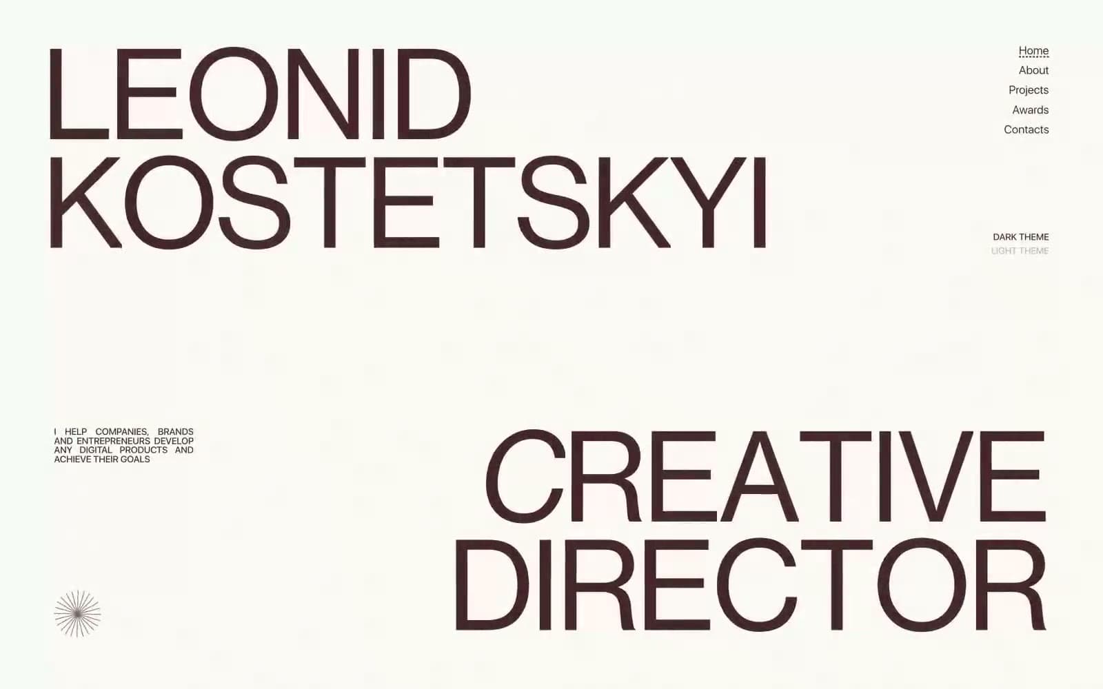
Leonid Kostetskyi design system

Brand1
The singular chromatic identity — display headlines, nav links, body text, borders, and the active theme toggle. This muted dark-wine red carries all brand presence; the system is monochrome with this one warm, desaturated red as the only color
Accent1
Red outline accent for tags, dividers, and focused UI edges. Use as a supporting accent, not as a status color
Neutrals4
Secondary text, decorative borders, and structural hairlines. Used as the neutral companion to Oxblood when chromatic emphasis isn't needed
Tertiary text and body borders. A softer near-black for inline content where pure black feels too harsh
Muted helper text, the inactive theme toggle label, and low-emphasis annotations
Page canvas and card surfaces. The background that the typography sits on; it reads as gallery white, not pure technical white
Try a pairing
Pick any two colors from the palette to check whether text stays readable on top.
Aa
Paper White on Oxblood
13.57 : 1 contrast
- Body textPasses AA 4.5
- Large textPasses AA 3
- StrictPasses AAA 7
More DESIGN.md files. Same web, different personalities.

Rauno Freiberg
Studio
Emil Kowalski
Studio

14islands
Studio
19–86
Studio
Aaron Poe & Co
Studio
Acceptandproceed
Studio
ACCOMPANY
Studio
Acolorbright
Studio
Adcker
Studio
Adopt
Studio
Agence Foudre
Studio


