
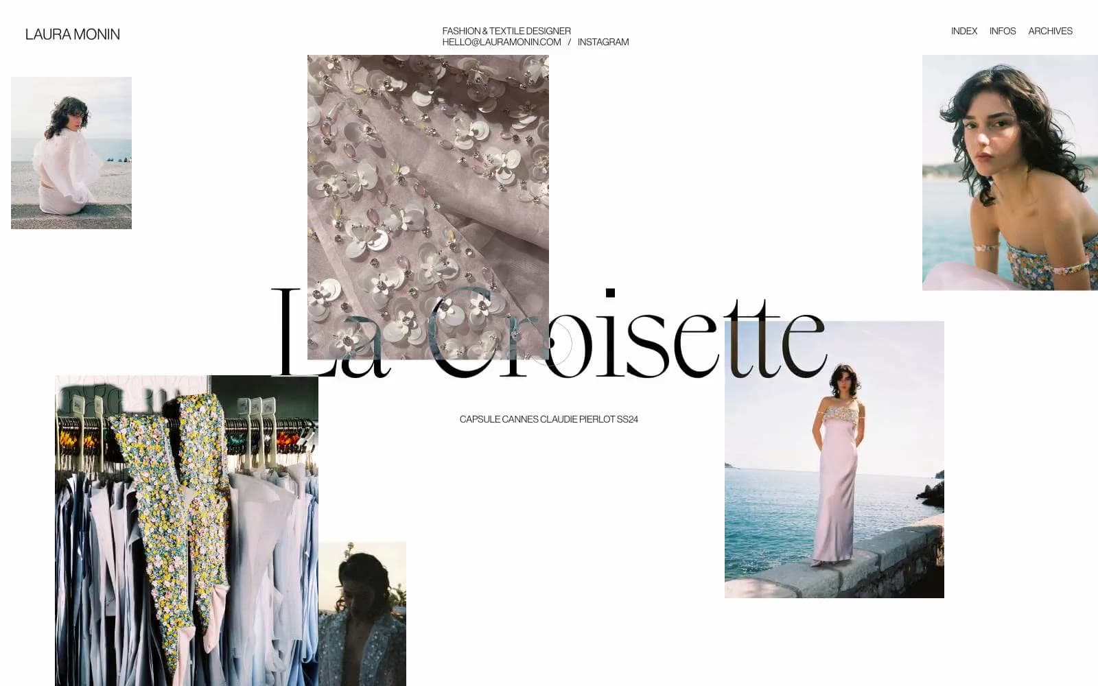
Laura Monin. Editorial gallery wall, white marble, ink stamp.
- Studio
- Light theme
- 2 colors
- 2 typefaces
Laura Monin is an editorial fashion portfolio built on absolute chromatic restraint: pure white canvas, black ink, and a single custom display serif that carries the entire brand voice. The layout behaves like a curated mood board — photographs scatter asymmetrically across generous negative space rather than aligning to a conventional grid, with overlay captions functioning as whispered labels rather than navigation. Typography carries all hierarchy: the massive display serif at 58–158px commands the center, while Neue Haas Grotesk at 12–22px serves as quiet scaffolding for navigation, metadata, and supporting text. There are no shadows, no rounded corners, no gradients, no color — the system achieves its luxury through what it removes, not what it adds. Every element should feel like it was placed by hand on a gallery wall: precise, unhurried, and never filling more of the frame than necessary.
Laura Monin design system

Neutrals2
Primary text, all border outlines on images and nav, list markers — the sole chromatic anchor
Page canvas, card surfaces, image borders, nav backgrounds — the only surface tone in the system
Try a pairing
Pick any two colors from the palette to check whether text stays readable on top.
Aa
Paper White on Ink Black
21.00 : 1 contrast
- Body textPasses AA 4.5
- Large textPasses AA 3
- StrictPasses AAA 7
More DESIGN.md files. Same web, different personalities.

Rauno Freiberg
Studio
Emil Kowalski
Studio

14islands
Studio
19–86
Studio
Aaron Poe & Co
Studio
Acceptandproceed
Studio
ACCOMPANY
Studio
Acolorbright
Studio
Adcker
Studio
Adopt
Studio
Agence Foudre
Studio


