
Katherine Pihl. A white-walled space where black type, generous gaps, and full-bleed imagery do all the work, and the UI itself is almost invisible.
- Studio
- Light theme
- 3 colors
- 2 typefaces
Katherine Pihl is an editorial portfolio system where the work does the talking and the interface recedes into the wall. The page is a pure white canvas with black and two grays — zero chromatic accent, zero decorative gradient, zero shadow — so the imagery carries all the color. The typographic system is the only expressive layer: a precise neo-grotesque (Neue Montreal) at 300–500 for all structural and label text, paired with a high-contrast light-weight serif (Ryhmes) that appears only as large display type overlaid on project imagery. Cards are not cards — they are unbordered, full-bleed images with text labels hanging in the whitespace below. Navigation is two text links. The layout rhythm is a 3-column grid with generous vertical breathing room; everything else is silence.
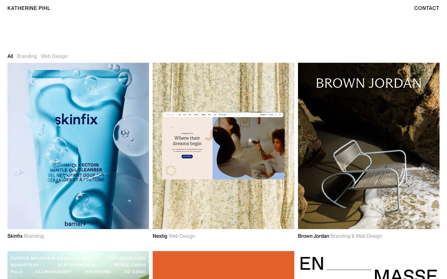
Katherine Pihl design system

Neutrals3
Primary text, all structural borders, hairline page frames, link underlines — the single typographic ink
Medium-contrast borders, control outlines, and structural separators.
Page background, watermark-level surfaces, lightest borders
Try a pairing
Pick any two colors from the palette to check whether text stays readable on top.
Aa
Fog on Ink
10.02 : 1 contrast
- Body textPasses AA 4.5
- Large textPasses AA 3
- StrictPasses AAA 7
More DESIGN.md files. Same web, different personalities.

Rauno Freiberg
Studio
Emil Kowalski
Studio

14islands
Studio
19–86
Studio
Aaron Poe & Co
Studio
Acceptandproceed
Studio
ACCOMPANY
Studio
Acolorbright
Studio
Adcker
Studio
Adopt
Studio
Agence Foudre
Studio


