
Invisibletech. Editorial sketchbook on graph paper.
- AI
- Light theme
- 14 colors
- 3 typefaces
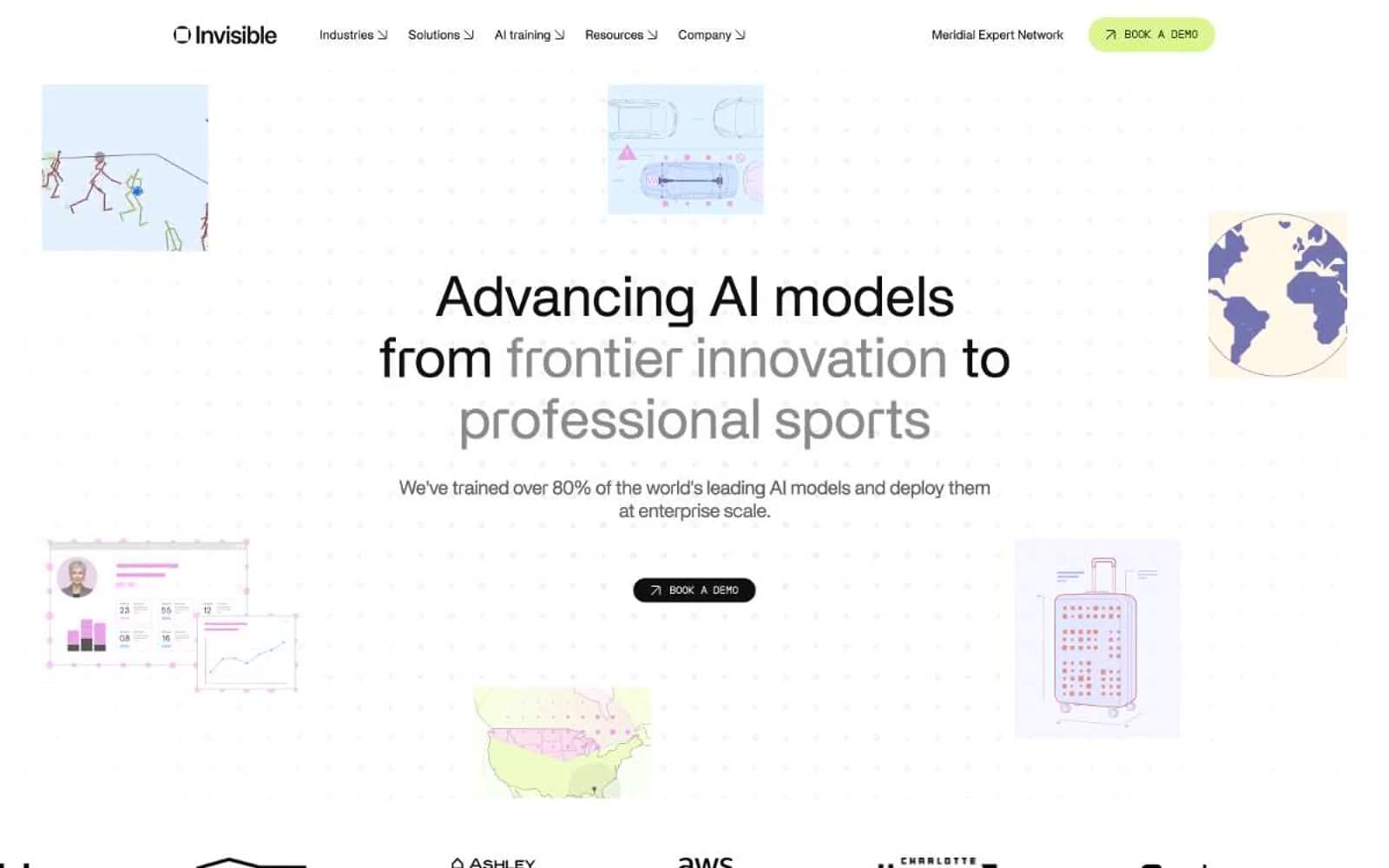
Invisible Tech reads as an editorial sketchbook laid over graph paper: a near-pure white canvas dotted with a faint grid, scattered with loose hand-drawn vignettes (basketball players, overhead cars, a globe), and anchored by a tight two-column content rhythm. The typographic system is a deliberate duet between two custom faces — Apk Galeria carries everything human (body, headlines, quotes) with a serif-influenced rhythm and progressively tighter tracking as type scales up, while Apkpraktikal handles everything categorical as wide-tracked small caps (section eyebrows, navigation labels, tab names). The color system is almost entirely achromatic — black, graphite, and a stack of grays do 98% of the work — with exactly two chromatic accents that carry meaning: a vivid cobalt blue for wayfinding dots and a lime-chartreuse green reserved exclusively for the primary conversion action. Components are pill-shaped, borders are 1px hairlines, and the page never raises its voice with shadows or gradients — it whispers, then lets the two-tone headline (one phrase in near-black, the following phrase in mid-gray) do the dramatic work.
Invisibletech design system

Brand2
Wayfinding dots beside section eyebrows, icon accents, link color — the navigation accent, never used as a fill
Green action color for filled buttons, selected navigation states, and focused conversion moments.
Neutrals12
Primary text, hero CTA button fill, logo mark — the dominant non-white color carrying 1000+ borders and all body copy
Secondary surface fill, dark card backgrounds, button borders — one step lighter than Carbon for layered elements
Body text, input borders, button borders, card borders — the working neutral for readable secondary copy
Muted headings, subhead text, supporting borders
Subtle heading text, dividers, light borders
Image borders, icon borders, tertiary text
Link borders, decorative dividers, lightest structural lines
Hairline borders, disabled states
Subtle borders, card outlines
Soft surface fills, secondary button backgrounds, subtle wash backgrounds
Feature card surfaces, soft highlight panels — the only tinted neutral, used to frame product previews and walkthrough banners
Page background, card surface, button text on dark fills
Try a pairing
Pick any two colors from the palette to check whether text stays readable on top.
Aa
Carbon Ink on Cobalt Spark
4.60 : 1 contrast
- Body textPasses AA 4.5
- Large textPasses AA 3
- StrictFails AAA 7























