
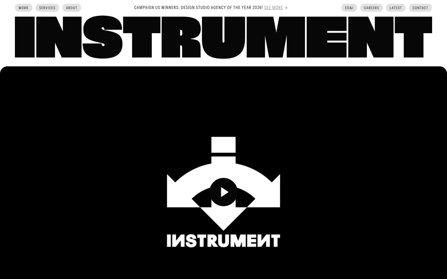
Instrument. Newspaper broadsheet meets brutalist poster.
- Studio
- Light theme
- 3 colors
- 3 typefaces
Instrument runs a stark monochrome editorial system: white canvas, near-black surfaces, a single mid-gray for secondary voice. Two custom type families carry the entire identity — a geometric sans for everything functional and a refined serif for emotional statements. The page rhythm is built on contrast: edge-to-edge massive wordmark, then a solid black cinematic hero, then breathing white space with serif-led editorial moments. Interactive elements are pill-shaped; content containers use a generous 24px radius. Color is never decorative here — it only signals hierarchy through value, not hue.
Instrument design system

Neutrals3
Primary text, all borders, full-bleed dark surfaces, pill-button outlines — the near-black that absorbs everything; choosing 070708 over pure black removes blue-cast and reads warmer on screen
Secondary labels, muted helper text, inactive filter states, badge borders, meta tags — the only mid-tone voice for tertiary information
Page canvas, card surfaces, reverse text on dark blocks, pill-button backgrounds and inverse outlines
Try a pairing
Pick any two colors from the palette to check whether text stays readable on top.
Aa
Paper on Obsidian
20.14 : 1 contrast
- Body textPasses AA 4.5
- Large textPasses AA 3
- StrictPasses AAA 7
More DESIGN.md files. Same web, different personalities.

Rauno Freiberg
Studio
Emil Kowalski
Studio

14islands
Studio
19–86
Studio
Aaron Poe & Co
Studio
Acceptandproceed
Studio
ACCOMPANY
Studio
Acolorbright
Studio
Adcker
Studio
Adopt
Studio
Agence Foudre
Studio


