
HyperAktiv. Swiss editorial broadsheet.
- Studio
- Light theme
- 5 colors
- 2 typefaces
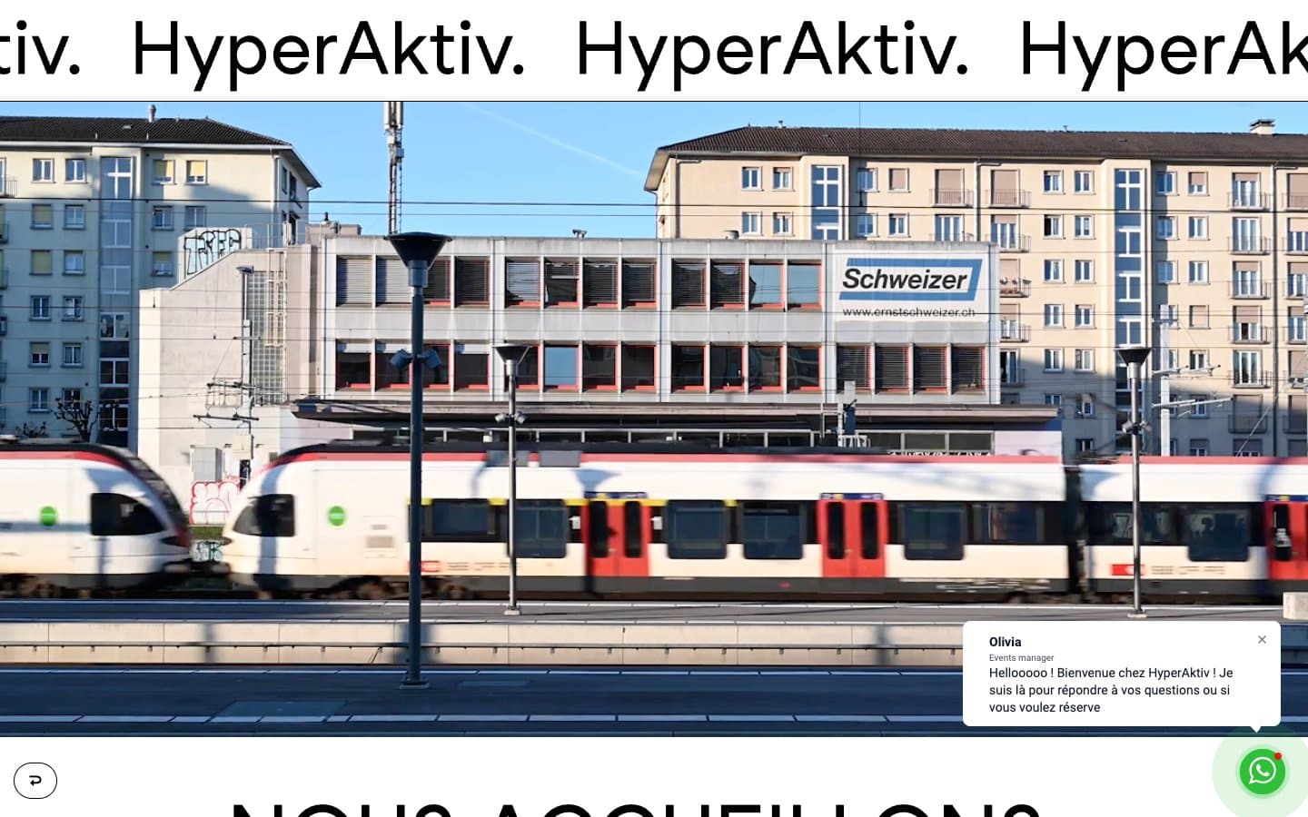
HyperAktiv operates as a Swiss editorial poster: pure white canvas, oversized black display type, and one electric blue (#0000ff) that fires only on action and footer surfaces. Headlines dominate at 72–90px with line-heights tightened to 0.89–1.0, collapsing the page into a vertical column of massive typographic statements. Layouts alternate between full-bleed photography and asymmetric 50/50 splits, treating the interior photos as raw documentation rather than styled artwork. Everything is sharp-cornered except a single 20px button radius, and the only shadows are the ones baked into the photography — the interface itself stays flat, binary, and graphic.
HyperAktiv design system

Brand1
Filled action buttons, footer background, interactive accent — the single chromatic punctuation against an otherwise achromatic system
Neutrals4
Body text, headings, icon strokes, hairline borders, image overlays
Input text, secondary text content
Input borders, subtle form dividers
Page background, card surfaces, text on dark/action backgrounds
Try a pairing
Pick any two colors from the palette to check whether text stays readable on top.
Aa
Pure White on Hyper Blue
8.59 : 1 contrast
- Body textPasses AA 4.5
- Large textPasses AA 3
- StrictPasses AAA 7
More DESIGN.md files. Same web, different personalities.

Rauno Freiberg
Studio
Emil Kowalski
Studio

14islands
Studio
19–86
Studio
Aaron Poe & Co
Studio
Acceptandproceed
Studio
ACCOMPANY
Studio
Acolorbright
Studio
Adcker
Studio
Adopt
Studio
Agence Foudre
Studio


