
Hume AI. Scientific pastel instrument panel.
- AI
- Light theme
- 12 colors
- 2 typefaces
Hume AI reads as a scientific pastel instrument panel: a near-white laboratory canvas where the only hard mark is a near-black #222222, and color enters as soft watercolor washes — rose, lavender, peach, mint, sky — that visualize data rather than decorate it. The headline typographic move is tight, low-contrast Fellix at 36–48px with negative tracking, set in a weight that whispers rather than shouts, framing emotional intelligence as measured restraint. Components are pill-shaped or softly rounded (8/12/16/24px radii), borders are invisible or hairline, shadows are absent — surfaces separate by hue and whitespace, not elevation. Monospace PP Fraktion Mono appears as the 'lab label' voice: uppercase column headers, tag chips, and data annotations carry a positive +0.025em tracking that contrasts the display sans's tight -0.025em. The overall rhythm is centered, generous, and editorial — sections breathe with 48–64px gaps, content never crowds, and the only saturated accent (#c094e4 violet) lives inside data bars and brand moments, never on chrome.
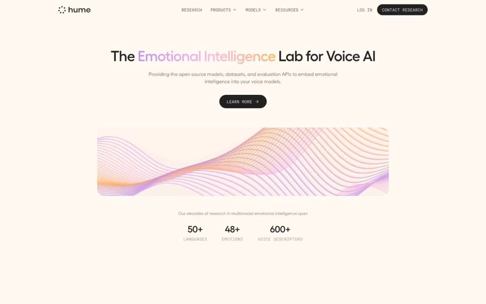
Hume AI design system

Brand1
Primary chromatic accent — data bar fills, brand gradient anchor, link color — violet carries the only sustained saturation in the UI; Sole vivid accent — horizontal bar chart fills, hero gradient, brand wordmark moments
Accent5
Pastel pink surface wash — category tile backgrounds, data card tints
Softest pink surface — subtle section tints, card backgrounds
Warm peach surface — category tiles, dataset swatches, complementary pastel
Mint pastel surface — category tiles, complementary data swatch
Green-tinted pastel surface — category swatch, soft data background
Neutrals6
Pure black reserved for icon fills and maximum-contrast accents
Primary text, filled buttons, nav strokes, icon fills — near-black rather than pure black to soften the interface
Cool dark plum for body text and dark-on-light icon strokes
Muted helper text, secondary button text, disabled labels
Warm off-white secondary surface, subtle background tints behind sections
Base canvas, card surfaces, button text on dark fills
Try a pairing
Pick any two colors from the palette to check whether text stays readable on top.
Aa
Carbon on Blush
17.04 : 1 contrast
- Body textPasses AA 4.5
- Large textPasses AA 3
- StrictPasses AAA 7























