
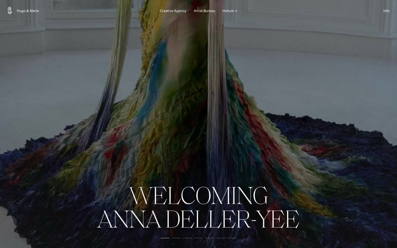
Hugo & Marie. Editorial photography mounted on infinite white, framed by whisper-thin serif.
- Studio
- Light theme
- 6 colors
- 3 typefaces
Hugo & Marie operates as a curatorial monochrome canvas: pure white negative space frames dramatic full-bleed editorial photography, with content living in the tension between near-black ink and paper. Typography carries all the personality — an ultralight serif display (weight 100, 100px) sets ceremonial headlines that feel like gallery wall text, while a restrained neo-grotesque sans (soehne, weights 300/400) handles everything from navigation to body copy. The interface refuses decorative chrome: no filled buttons, no color accents, no shadows — navigation is text-with-arrow, badges are hairline pills, and section dividers are single-pixel rules. This is a portfolio-first system where the artists' imagery is the only chromatic event, and the UI must vanish around it.
Hugo & Marie design system

Neutrals6
Primary text, dense border structure, dark image overlays — the structural anchor for rules and headings
Dark borders and separators for elevated surfaces and inverted UI.
Input field borders — the only place a mid-gray border appears, marking form-field edges without competing with imagery
Muted icon strokes, separators, and secondary graphic details. Do not promote it to the primary CTA color
Neutral form states, badge text, and quiet UI feedback where color should stay understated.
Page background, card surfaces, badge fills, nav dividers, input fields — the dominant surface that recedes to let imagery speak
Try a pairing
Pick any two colors from the palette to check whether text stays readable on top.
Aa
Paper White on Ink Black
21.00 : 1 contrast
- Body textPasses AA 4.5
- Large textPasses AA 3
- StrictPasses AAA 7
More DESIGN.md files. Same web, different personalities.

Rauno Freiberg
Studio
Emil Kowalski
Studio

14islands
Studio
19–86
Studio
Aaron Poe & Co
Studio
Acceptandproceed
Studio
ACCOMPANY
Studio
Acolorbright
Studio
Adcker
Studio
Adopt
Studio
Agence Foudre
Studio


