
Heynds. Ember on fresh snow.
- AI
- Light theme
- 8 colors
- 1 typeface
Heynds speaks in a high-contrast productivity language: a near-white canvas (#fffafa) lit by a single vivid orange ember (#f53900) that does all the work — CTAs, accent text, icons, decorative rays. Typography is modern and confident via Geist, with heavy display weights anchoring headlines and comfortable 16px reading sizes for body. The surface treatment stays almost flat: hairline #e5e5e5 dividers, tiny 4–8px corner radii, and one whisper-soft 0.05 shadow that barely registers. The single-color discipline means the orange reads as energy and urgency against the quiet monochrome chrome. Decorative radiating line patterns in faint orange wash warmth across hero and FAQ sections without breaking the clean surface.
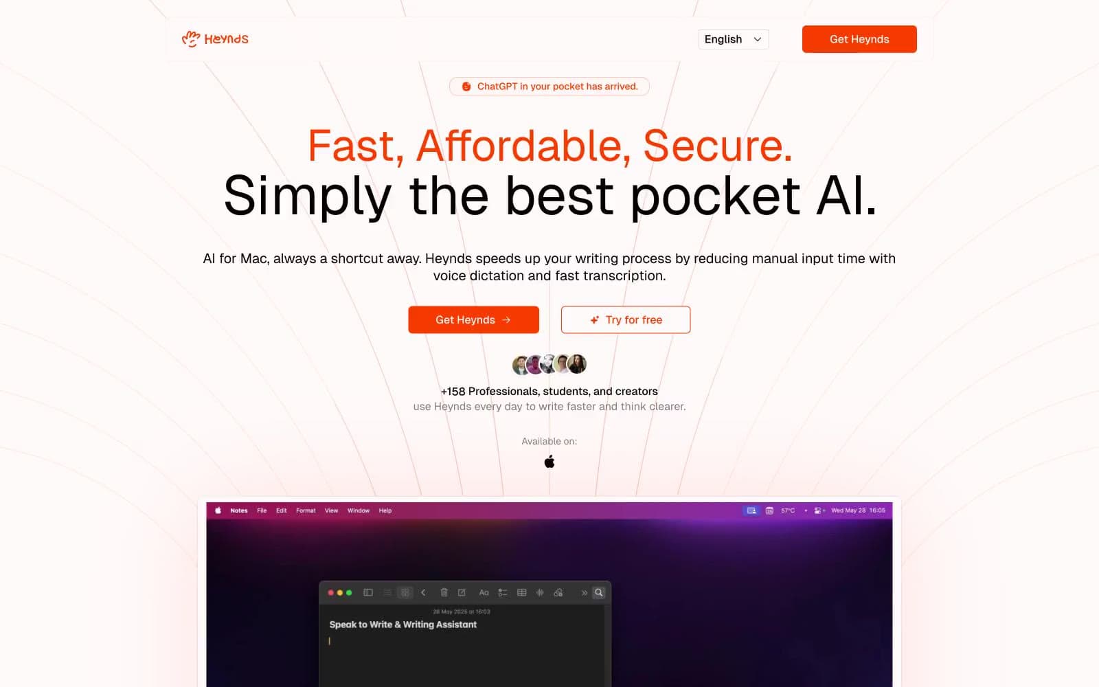
Heynds design system

Brand1
Primary brand accent — filled CTAs, outlined action borders, icon fills, decorative accents, sparkline highlights. The only chromatic color in the interface; its vividness against the achromatic canvas makes every action feel switched on
Accent1
Soft tinted surface — pill-badge backgrounds, subtle highlight panels, secondary button fills where a quieter orange is needed
Neutrals6
Primary text color for headings, body, and nav. Used for icon strokes and form input values
Tertiary text — timestamps, micro-labels, fine print beneath primary content
Secondary and helper text — muted descriptions, captions, placeholder strings
Subtle alternating section backgrounds and disabled state fills
Hairline dividers, card borders, FAQ separators, input field borders, icon outline strokes
Primary page background and elevated surface — the base on which all other elements sit
Try a pairing
Pick any two colors from the palette to check whether text stays readable on top.
Aa
Ink Black on Ember Orange
5.41 : 1 contrast
- Body textPasses AA 4.5
- Large textPasses AA 3
- StrictFails AAA 7























