
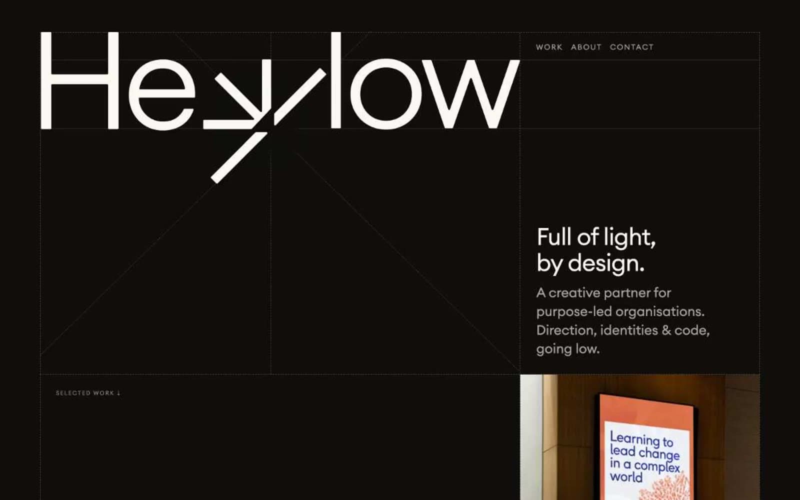
Hey Low. Measured, organic, and mostly silent, with one lime-green note singing on the page.
- Studio
- Light theme
- 9 colors
- 2 typefaces
Hey Low is an ecological field journal rendered as a website: white paper, forest-ink typography, and a single sprig of chartreuse that makes actions feel alive. The composition is generous and unhurried — most of the canvas stays quiet and near-white, with dark evergreen as the structural color and pale lime appearing only where a system needs to pulse. Headlines are set in a tight, geometric sans with aggressive negative tracking at large sizes, then punctuated by a hand-set italic serif accent that injects warmth into otherwise clinical copy. Cards, buttons, and project tiles are flat and low-elevation; visual weight comes from type contrast and illustration, not shadows or gradients. Everything should feel like a studio that designs for the planet — restrained, botanical, and deliberately spare.
Hey Low design system

Brand3
Headlines, body copy, navigation text, illustration strokes, link color — the structural color that carries every page
Primary CTA button fill, feature card surfaces, highlight washes — the single accent that makes interactive elements feel switched on
Secondary action button, hover or pressed states where a darker counterweight to the lime CTA is needed
Accent1
Decorative high-energy accent inside illustrations, hover halos, or emphasis marks — louder sibling of Chartreuse Sprig
Neutrals5
Occasional true-black fills for SVG details and one dark button variant
Tertiary text, subdued labels, low-priority annotations
Muted helper text, secondary descriptions, caption-level copy where full Forest Ink would compete with the headline
Page canvas, hairline borders across cards/links/images, subtle section backgrounds — the surface that the design breathes on
Card surfaces, elevated tiles, button backgrounds, inverse text on dark fills
Try a pairing
Pick any two colors from the palette to check whether text stays readable on top.
Aa
White Sheet on Forest Ink
13.95 : 1 contrast
- Body textPasses AA 4.5
- Large textPasses AA 3
- StrictPasses AAA 7
More DESIGN.md files. Same web, different personalities.

Rauno Freiberg
Studio
Emil Kowalski
Studio

14islands
Studio
19–86
Studio
Aaron Poe & Co
Studio
Acceptandproceed
Studio
ACCOMPANY
Studio
Acolorbright
Studio
Adcker
Studio
Adopt
Studio
Agence Foudre
Studio


