
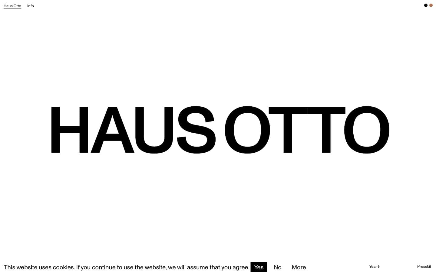
Haus Otto. Monumental wordmark on white void.
- Studio
- Light theme
- 3 colors
- 1 typeface
Haus Otto operates as a typographic monolith: a single ultra-condensed wordmark stretches across a vast white void, treating the brand name as both logo and content. The entire interface is two-tone — near-black on paper-white — with no shadows, no gradients, no borders, and no decorative geometry. Typography is the only material; Monument at 216px dominates with weight 400 and aggressive negative tracking, while smaller sizes at 13–23px handle navigation and metadata at near-whisper volumes. The layout is radically spacious, using emptiness as the primary compositional tool rather than fills, cards, or dividers. Every screen should feel like walking into a gallery where one object occupies the room.
Haus Otto design system

Accent1
Sole chromatic accent — warm earthen tone for hover states, active indicators, or single-element highlights against the monochrome field
Neutrals2
Primary text, wordmark fills, link text, all heading color — the only non-white pigment in the interface
Page canvas, card surfaces, inverse text on dark moments
Try a pairing
Pick any two colors from the palette to check whether text stays readable on top.
Aa
Obsidian on Terracotta
5.54 : 1 contrast
- Body textPasses AA 4.5
- Large textPasses AA 3
- StrictFails AAA 7
More DESIGN.md files. Same web, different personalities.

Rauno Freiberg
Studio
Emil Kowalski
Studio

14islands
Studio
19–86
Studio
Aaron Poe & Co
Studio
Acceptandproceed
Studio
ACCOMPANY
Studio
Acolorbright
Studio
Adcker
Studio
Adopt
Studio
Agence Foudre
Studio


