
Hatch. Hand-drawn zine meets pastel candy store.
- Studio
- Light theme
- 12 colors
- 2 typefaces
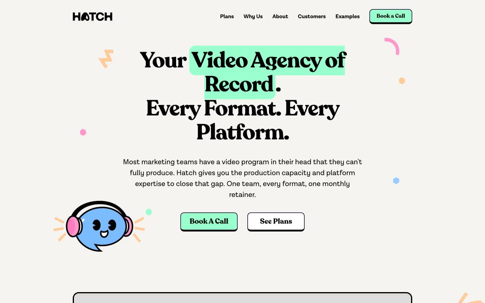
Hatch operates as a playful creative-agency brand on a warm cream canvas: the page reads like a hand-illustrated zine rather than a corporate SaaS site. Recoleta, a chunky high-contrast serif at very large sizes with tight negative tracking, carries every headline while a quiet grotesque (Lota Grotes Que Alt) handles UI and body. A four-color pastel palette — mint, sky, peach, pink — functions as functional punctuation against the cream, with mint green reserved for the primary action and the other three cycling through decorative dots, highlight swashes, illustration strokes, and tag chips. Cards, buttons, and tags lean heavily rounded (16–40px, full pill for CTAs), generous 4px-based spacing creates breathing room, and a recurring visual vocabulary of hand-drawn mint highlight swashes, confetti dots, and a cute blue mascot character threads the whole system together.
Hatch design system

Brand3
Primary action button fill, hand-drawn headline highlight swashes, active nav emphasis — the signature color that signals go
Deep brand accent for dark surface text, illustration fills, and emphasis — provides a rich counterweight to the pastels
Outlined action border, dark button outline variant — borders and strokes when a deeper violet frame is needed without filling
Accent3
Decorative illustration strokes, confetti dots, secondary accent chips, icon outlines — the cool member of the pastel set
Decorative confetti dots, highlight swashes, playful accent shapes — adds warmth and energy
Decorative dots, warm accent fills, illustration warm tones — the sunset note in the pastel quartet
Neutrals6
Primary text, hairline borders, icon strokes, card outlines — the dominant structural color, 3625 occurrences make it the spine of every layout
Body text and secondary headings when a slightly softer black is needed
Nav text and subdued UI labels
Subtle link underlines and dividers in muted contexts
Page background, canvas — warm off-white that softens the overall feel and keeps the pastel accents from vibrating against pure white
Card and button surfaces — sits one elevation above the cream canvas
Try a pairing
Pick any two colors from the palette to check whether text stays readable on top.
Aa
Ink Black on Mint Splash
17.53 : 1 contrast
- Body textPasses AA 4.5
- Large textPasses AA 3
- StrictPasses AAA 7
More DESIGN.md files. Same web, different personalities.

Rauno Freiberg
Studio
Emil Kowalski
Studio

14islands
Studio
19–86
Studio
Aaron Poe & Co
Studio
Acceptandproceed
Studio
ACCOMPANY
Studio
Acolorbright
Studio
Adcker
Studio
Adopt
Studio
Agence Foudre
Studio


