
Handsome Frank. A warm-paper gallery where illustrated worlds bloom against indigo frames.
- Studio
- Light theme
- 19 colors
- 3 typefaces
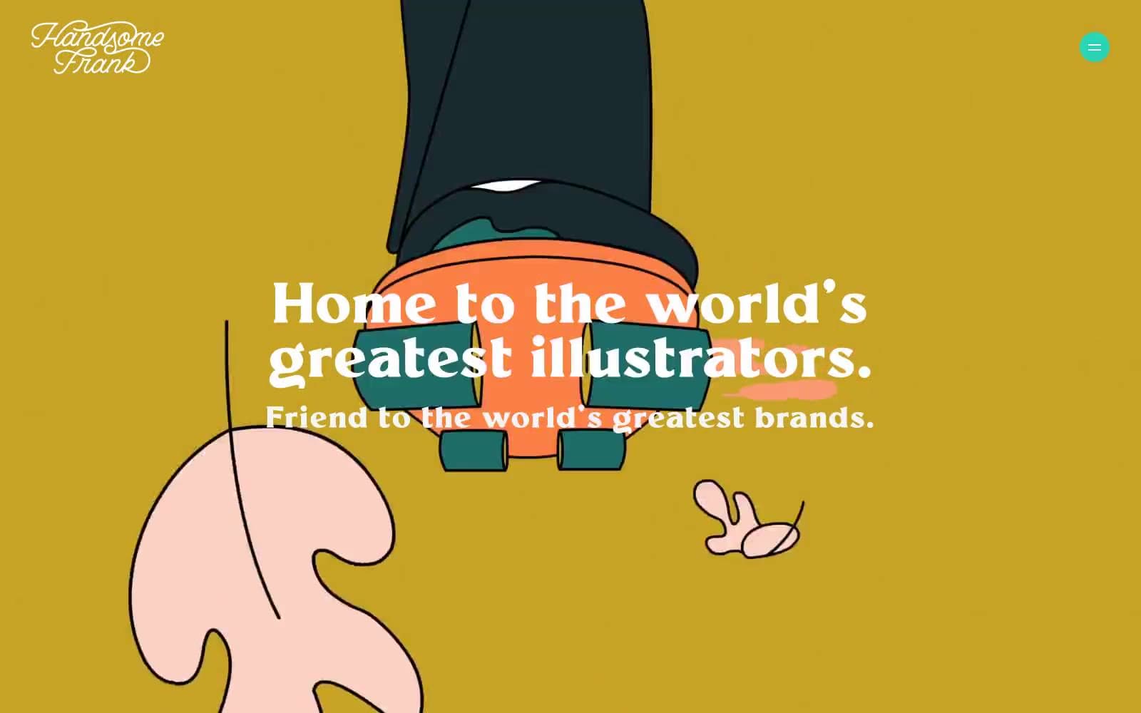
Handsome Frank operates as a curator's atelier for contemporary illustration: full-bleed illustrated hero scenes give way to warm paper-toned canvases where artist work is presented with museum-label restraint. The system is defined by a single dominant deep indigo (#160572) that anchors navigation, headlines, and the closing footer bar, surrounded by hairline black borders that act like gallery frame edges. Typography is a two-voice conversation — a tight-tracked editorial serif (Millik) for hero/display headlines and a quiet grotesque (Klarheit) for everything structural. Color is deployed as curated punctuation: the hero illustration carries the chromatic spectrum, while the rest of the page stays achromatic with isolated bursts of vivid red, teal, orange, and yellow acting as spotlight accents on links, tags, and project cards.
Handsome Frank design system

Brand1
Navigation strokes, display headlines, footer band — the deepest anchor in the system, commanding authority without shouting
Accent11
Editorial accent for critical announcements and bold display statements — the marquee marker
Warm secondary accent on project card titles, links, and illustrative borders
Soft warm accent for icon strokes and decorative borders
Mid-warmth accent on icon outlines and link underlines
Filled action button background — the only true filled CTA, used for the play/forward action in the footer
Filled action button background for primary browse/enter actions
Filled action button background for dark editorial CTAs
Filled action button background for soft secondary entries
Interactive link and menu accent — the only cool chromatic in the system, reserved for navigation affordances
Secondary interactive link accent for hover/active states
Decorative icon and link accent — cheerful punctuation
Neutrals6
Dominant border, text, and icon stroke — used as a 1-2px frame line across nav, cards, and decorative elements
Secondary text and softer borders where pure black feels too severe
Primary page canvas for content sections — warm eggshell that softens black text and lets illustration breathe
Pale blue-tinted background for muted emphasis blocks
Subtle warm wash for highlighted text or callout backgrounds
Card surfaces, reversed text on dark bands, and the clean counterpoint to cream — the gallery wall
semantic1
Badge background for editorial tags and callout labels
Try a pairing
Pick any two colors from the palette to check whether text stays readable on top.
Aa
Pure White on Indigo Frame
16.17 : 1 contrast
- Body textPasses AA 4.5
- Large textPasses AA 3
- StrictPasses AAA 7
More DESIGN.md files. Same web, different personalities.

Rauno Freiberg
Studio
Emil Kowalski
Studio

14islands
Studio
19–86
Studio
Aaron Poe & Co
Studio
Acceptandproceed
Studio
ACCOMPANY
Studio
Acolorbright
Studio
Adcker
Studio
Adopt
Studio
Agence Foudre
Studio


