
Handhold. A hand-set editorial spread with zero chromatic noise, where a hairline serif at weight 200 carries all the voice.
- AI
- Light theme
- 6 colors
- 2 typefaces
Handhold operates in an almost purely editorial register: a warm cream canvas (#f2f1ed) replaces the SaaS-standard pure white, and a custom serif at weight 200 does all the headline work while Inter at a single weight (400) handles everything else. The palette is strictly monochrome — 0% colorfulness detected — so hierarchy is built entirely through scale, tracking, and the serif/sans contrast rather than color. Surfaces are flat with no shadows; structure comes from generous border-radius (24-32px on cards, fully pill-shaped buttons) and tight tracking on the serif. The result reads like a design studio monograph or a luxury print catalog, not a typical B2B SaaS landing page. Density stays comfortable — 4px base, 48px section gaps, 28-32px card padding — with one centered column hero that breathes.
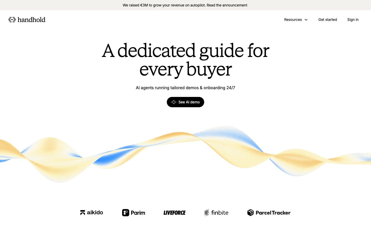
Handhold design system

Neutrals6
Primary text, heading strokes, card borders, filled CTA backgrounds — the sole carrier of visual weight in an otherwise empty palette
Secondary body text, muted labels, subtle borders — never used for primary copy
Tertiary text, helper copy, disabled states — the quietest voice in the type stack
Elevated surface, hairline dividers, and card-on-card separation — one shade deeper than the canvas to create structure without contrast
Page canvas, card surfaces, and the default background — warm off-white that distinguishes the brand from clinical SaaS whites
Text on dark filled CTAs, occasional card surface where higher contrast is needed against the cream canvas
Try a pairing
Pick any two colors from the palette to check whether text stays readable on top.
Aa
Pure White on Ink Black
21.00 : 1 contrast
- Body textPasses AA 4.5
- Large textPasses AA 3
- StrictPasses AAA 7























