
Getburnt. A minimal typeset spread where warm-black ink, a light display serif, and pill-shaped controls turn a B2B tool into something that reads like a quarterly journal.
- AI
- Light theme
- 3 colors
- 2 typefaces
Getburnt operates in a near-achromatic editorial register: a warm near-black ink against white paper, with a single mid-gray for secondary text. The visual language borrows from print typography — a featherweight display serif carries headlines while a neutral grotesque handles everything operational, creating the rhythm of a magazine spread rather than a SaaS dashboard. Pill-shaped controls and small-radius cards keep the UI tactile and quick, and the deliberate absence of chromatic accents forces hierarchy through scale, weight, and whitespace alone. Product mockups float as photographic-style still lifes within warm grayscale containers, making the interface feel like a curated catalog rather than a software platform.
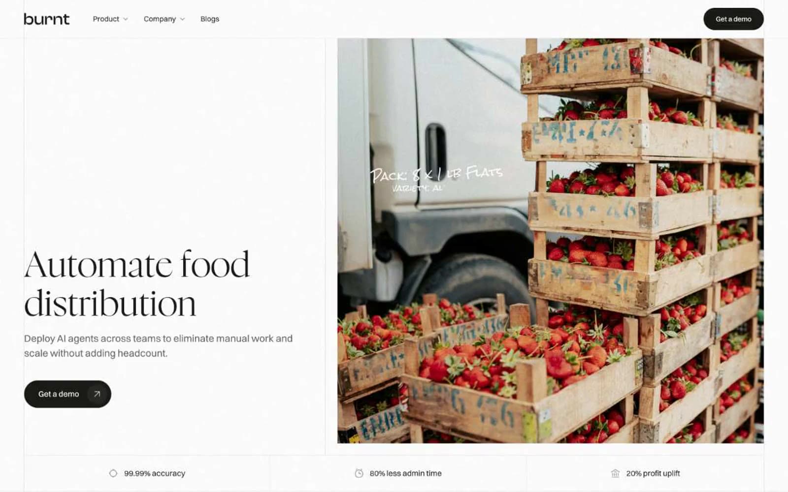
Getburnt design system

Neutrals3
Primary text, filled buttons, dark surface backgrounds, heading strokes — a warm-tinted near-black that replaces pure #000 throughout the system
Secondary body text, helper text, muted borders, low-emphasis UI metadata
Page canvas, card surfaces, light section backgrounds, button borders on dark surfaces
Try a pairing
Pick any two colors from the palette to check whether text stays readable on top.
Aa
Paper on Ink
17.44 : 1 contrast
- Body textPasses AA 4.5
- Large textPasses AA 3
- StrictPasses AAA 7























