
Geniestudio. The kind with generous margins and a single bold pen stroke.
- AI
- Light theme
- 18 colors
- 2 typefaces
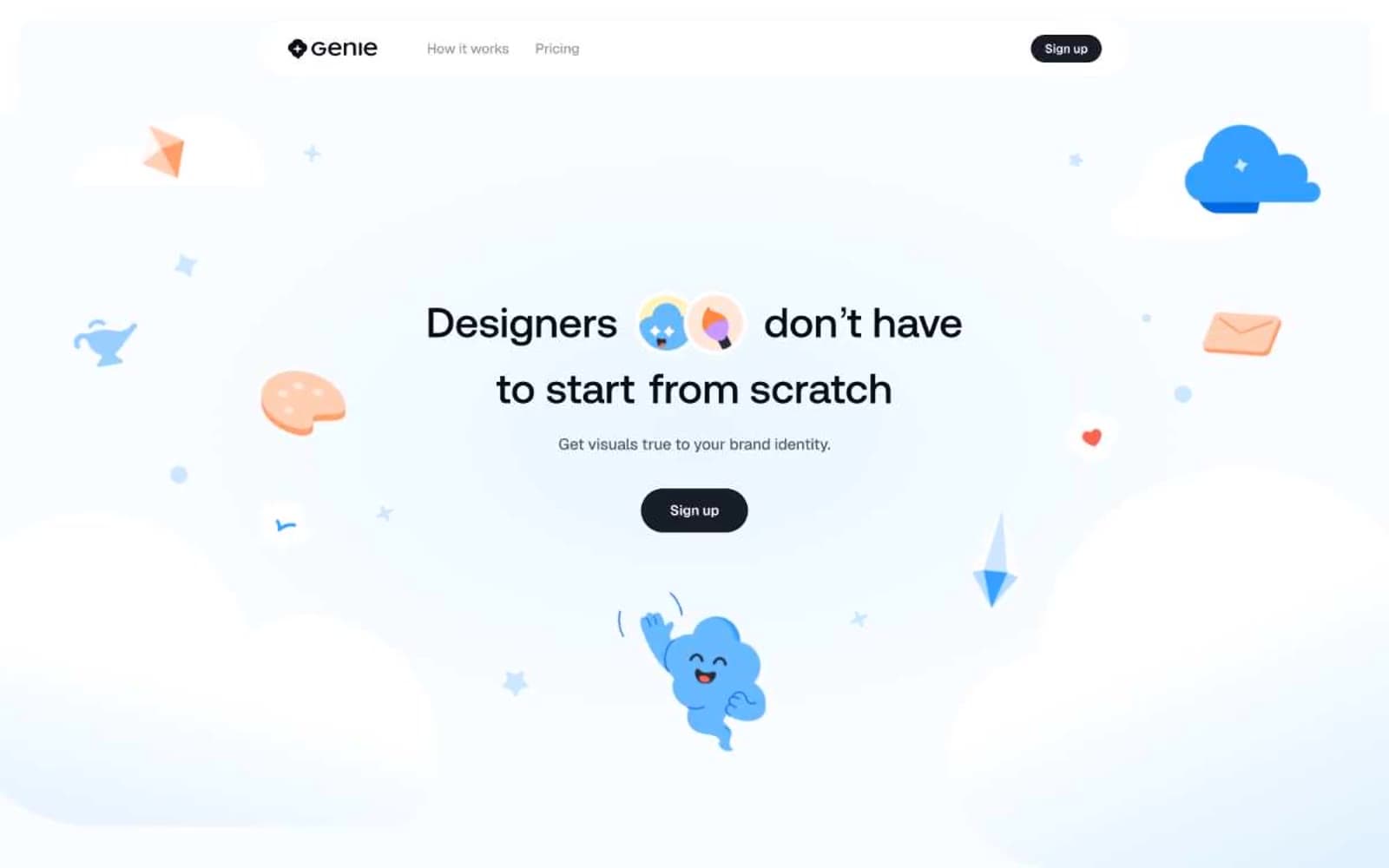
Genie uses an airy, daylight-studio language: a pale sky-blue canvas (#ebf5ff) hosts an almost-monochrome interface where near-black buttons provide the only dense visual weight. Display type runs enormous — up to 148px in Aeonik — with a fixed weight 500 that feels engraved rather than shouted, and tracking pulled tight (-0.02em) so headlines read as confident typography, not decorative type. Rounded shapes dominate: 32px cards, 9999px pills, and soft pastel washes (lavender, mint, peach, sky) become the only places color appears beyond a single vivid blue accent and the dark charcoal CTA fill. Whimsical 3D-rendered illustrations — clouds, crayons, smiling objects, floating envelopes — float in the whitespace and carry the brand's personality; the UI itself stays disciplined, almost architectural in its restraint.
Geniestudio design system

Accent9
Brand accent — chromatic borders, outline strokes, and the single vivid punctuation color in the otherwise pale system; Brand gradient used for decorative borders and accent fills
Inline highlight text and emphasis spans within body copy
Pastel card surface for feature tiles and category blocks
Pastel card surface for feature tiles and category blocks
Gray wash for highlight backgrounds, decorative bands, and soft emphasis behind content
Warm gradient stop for decorative feature highlights
Decorative gradient wash for feature category blocks
Decorative gradient wash for feature category blocks
Decorative gradient wash for feature category blocks
Neutrals9
All heading text, primary display type, and deep emphasis copy
Filled button backgrounds and the dense visual anchor against the airy canvas
Dark shadow tone behind buttons and elevated controls
Secondary body text and supporting copy
Muted helper text, FAQ answers, and low-emphasis body
Page canvas and soft background washes — the defining ambient color that sets the daylight atmosphere
Subtle secondary surfaces and section dividers
Primary card surface and elevated panel backgrounds — a barely-blue white that feels paper-like
Pure card surfaces, button text, and icon fills on dark controls
Try a pairing
Pick any two colors from the palette to check whether text stays readable on top.
Aa
Ink on Sky Blue
6.49 : 1 contrast
- Body textPasses AA 4.5
- Large textPasses AA 3
- StrictFails AAA 7























