
General Intelligence Company. Literary journal beside a bonfire.
- AI
- Light theme
- 13 colors
- 2 typefaces
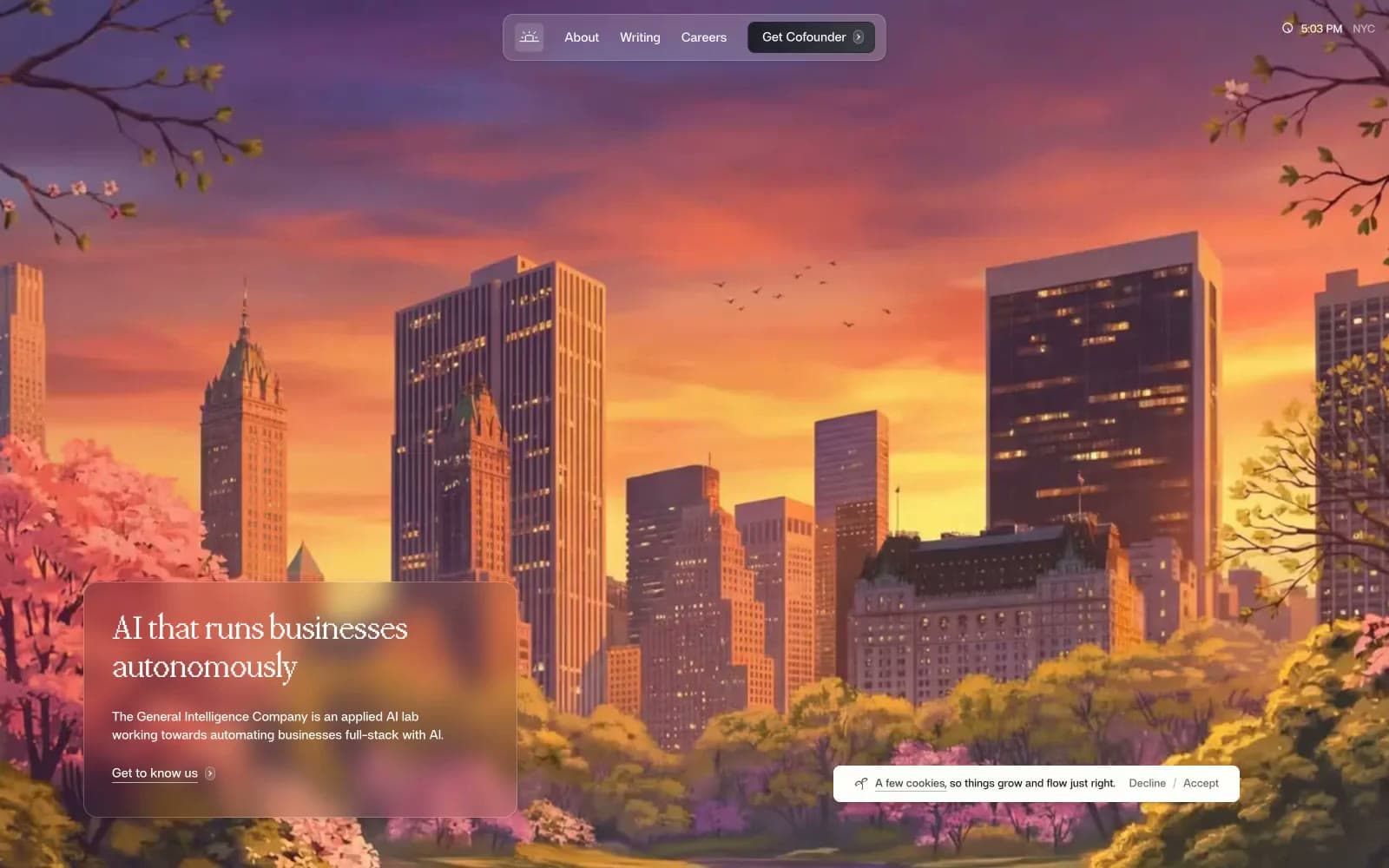
General Intelligence Company uses an editorial, almost literary visual language: a warm off-white canvas interrupted by hand-painted atmospheric illustrations (moonlit skylines, wildflower meadows) that do the emotional work, while the actual UI lives on clean white between these scenes. Typography carries the brand — a custom display serif (ppmondwest) speaks in a low, measured voice at 48–54px with tight -0.04em tracking, while a custom sans (af) handles everything utilitarian at 13–18px. Color is nearly absent: a warm parchment white, a soft green-gray border, and one vivid blue (#41a1cf) used only as an outlined action border. Components whisper — 4px and 8px radii, hairline 1px borders, subtle backdrop-blur on the navigation, no decorative shadows.
General Intelligence Company design system

Brand2
Blue accent for outlined action borders, linked labels, and lightweight interactive emphasis. Do not promote it to the primary CTA color
Vivid blue used for a singular saturated card surface — the lone moment of pure color intensity, used sparingly as atmospheric punctuation
Neutrals11
Primary foreground token, strong body text where maximum contrast is needed
Filled button background — a near-black with cool violet undertone, the only non-white filled surface in the system
Near-black with a cool blue undertone — used for nav borders, icon strokes, and outlined actions; reads darker than its lightness suggests
Headlines and key body text — softer than pure black, pairs with the warm canvas
Secondary text, button text — the workhorse text tone for body copy and UI labels
Muted helper text, descriptive copy, subdued UI
Tertiary borders, disabled states, lightest neutral in the scale
Hairline borders on cards, buttons, and section dividers — green-tinted to harmonize with illustrations
Input fields, subtle surface wash, nav fill — barely-perceptible off-white that reads as neutral
Page canvas — warm off-white slightly creamier than pure white, gives the whole site its book-page atmosphere
Card surfaces, section backgrounds, footer — the slightly cooler clean white used for elevated content areas
Try a pairing
Pick any two colors from the palette to check whether text stays readable on top.
Aa
Ink Black on Signal Blue
6.17 : 1 contrast
- Body textPasses AA 4.5
- Large textPasses AA 3
- StrictFails AAA 7























