
Garden Eight. Monumental cream-paper editorial.
- Studio
- Light theme
- 3 colors
- 2 typefaces
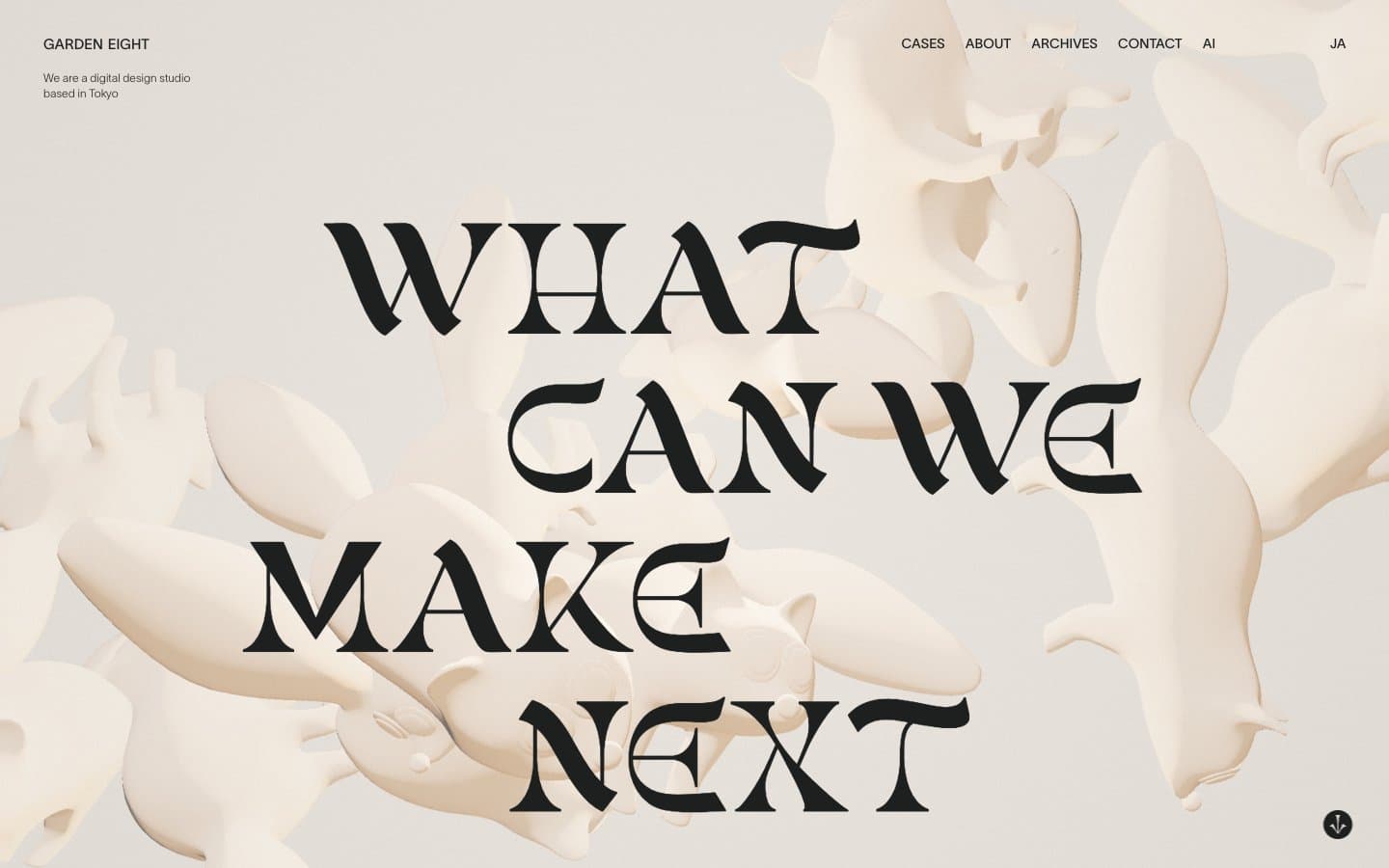
Garden Eight operates as an art-book editorial spread: a warm cream parchment canvas hosts monumental serif type that behaves like gallery wall text rather than product UI. The palette is ruthlessly binary — bone-white surface, ink-black type — and every additional color is treated as intrusion. Layout breathes at near-museum scale, with 180px gutter margins and oversized negative space letting type and sculptural 3D objects become the only content. There is no functional color language: no alert red, no success green, no info blue. Decisions are made by weight, scale, and silence. The system reads more like a couture magazine masthead than a SaaS interface, and any agent reproducing it should prioritize typographic drama and atmospheric restraint over conventional UI affordances.
Garden Eight design system

Neutrals3
Reserved for maximum-contrast display moments and the deepest text on the lightest surfaces — used sparingly so Carbon Ink carries the default reading weight
Primary text, display headlines, nav rules, card borders, icon strokes — near-black with the faintest warm cast that harmonizes with the parchment rather than fighting it
Page canvas, card surfaces, light dividers, link borders — a warm desaturated bone tone that replaces the conventional near-white and gives the whole system its editorial temperature
Try a pairing
Pick any two colors from the palette to check whether text stays readable on top.
Aa
Parchment on Pitch Black
14.54 : 1 contrast
- Body textPasses AA 4.5
- Large textPasses AA 3
- StrictPasses AAA 7
More DESIGN.md files. Same web, different personalities.

Rauno Freiberg
Studio
Emil Kowalski
Studio

14islands
Studio
19–86
Studio
Aaron Poe & Co
Studio
Acceptandproceed
Studio
ACCOMPANY
Studio
Acolorbright
Studio
Adcker
Studio
Adopt
Studio
Agence Foudre
Studio


