
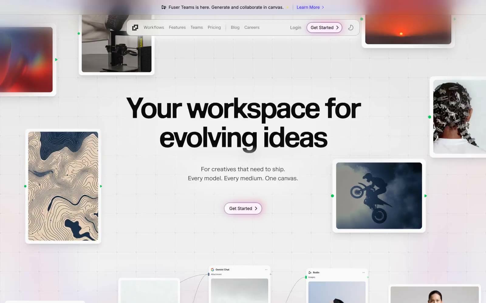
Fuser. Scattered polaroids on a designer's working wall.
- AI
- Light theme
- 22 colors
- 2 typefaces
Fuser is a light, airy creative-canvas interface that treats the page itself like a scattered studio mood board: white surfaces, thin hairline borders, generous breathing room, and a single confident violet accent. The visual grammar is polaroids-on-paper — floating image cards, subtle shadows, soft 16px radii — layered over a faint grid that implies infinite workspace. Typography pairs a humanist serif display face (Marund) with a utilitarian sans (Inter) so headlines feel editorial while UI stays neutral. Color is used as functional punctuation, not decoration: violet for connection and action, a vivid green for live/connected node markers, and an almost-achromatic neutral scale for everything else. The aesthetic signals creative-tool-with-serious-substance — playful in composition, disciplined in execution.
Fuser design system

Brand5
Primary brand accent — icon strokes, card borders, active link underlines, connection lines, and the dominant chromatic signal across product surfaces
Interactive links, active nav items, icon highlights, and secondary borders — a slightly lighter sibling to Electric Violet for hover/active states
Pressed/visited state of brand accent, dark text on light-violet surfaces, and the deepest chromatic token in the brand scale
Outlined button borders, light icon strokes, and lavender-toned hairlines — the pastel end of the brand ramp
Filled primary action background, soft chip/badge fills, and tinted section washes — the chromatic surface that makes CTAs feel warm without shouting
Accent2
Soft tinted body backgrounds and gentle section highlights — used sparingly to break up white space
Green decorative accent for icons, marks, and small graphic details
Neutrals15
Display headline text, primary button labels, and maximum-contrast text
Primary heading text, logo fill, and the darkest body text — near-black without the harshness of pure #000
Heading text and strong body copy
Secondary heading text and body emphasis
Primary text on light surfaces, most-used border color, and structural hairlines — the workhorse neutral
Body text on light tinted surfaces where pure black would feel too heavy
Body subtext, icon inactive state, and heading accents — the most-used muted text color
Caption text, nav meta, and medium-emphasis supporting copy
Muted icon fills, secondary button borders, and de-emphasized text
Soft shadows, placeholder text in dark mode, and muted decorative fills
Icon fills and decorative shapes on light surfaces
Card borders, subtle dividers, and disabled surfaces — the first gray that reads as a visible line
Subtle button borders, inset surface fills, and the faintest hairline dividers
Secondary surface, button hover fills, and section backgrounds — the step below Paper
Page canvas and card surface — the lightest layer, sits behind everything
Try a pairing
Pick any two colors from the palette to check whether text stays readable on top.
Aa
Paper on Electric Violet
7.75 : 1 contrast
- Body textPasses AA 4.5
- Large textPasses AA 3
- StrictPasses AAA 7























