
Forner. Imagine a ceramics studio at golden hour, where every surface is clay, bone, or roasted coffee, and the only chrome is the potter's hand-lettered note pinned to the wall.
- Studio
- Light theme
- 9 colors
- 3 typefaces
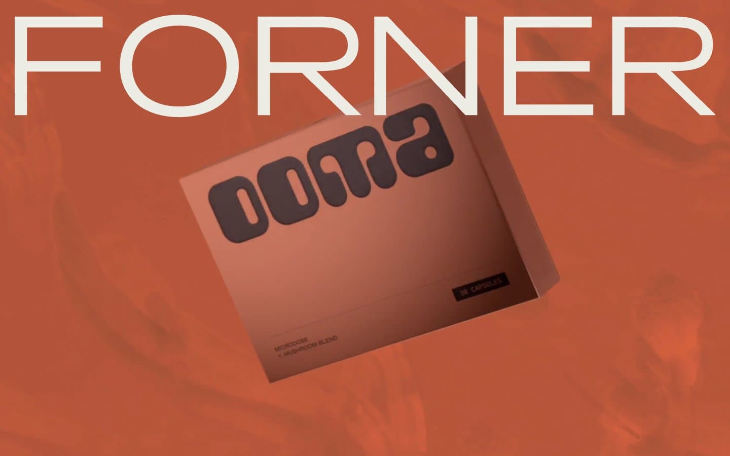
Forner operates as a sun-baked design atelier: an almost entirely warm-earth palette, a single custom grotesque carrying 95% of the voice, and typography so oversized it abandons hierarchy for atmosphere. The canvas is a dry cream; the ink is a deep roast brown; every accent lives in the same brown-to-bone spectrum. There is no chromatic brand color — the warmth itself is the brand. Surfaces are flat with hairline borders, corners are surgically sharp at 4px, and breathing room is generous (100px+ between sections). Custom serif italics appear sparingly as hand-set annotations against the grotesque's mechanical rhythm.
Forner design system

Neutrals9
Maximum-contrast borders and text — the darkest available, used sparingly for absolute emphasis
Deep heading text, near-black emphasis — warmer than pure black, reserved for the heaviest type moments
Primary text, borders, icon strokes, the structural backbone of every interface — deep warm brown acts as ink on cream, the dominant foreground color across the entire system
Cool-toned hairline borders, dividers, structural lines — the only break from the warm palette, providing neutral structural contrast
Heading accents, icon strokes, decorative borders, link underlines — the lightest chromatic-feeling neutral, used when the Roast Ink feels too heavy
Link text, secondary interactive states — warmer than the cool grays, keeps the link family inside the earth palette
Warm highlight wash, soft fill for tags and subtle emphasis blocks
Card surfaces, elevated panels, content blocks — one step removed from the canvas, slightly cooler and grayer to recede
Page background, the warm cream field that all surfaces sit on
Try a pairing
Pick any two colors from the palette to check whether text stays readable on top.
Aa
Bone Canvas on Obsidian
14.20 : 1 contrast
- Body textPasses AA 4.5
- Large textPasses AA 3
- StrictPasses AAA 7
More DESIGN.md files. Same web, different personalities.

Rauno Freiberg
Studio
Emil Kowalski
Studio

14islands
Studio
19–86
Studio
Aaron Poe & Co
Studio
Acceptandproceed
Studio
ACCOMPANY
Studio
Acolorbright
Studio
Adcker
Studio
Adopt
Studio
Agence Foudre
Studio


