
FORA. Swiss editorial mosaic on white.
- Studio
- Light theme
- 4 colors
- 2 typefaces
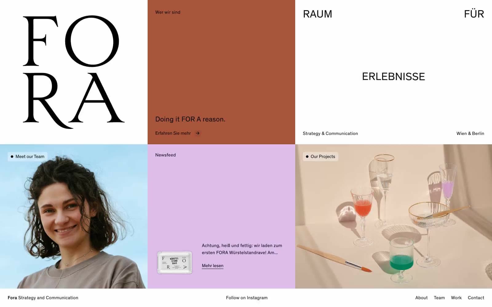
FORA presents as a Swiss editorial mosaic: a strict white grid broken by full-bleed panels of terracotta and lilac, each tile a self-contained statement. Typography carries the brand's authority — Theinhardt at generous sizes with consistently positive letter-spacing, giving headlines room to breathe and creating an anti-Silicon-Valley attitude where space signals confidence. Black is absolute and unsoftened; chromatic color never decorates, it claims entire zones. The interface feels like a printed design annual translated to web — bold rules, quiet type, and the conviction that two colors plus white can carry an entire brand system.
FORA design system

Brand1
Full-bleed section panels and hero zones. Warm oxidized red-brown against pure black and white — evokes raw clay and printed editorial covers
Accent1
Full-bleed section panels, content cards, and soft surface tint. Muted chalky pink that cools the terracotta into a balanced two-color rhythm
Neutrals2
All text, headings, icons, nav links, dividers, and borders. Unsoftened true black anchors every chromatic panel
Page canvas, default card surface, and the negative space that lets chromatic panels breathe. Never tinted
Try a pairing
Pick any two colors from the palette to check whether text stays readable on top.
Aa
Paper on Terracotta
5.18 : 1 contrast
- Body textPasses AA 4.5
- Large textPasses AA 3
- StrictFails AAA 7
More DESIGN.md files. Same web, different personalities.

Rauno Freiberg
Studio
Emil Kowalski
Studio

14islands
Studio
19–86
Studio
Aaron Poe & Co
Studio
Acceptandproceed
Studio
ACCOMPANY
Studio
Acolorbright
Studio
Adcker
Studio
Adopt
Studio
Agence Foudre
Studio


