
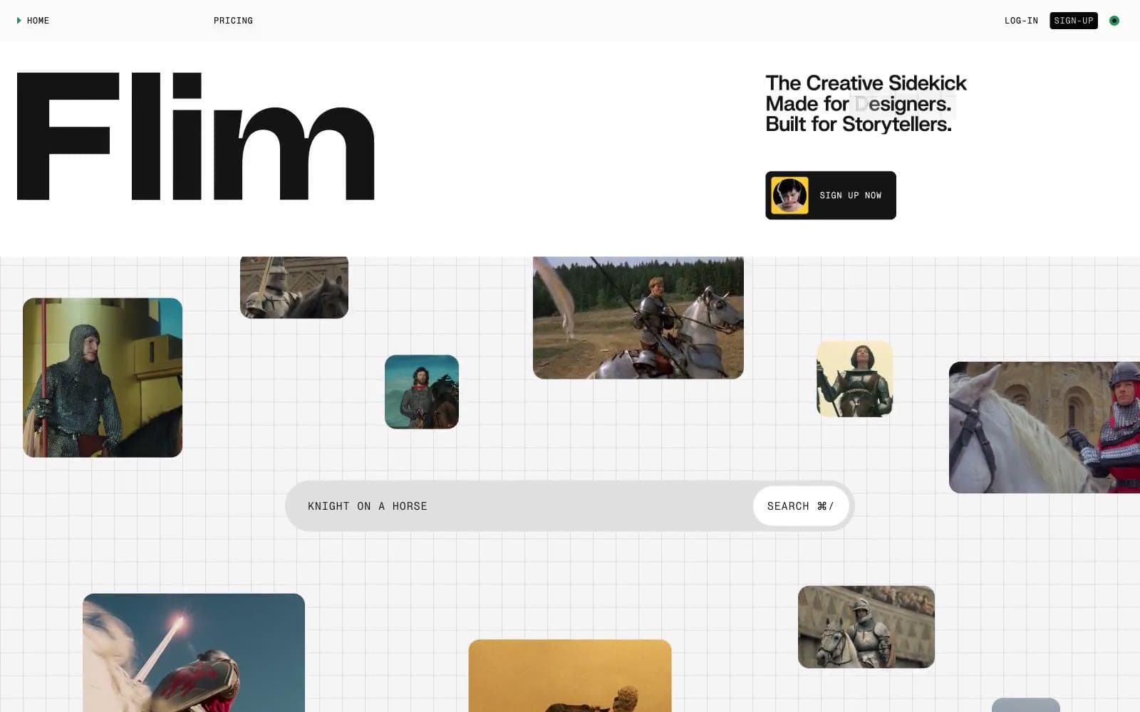
Flim. Scattered polaroids on a sketchpad grid.
- AI
- Light theme
- 9 colors
- 3 typefaces
Flim's design language is a creative-tool's analog workspace: a vast light-gray canvas etched with a subtle grid, scattered with rounded polaroid-like image cards, and anchored by a single oversized custom wordmark. The system is 99% monochrome — near-black ink on warm light gray paper — with tiny, deliberate splashes of signal green, ember orange, and highlight yellow used as functional punctuation rather than decoration. Typography splits into three voices: a heavy custom display face (Swizzy) for the hero wordmark, a mono micro-typeface (PP Neue Montreal Mono) for navigation, labels, and search placeholders, and system Arial for body. Components feel loose and handmade rather than gridded: pill-shaped search bars, image thumbnails with a 16px radius floating asymmetrically, ghost navigation, and a single hard-edged black button. The grid pattern and scattered image layout evoke a corkboard or lightbox — the visual metaphor of a creative agency's working surface.
Flim design system

Brand2
Green outline accent for tags, dividers, and focused UI edges
Deeper green for icon borders, heading underlines, secondary green accents where Signal Green would be too bright
Accent2
Heading background highlight wash, warm tag fills — used as a marker-pen underline behind words, not as surface color
Warm card accent backgrounds, orange UI moments — the rare heat in an otherwise cool palette
Neutrals5
Primary text, nav links, icon strokes, image card borders, filled button background, the dominant near-black that carries the entire UI
Grid line strokes, subtle dividers, the near-invisible linework that creates the sketchpad texture
Secondary surface fills, card backgrounds, alternating bands below the canvas, muted blocks
Page background, search bar fills, the warm light gray that is the base layer for everything
Text on dark surfaces, surface highlights, card surfaces floating above the canvas, button text on filled actions
Try a pairing
Pick any two colors from the palette to check whether text stays readable on top.
Aa
Ink on Signal Green
5.92 : 1 contrast
- Body textPasses AA 4.5
- Large textPasses AA 3
- StrictFails AAA 7























