
Firecrawl. Technical blueprint on warm vellum.
- AI
- Light theme
- 12 colors
- 2 typefaces
Firecrawl operates as a developer-first workspace: a pale near-white canvas overlaid with a fine grid of hairline borders, a single vivid orange accent (#ff4d00) that acts as functional punctuation, and typography set in Suisse — a humanist grotesque whose tight tracking and generous x-height keep everything feeling engineered rather than editorial. Components are flat and quiet: pill-shaped controls (999px radius), 8px card corners, and shadow stacks that are barely perceptible (black at 2-3% alpha) so that depth comes from layering and the orange border-glow, not from drop shadows. The orange is never decorative — it appears on the CTA, the fire icon, highlight words in headlines, badge dots, and tab underlines. Everything else is a calibrated gray scale, with #e5e7eb doing the work of a thousand borders and #262626 carrying the full weight of body and heading text at AAA contrast against the off-white surfaces.
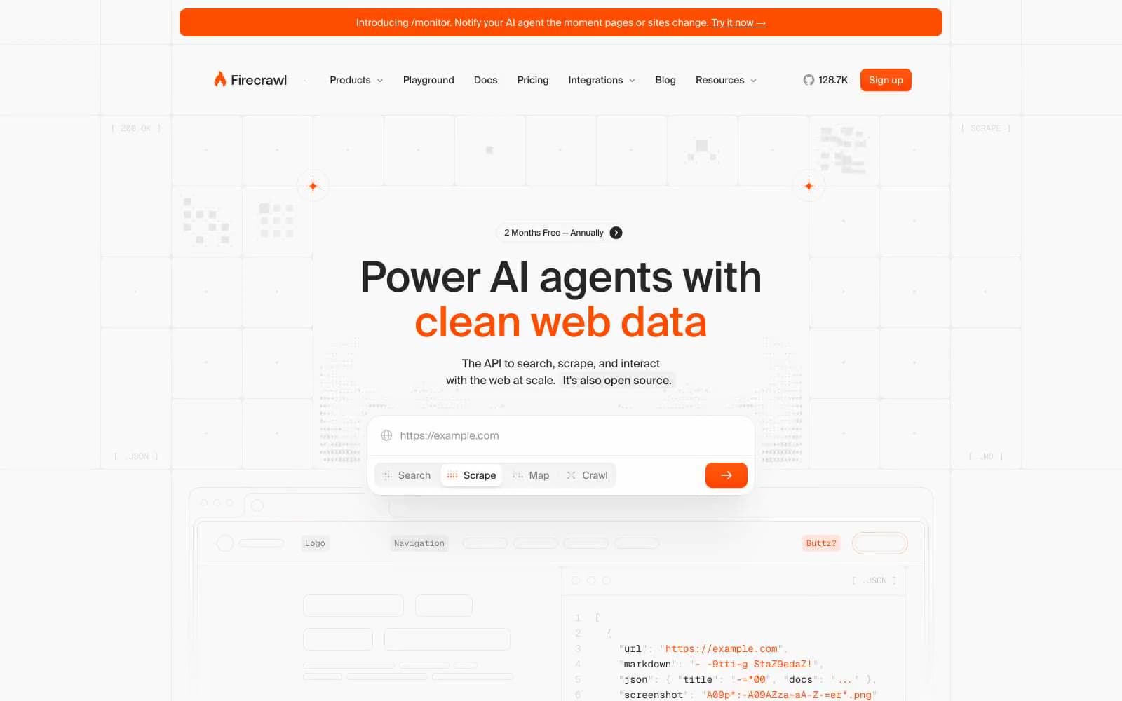
Firecrawl design system

Brand3
Primary action background, accent text, highlight words in headlines, fire icon, active tab underline, badge dots, link strokes — the system's only chromatic signal
Soft orange-tinted shadow halos behind orange buttons and badges, giving them a warm bloom without raising elevation
Secondary warm-tinted shadow wash, used for outer glow rings on highlighted cards and code windows
Neutrals9
Primary text, heading fills, icon strokes, button text on light surfaces, code text
Link text in body copy, supporting paragraphs, slightly lighter than Ink for inline emphasis
Secondary text, muted body copy, placeholder labels, disabled-state copy
Muted button text on neutral surfaces, subtle UI labels
Tertiary text, helper text, subtle icon strokes, caption-tier metadata
Decorative strokes, faint dividers, background-pattern dots and crosses
Placeholder text in inputs and code blocks, very light body text where contrast is deliberately reduced
Dominant hairline border, card outlines, input strokes, code window dividers, grid background lines — the structural skeleton of every screen
Page and card background, the softest surface in the stack; inset shadow fields use a vellum-tinted ring to create depth without darkening
Try a pairing
Pick any two colors from the palette to check whether text stays readable on top.
Aa
Ink on Ember Orange
4.55 : 1 contrast
- Body textPasses AA 4.5
- Large textPasses AA 3
- StrictFails AAA 7























