
Evermade. Editorial punk on cream paper.
- Studio
- Light theme
- 6 colors
- 3 typefaces
Evermade uses an editorial-meets-punk aesthetic: warm cream canvases (#fef0e6) serve as the quiet stage, while a single hot-pink accent (#ff0389) and a deep maroon dark mode (#2d070b) provide the dramatic punctuation. The type system pairs Instrument Serif's magazine-grade display voice with DM Mono's technical labels and Manrope's neutral body, creating a clear three-tier hierarchy where each tier has a distinct visual job. Everything is pill-shaped (9999px radius) — buttons, tags, link underlines — giving the interface a soft, rounded, almost sticker-like quality. Components are flat and border-driven rather than shadow-driven; depth comes from alternating cream and blush surfaces and the occasional maroon band, not from elevation.
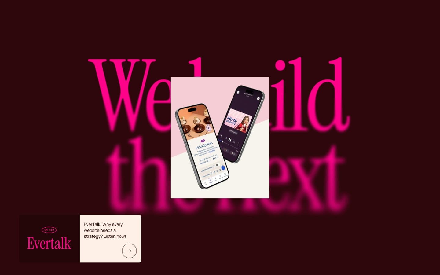
Evermade design system

Brand2
Dark section background, heading text on cream, card borders, footer surface — near-black with a blood-red undertone, sets the dramatic contrast against the cream canvas
Outlined action borders, link underlines, tag labels, decorative brand accent — the visual signature; appears as border-color and text, never as filled background
Accent1
Muted pink accent for secondary links and tag borders — desaturated cousin of Hot Pink used where less visual weight is needed
Neutrals3
Card borders on cream, dark text fallback, high-contrast borders — used sparingly, Wine Maroon usually takes the dark role
Secondary card surface, subtle highlight wash, tag pill backgrounds — one step warmer and pinker than the cream, creates gentle figure-ground separation
Primary page canvas, section background, card surface for hero product mockups — warm off-white that reads as paper rather than screen
Try a pairing
Pick any two colors from the palette to check whether text stays readable on top.
Aa
Cream Paper on Wine Maroon
16.41 : 1 contrast
- Body textPasses AA 4.5
- Large textPasses AA 3
- StrictPasses AAA 7
More DESIGN.md files. Same web, different personalities.

Rauno Freiberg
Studio
Emil Kowalski
Studio

14islands
Studio
19–86
Studio
Aaron Poe & Co
Studio
Acceptandproceed
Studio
ACCOMPANY
Studio
Acolorbright
Studio
Adcker
Studio
Adopt
Studio
Agence Foudre
Studio


