
ElevenReader. Newsprint minimalism with a single color bloom.
- AI
- Light theme
- 8 colors
- 2 typefaces
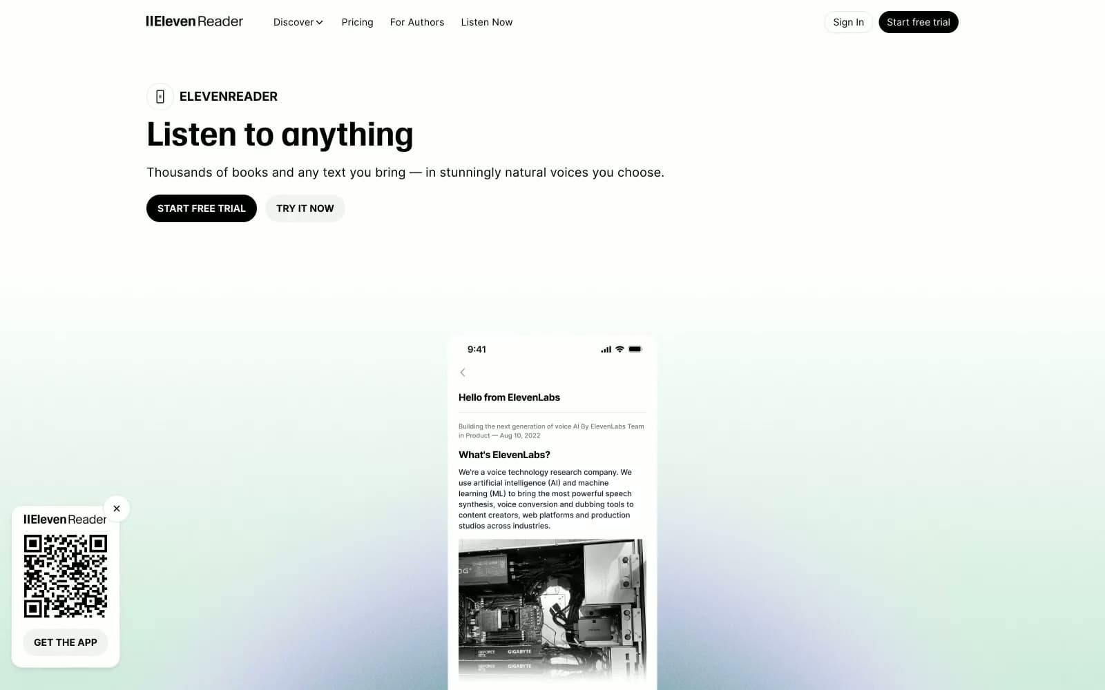
ElevenReader runs on a near-monochrome visual language: paper-white canvas, ink-black type, and hairline gray borders doing all the structural work. A single custom display face (WaldenburgHF, bold only) carries every heading at a fixed tight leading, creating a single typographic voice across the whole product surface. The interface stays flat — no shadows, no elevation stacks, no decorative gradients in the UI — with one moment of color appearing as an atmospheric radial wash in the hero (forest green dissolving into lavender) that sets an emotional tone without ever repeating inside components. Pill-shaped controls (9999px radius), large generous gutters, and a single weight contrast (Inter 400 vs 700) keep the system feeling like printed editorial spread — content-first, ornament-last.
ElevenReader design system

Brand1
Decorative atmospheric radial gradient — forest-green to lavender wash used only behind the hero media block, never repeated in components
Neutrals7
Dark supporting neutral for text, icons, and strong contrast. Do not promote it to the primary CTA color
Tertiary captions, press attribution, supplementary labels
Muted body text, metadata, helper copy — secondary reading layer under Ink headlines
Soft atmospheric wash — appears only as a near-gray tinted background band near the hero, never as a functional UI color
Hairline borders, dividers between stacked rows, FAQ item outlines, low-contrast separators
Page canvas, subtle alternating section backgrounds, secondary surface tone behind cards
Light supporting surface for subtle backgrounds and section separation. Do not promote it to the primary CTA color
Try a pairing
Pick any two colors from the palette to check whether text stays readable on top.
Aa
Paper on Ink
21.00 : 1 contrast
- Body textPasses AA 4.5
- Large textPasses AA 3
- StrictPasses AAA 7























