
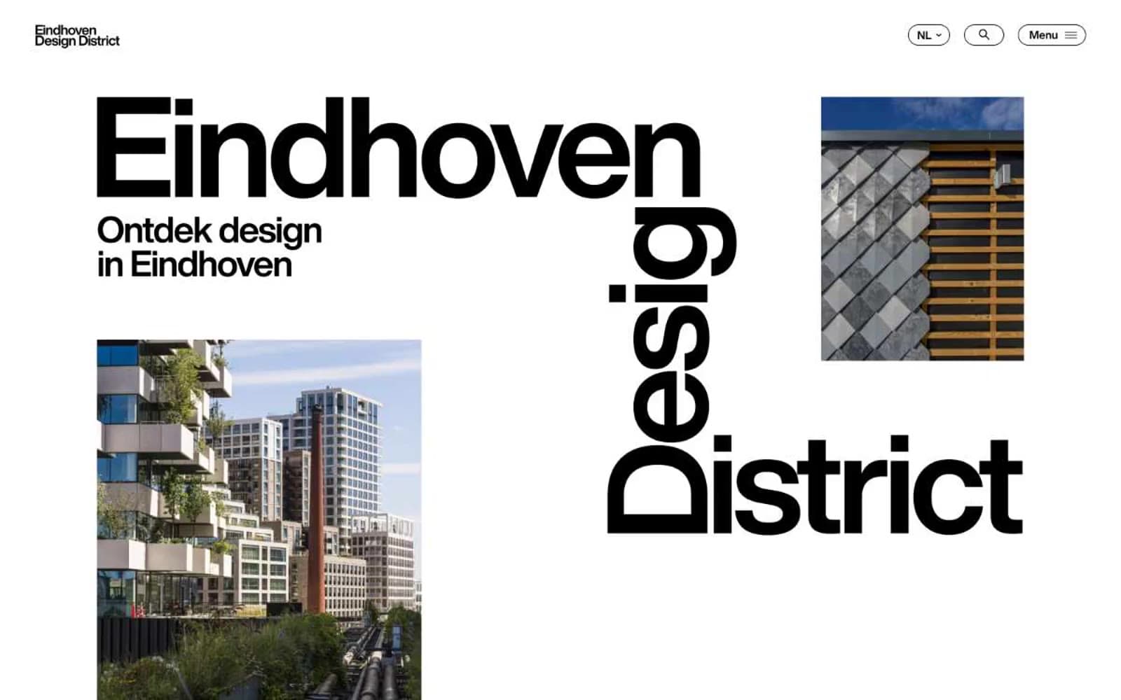
Eindhoven Design District. A municipal design manifesto rendered in oversized type, sparse photographs, and absolute restraint.
- Studio
- Light theme
- 5 colors
- 1 typeface
Eindhoven Design District reads as editorial brutalism on white paper: a near-monochrome canvas where typography does the heavy lifting and photography earns its space through scale and asymmetric placement. The entire interface is a conversation between massive HelveticaNow display type and quiet supporting text, with black-on-white doing 95% of the work. The only chromatic note is a single vivid red used as a content accent (article category labels) — never as UI chrome. Components are deliberately flat: pill-shaped ghost buttons, image-top article cards, hairline borders, zero shadows or gradients. The result is less a website and more a printed design journal that happens to be interactive.
Eindhoven Design District design system

Accent1
Red outline accent for tags, dividers, and focused UI edges.
Neutrals4
All text, borders, icon strokes, nav links, button outlines, and structural lines. The dominant ink of the system — every shape and character carries this weight
Muted helper text, list dividers, secondary link borders — used sparingly where information is deprioritized but still present
Section background for content bands (article grids, footer areas) — creates quiet tonal shifts between white sections without introducing a second hue
Primary page canvas, card surfaces, button fills, and inverted text on dark blocks. The ground against which everything else is set
Try a pairing
Pick any two colors from the palette to check whether text stays readable on top.
Aa
Charcoal Ink on Signal Red
5.25 : 1 contrast
- Body textPasses AA 4.5
- Large textPasses AA 3
- StrictFails AAA 7
More DESIGN.md files. Same web, different personalities.

Rauno Freiberg
Studio
Emil Kowalski
Studio

14islands
Studio
19–86
Studio
Aaron Poe & Co
Studio
Acceptandproceed
Studio
ACCOMPANY
Studio
Acolorbright
Studio
Adcker
Studio
Adopt
Studio
Agence Foudre
Studio


