
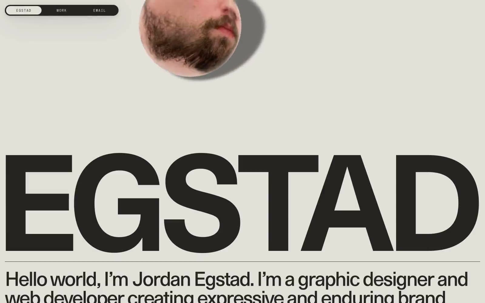
Egstad. Monumental type, one paper color, zero decoration.
- Studio
- Light theme
- 3 colors
- 3 typefaces
Egstad operates as a one-color editorial broadside: warm ink (#252422) stamped onto warm cream paper (#e2e0d9), with no decorative color, no gradients, and almost no UI chrome. The entire visual identity is carried by three typefaces — a custom monumental display face (EG Metaphor) that fills the page edge-to-edge, system Times for body copy, and a wide-tracked micro-display (S85) for navigation. Components are stripped to their bones: a fully pill-shaped dark navigation bar, hairline horizontal rules, and circular image masks that overlap type without containers. The result reads more like a printed poster or magazine masthead than a typical portfolio site — restraint as identity, typography as architecture.
Egstad design system

Neutrals3
Hairline borders and rare exact-black accents where maximum edge contrast is needed against the cream canvas
Primary text, heading strokes, borders, dark surface for the navigation bar and any filled dark blocks — warm near-black with a brown undertone that sits softer than pure black on the cream canvas
Page canvas, card and container backgrounds, inverted text on dark surfaces — warm off-white with a slight olive/khaki cast that makes the dark ink feel printed rather than digital
Try a pairing
Pick any two colors from the palette to check whether text stays readable on top.
Aa
Bone Paper on Pure Carbon
15.90 : 1 contrast
- Body textPasses AA 4.5
- Large textPasses AA 3
- StrictPasses AAA 7
More DESIGN.md files. Same web, different personalities.

Rauno Freiberg
Studio
Emil Kowalski
Studio

14islands
Studio
19–86
Studio
Aaron Poe & Co
Studio
Acceptandproceed
Studio
ACCOMPANY
Studio
Acolorbright
Studio
Adcker
Studio
Adopt
Studio
Agence Foudre
Studio


