
Dries Bos. Editorial ink on warm vellum.
- Studio
- Light theme
- 4 colors
- 2 typefaces
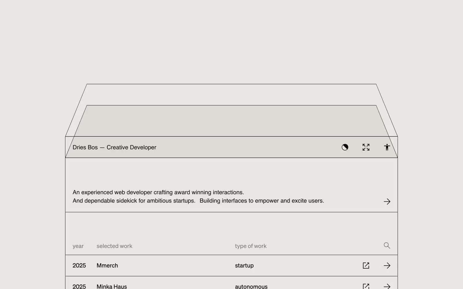
A monochromatic portfolio language built on warm vellum paper and near-black ink — the visual equivalent of an architect's drafting table. Every element is a line, a label, or empty space; no fills, no shadows, no chromatic accents interrupt the editorial calm. The work list is a spreadsheet made beautiful: columns, dates, project names, and discipline tags sit on the same horizontal grid, separated by hairline rules rather than card containers. The hero is a large wireframe drawing — thin strokes on warm ground — that signals the developer's craft without ever showing a screenshot. Color is structural (paper, ink, gray) not expressive; the site trusts whitespace and type to carry mood.
Dries Bos design system

Neutrals4
Body text, hairline borders, wireframe strokes, icon strokes — the only high-contrast tone in the system
Muted secondary text, disabled icon strokes, de-emphasized metadata
Alternating table rows, subtle surface lift one step above the canvas
Page background, table row base, card surfaces — warm off-white reads as paper, not screen
Try a pairing
Pick any two colors from the palette to check whether text stays readable on top.
Aa
Vellum on India Ink
16.72 : 1 contrast
- Body textPasses AA 4.5
- Large textPasses AA 3
- StrictPasses AAA 7
More DESIGN.md files. Same web, different personalities.

Rauno Freiberg
Studio
Emil Kowalski
Studio

14islands
Studio
19–86
Studio
Aaron Poe & Co
Studio
Acceptandproceed
Studio
ACCOMPANY
Studio
Acolorbright
Studio
Adcker
Studio
Adopt
Studio
Agence Foudre
Studio


