
DNCO. Editorial gallery on white linen.
- Studio
- Light theme
- 4 colors
- 1 typeface
DNCO operates on radical typographic restraint: a single sans-serif at a single weight (Neue Haas Unica Pro, 400) deployed across a 72px-to-16px scale, anchored on a near-achromatic palette of white, off-white, and pure black. The site reads like an editorial print spread — headlines breathe against generous whitespace, borders are whisper-thin hairlines (#e5e7eb), and the only color in the system comes from project photography, never from chrome or accent fills. Navigation and interactive elements are pill-shaped (9999px radius), text is always the interactive primitive, and the brand wordmark doubles as a full-bleed hero that inverts to black. Components are minimal, weightless, and border-driven rather than shadow-driven — the aesthetic is gallery catalogue, not SaaS dashboard.
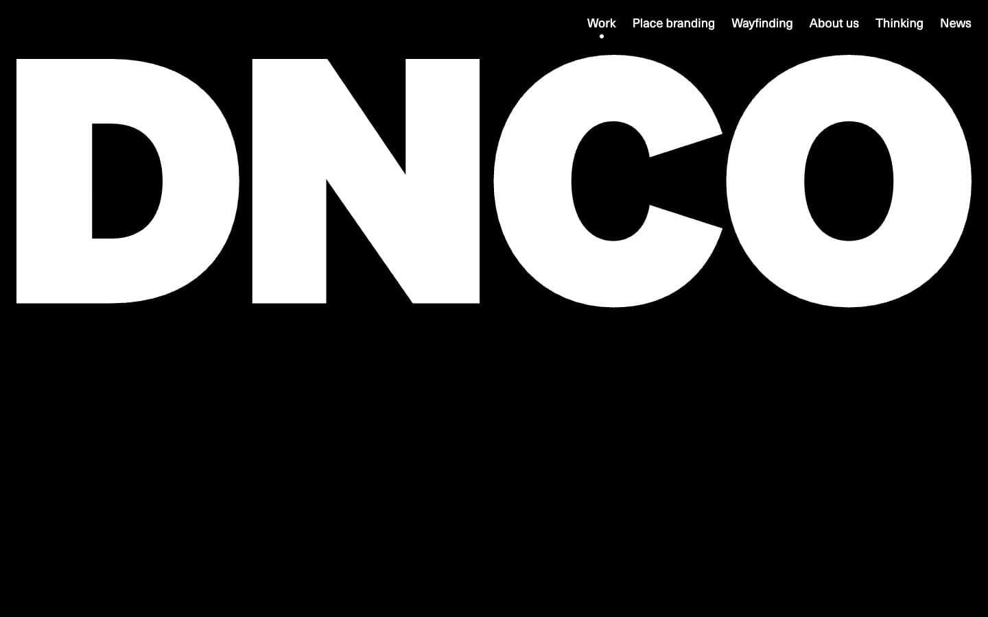
DNCO design system

Neutrals4
Primary text, brand wordmark fill, dark hero background, link text, heading color
Muted secondary text, captions, inactive filter labels, helper text
Hairline borders, dividers, subtle surface wash, filter chip backgrounds, image placeholder fill
Page background, primary surface for content blocks, card bases
Try a pairing
Pick any two colors from the palette to check whether text stays readable on top.
Aa
Canvas White on Obsidian
21.00 : 1 contrast
- Body textPasses AA 4.5
- Large textPasses AA 3
- StrictPasses AAA 7
More DESIGN.md files. Same web, different personalities.

Rauno Freiberg
Studio
Emil Kowalski
Studio

14islands
Studio
19–86
Studio
Aaron Poe & Co
Studio
Acceptandproceed
Studio
ACCOMPANY
Studio
Acolorbright
Studio
Adcker
Studio
Adopt
Studio
Agence Foudre
Studio


