
destroytoday.com. Designer's monograph on cream paper.
- Studio
- Light theme
- 12 colors
- 1 typeface
A designer's personal monograph rendered as a quiet, text-first portfolio on white paper. The visual language is almost typographic: a single dark gray on warm white, a tiny blue square logo stamp, underlined links in muted indigo, and paper-warm dividers — like reading someone's printed case studies. Color only enters as illustration accent: a Stripe section with flowing yellow and orange arrows weaving through cobalt gradient blocks, a Casper product photo on bare white, a Dropbox phone mockup with carousel UI. The system deliberately refuses visual noise — no shadows, no gradients on UI, no decorative borders. What breaks the monochrome is meaningful: project imagery and the signature blue stamp that anchors identity.
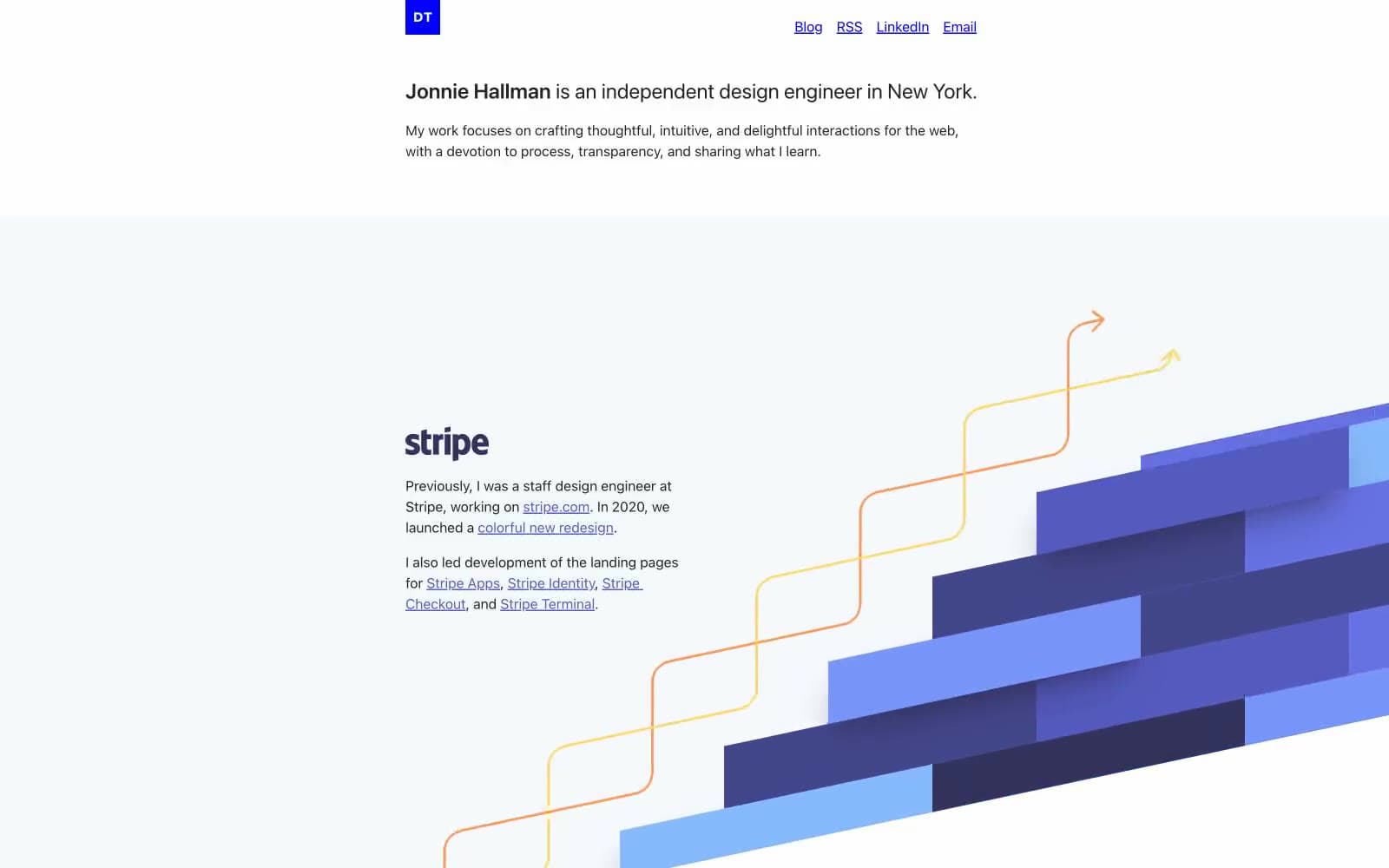
destroytoday.com design system

Brand2
DT logo badge fill and link/nav border — a pure, unmoderated blue that acts as the only brand mark, used sparingly as a square stamp in the header
Underlined link text and link borders throughout body copy and project entries — the workhorse interactive color
Accent6
Drop shadow tone beneath illustration blocks — the darkest blue in the gradient stack
Mid-tone blue in the Stripe illustration gradient stack
Brighter blue in the Stripe illustration gradient, adjacent to the mid-tone
Yellow stroke for the flowing curved arrows in the Stripe illustration
Orange stroke for the secondary flowing arrows in the Stripe illustration
Rare warm-orange link variant for cross-section references
Neutrals4
Icon fills, absolute contrast moments in illustration shadows
Primary text, nav text, body copy, image borders, dominant foreground on white canvas
Warm hairline dividers, image borders, subtle structural lines — the only neutral that carries a paper-warm tint
Page background, image backgrounds, the base surface every section sits on
Try a pairing
Pick any two colors from the palette to check whether text stays readable on top.
Aa
Paper White on Stamp Blue
8.59 : 1 contrast
- Body textPasses AA 4.5
- Large textPasses AA 3
- StrictPasses AAA 7
More DESIGN.md files. Same web, different personalities.

Rauno Freiberg
Studio
Emil Kowalski
Studio

14islands
Studio
19–86
Studio
Aaron Poe & Co
Studio
Acceptandproceed
Studio
ACCOMPANY
Studio
Acolorbright
Studio
Adcker
Studio
Adopt
Studio
Agence Foudre
Studio


