
Delphi. Warm parchment editorial with ember sparks.
- AI
- Light theme
- 14 colors
- 3 typefaces
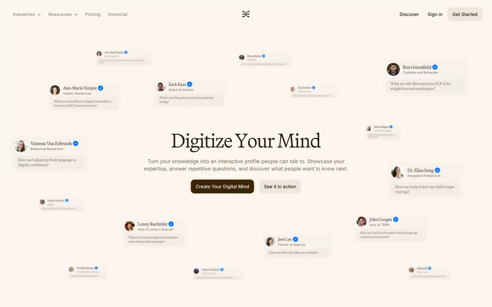
Delphi reads like an editorial spread on warm parchment: cream canvas, brown-black ink, a serif display voice, and orange sparks of energy. The product promises digital preservation of human expertise, and the visual language mirrors that — quiet, literary surfaces, generous whitespace, and chrome that feels printed rather than engineered. Color is used sparingly: the page stays achromatic-warm, with a single dark-chestnut button tone and a vivid ember orange reserved for trust signals, highlights, and the conversational heat of the hero's scattered question cards. Components are flat, low-elevation, and rely on thin hairlines and soft 12px corners rather than shadow stacks. Typography carries the personality — a humanist serif at whisper-light weight for headlines, a workhorse sans for body — creating the rhythm of a long-form magazine sitting next to a product interface.
Delphi design system

Brand2
Orange supporting accent for decorative details and low-frequency emphasis. Do not promote it to the primary CTA color
Accent text, in-card highlights, conversational emphasis — warm vivid orange that ignites against the parchment
Accent2
Orange supporting accent for decorative details and low-frequency emphasis.
Orange supporting accent for decorative details and low-frequency emphasis. Do not promote it to the primary CTA color
Neutrals10
Primary text, icon strokes, and border lines — used at the highest prominence to anchor every paragraph and heading
Headings, button text, emphasized inline elements — dark brown instead of black gives headlines a printed-ink quality
Body text on light surfaces where pure black reads too cold against the cream
Muted secondary body text, descriptive captions beneath headings
Tertiary text, nav links, low-emphasis labels, and warm-toned dividers
Disabled or lowest-emphasis text, ghost iconography
Hairline borders, card edges, and subtle dividers on cream surfaces
Navigation background, secondary surface layer, subtle hover/elevated zones
Page canvas, hero background, card surfaces on light sections — sets the warm literary tone that distinguishes this from the cool-white default of most SaaS
Foreground card surface for content blocks, feature panels, and the floating chat testimonials in the hero
Try a pairing
Pick any two colors from the palette to check whether text stays readable on top.
Aa
Pure Card on Chestnut
14.38 : 1 contrast
- Body textPasses AA 4.5
- Large textPasses AA 3
- StrictPasses AAA 7























