
Dayos. Brutalist editorial showroom on warm gray.
- AI
- Light theme
- 10 colors
- 3 typefaces
Dayos runs on a brutalist-editorial logic: near-monochrome canvas (#e5e5e5 page, #ffffff cards, #000000 blocks), oversized uppercase display type squeezed into 0.9 line-height, and zero shadows or gradients. The single chromatic accent is a pale mint green (#d1ffca) used sparingly on tags and links, with yellow (#fff100) as a near-neon highlight on small elements. Components are heavy on border-radius (24-64px on cards, 48px on nav pills) and light on decoration — flat surfaces, thin or zero borders, no elevation effects. Typography does all the emotional work: compressed condensed headlines at 130px tower over 16px body text, creating a dramatic scale ratio. The hero pairs a massive black headline with a 3D physical object render (textured cubes with brand labels), establishing a tactile, material-product feel against the clinical canvas.
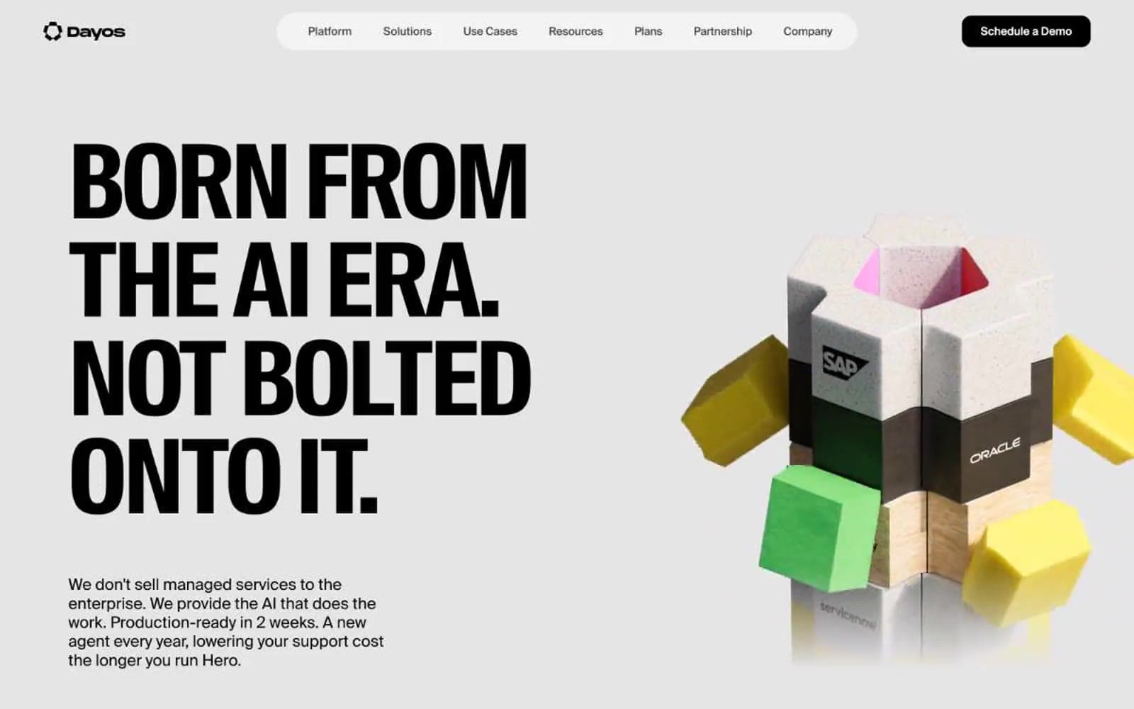
Dayos design system

Accent2
Link backgrounds, tag pills, accent highlights — the signature pale green that punctuates the monochrome system
Email highlights, small accent dots, decorative bursts — the high-energy chromatic note on micro-elements
Neutrals8
Primary text, inverted card surfaces, filled blocks — the structural dark that anchors the monochrome system
Deep surface for code blocks or heavy accents — near-black alternative
Secondary body text, navigation labels, and subdued headings. Do not promote it to the primary CTA color
Body text secondary, meta labels, icon strokes — the muted text level for non-emphasized content
Borders, hairlines, disabled states — mid-tone neutral for structural lines
Page background, hero backdrop, section dividers — the slightly warm gray that distinguishes this from a clinical white canvas
Secondary surface, nav pill backgrounds, subtle panels — one step lighter than canvas for quiet layering
Card surfaces, inverted text on dark blocks, icon fills — the bright counterpoint to carbon black
Try a pairing
Pick any two colors from the palette to check whether text stays readable on top.
Aa
Carbon Black on Mint Chip
18.87 : 1 contrast
- Body textPasses AA 4.5
- Large textPasses AA 3
- StrictPasses AAA 7























