
Dash Digital Studio. Editorial museum on warm paper.
- Studio
- Light theme
- 8 colors
- 2 typefaces
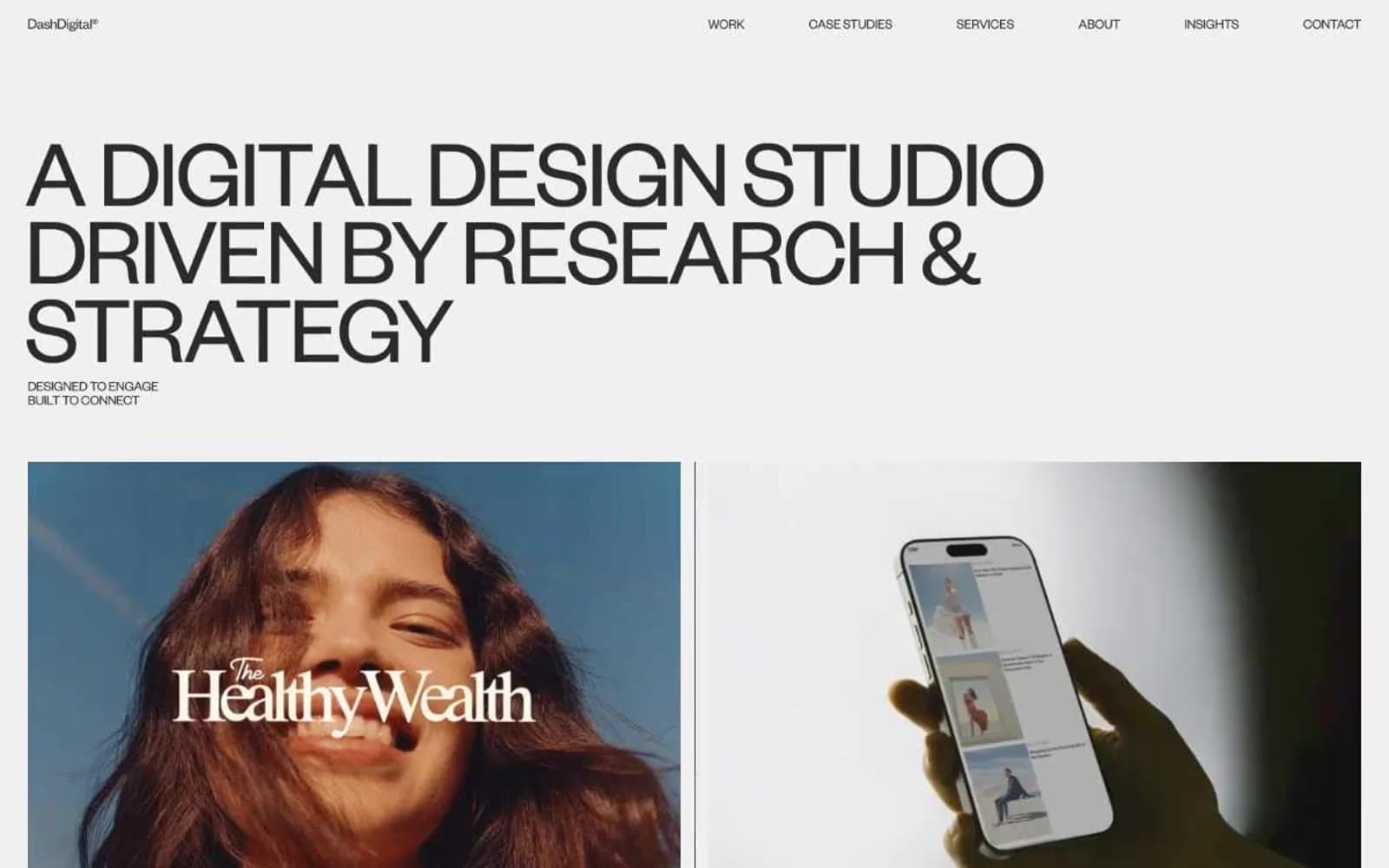
Dash Digital Studio runs a strictly achromatic editorial system — warm off-white canvases, near-black type, and absolutely zero chromatic accent. The entire visual language is carried by two type weights of Founders Grotesk at extreme sizes: whisper-light 300 for monumental display headlines (70–101px) and regular 400 for body and navigation. Letter-spacing tightens aggressively at large sizes (-0.0600em at display) while line-heights compress to 0.80–0.88, making the giant headlines feel architectural and sculptural rather than promotional. Work is presented like a gallery: full-bleed product photography inside 2-up case study frames, minimal UI chrome, pill-shaped dark badges for actions, and hairline rules separating brand lists. The absence of color is the system — every signal (hierarchy, emphasis, interaction) must be built from type weight, scale, spacing, and the tonal shift between #fafafa, #f0f0f0, and #2a2a2a.
Dash Digital Studio design system

Neutrals8
Maximum-contrast text and hard borders, reserved for the strongest emphasis moments
Primary text, nav links, body copy, badge text, footer copy — the near-black that carries every word on the site
Deepest mid-gray — used for low-emphasis supporting text and the dimmest UI separators
Warm mid-gray for transitional surfaces between bone and parchment
Muted fills, hairline borders, and disabled/inactive surface treatments
Alternate warm section background — introduces a barely-perceptible cream tint to break the neutral flow
Page canvas and primary surface — the warm off-white that fills every section background
Subtle elevated surface and section dividers — one step lighter than the canvas for soft separation
Try a pairing
Pick any two colors from the palette to check whether text stays readable on top.
Aa
Linen on Ink
20.12 : 1 contrast
- Body textPasses AA 4.5
- Large textPasses AA 3
- StrictPasses AAA 7
More DESIGN.md files. Same web, different personalities.

Rauno Freiberg
Studio
Emil Kowalski
Studio

14islands
Studio
19–86
Studio
Aaron Poe & Co
Studio
Acceptandproceed
Studio
ACCOMPANY
Studio
Acolorbright
Studio
Adcker
Studio
Adopt
Studio
Agence Foudre
Studio


