
Daniël van der Winden. Printed monograph on vellum.
- Studio
- Light theme
- 10 colors
- 2 typefaces
This is an editorial personal folio rendered like a printed monograph on warm paper. A single warm-gray canvas (#e5e7eb) holds everything, with content floating on it without visible card containers or heavy dividers. The type system is the design: a humanist sans (Degular) handles UI, body, and navigation while a bookish serif (Blanco) carries all editorial weight — headlines, introductions, and section titles. Color is almost entirely absent; the only chromatic event is the near-black fill of the sole action button against the light field. Layout is a fixed left rail of nav links and a generous reading-width column of text, with photographs overlapping the text column as collaged inserts. Everything else — borders, hairlines, separators — is hairline and quiet.
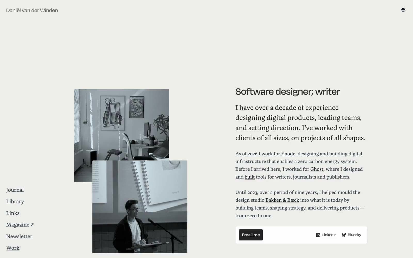
Daniël van der Winden design system

Brand2
Primary action button fill — the only dark surface on the canvas, creating the only moment of visual weight
Secondary dark surface, alternate button fill
Neutrals8
Primary text, nav links, body copy — the default reading color
Headings and editorial emphasis — slightly warm dark for serif display
Secondary body text, list items, supporting copy — one step lighter than primary ink
Tertiary text, icon fills, meta labels
Subdued heading variant, de-emphasized titles
Muted body text, image captions, fine print
Rarely-used border, subtle structural separator
Page canvas, hairline dividers, link underlines, card-edge borders — the warm-gray field that holds all content
Try a pairing
Pick any two colors from the palette to check whether text stays readable on top.
Aa
Vellum on Pressed Ink
12.85 : 1 contrast
- Body textPasses AA 4.5
- Large textPasses AA 3
- StrictPasses AAA 7
More DESIGN.md files. Same web, different personalities.

Rauno Freiberg
Studio
Emil Kowalski
Studio

14islands
Studio
19–86
Studio
Aaron Poe & Co
Studio
Acceptandproceed
Studio
ACCOMPANY
Studio
Acolorbright
Studio
Adcker
Studio
Adopt
Studio
Agence Foudre
Studio


