
Creative Giants. Oversized editorial poster on cream paper.
- Studio
- Light theme
- 12 colors
- 1 typeface
Creative Giants reads like an oversized art-book spread rendered in code: a warm off-white canvas, hairline margins, and display type so large it functions as a poster rather than a heading. The whole system runs on negative space and one weight of light (300) — headlines whisper at 64–84px instead of bolding into shouting, and letter-spacing tightens aggressively (-0.04em) as type grows so the words feel chiseled, not spaced. Chromatic color is rationed into small, saturated hits: vivid magenta, deep teal, powder blue, hot pink, mint, and navy appear as card surfaces or accents, never as background floods. Interactive elements are black-on-cream pills with fully rounded (1440px) radii, and the chrome is almost invisible — a single circular logo mark and a 'Menu' button floating in white space. The visual identity is a production studio's contact sheet: one enormous headline, one full-bleed photograph, one quiet line of meta text. Every other page should follow the same economy.
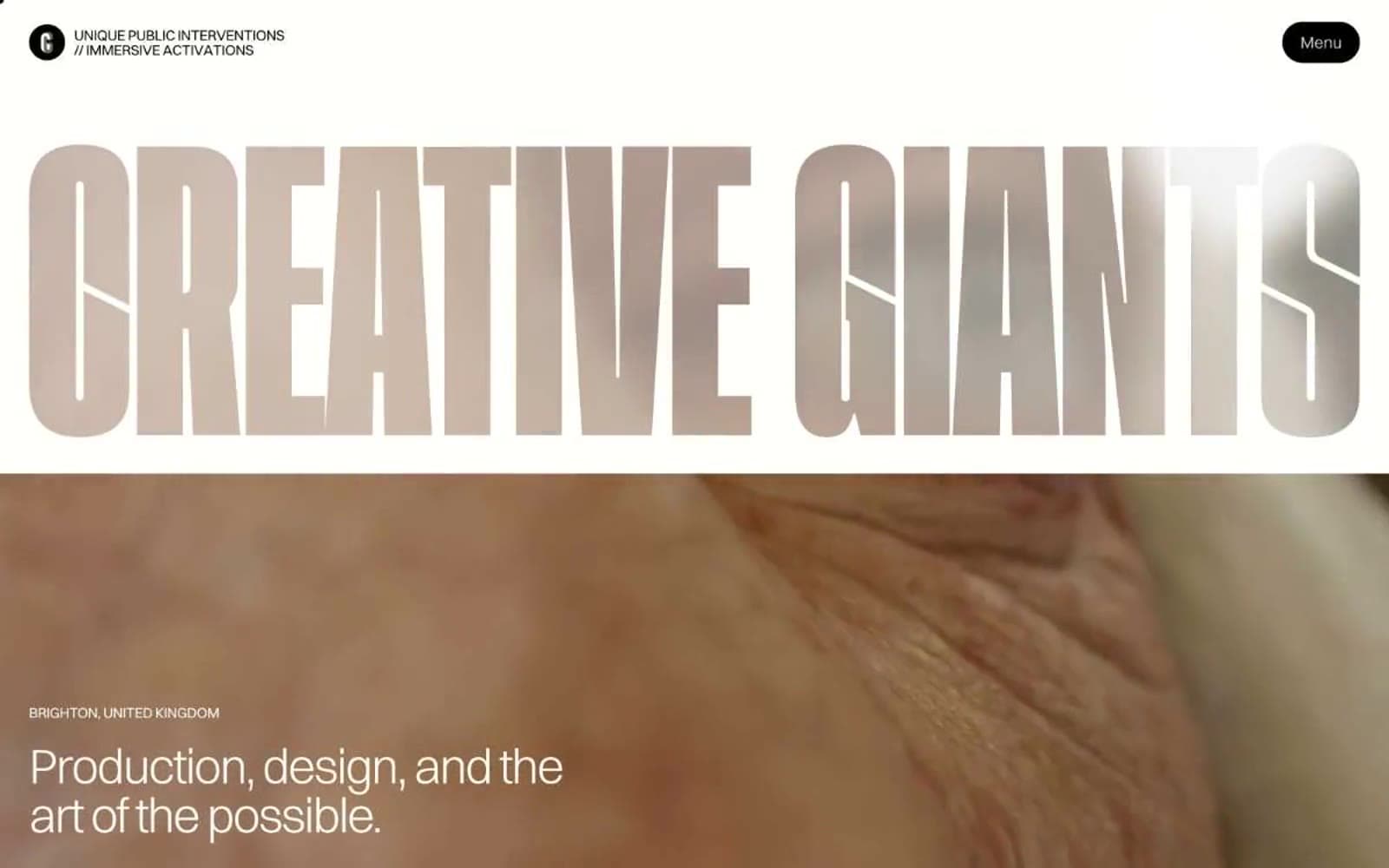
Creative Giants design system

Brand2
Pink supporting accent for decorative details and low-frequency emphasis. Do not promote it to the primary CTA color
Saturated brand accent for card frames and decorative strokes; pairs with Magenta Bloom for duotone treatments
Accent5
Soft chromatic accent — card backgrounds, wash backgrounds, muted illustration fill; cools the warm canvas without competing
Pastel card surface — high-key, used as one-of-many tints in news/article cards; a softer sibling of Magenta Bloom
Pastel card surface — replaces the structural canvas on selected cards; reads as calm, cool, breathable
Deep accent card surface and inverted text ground; the only dark field the system uses, applied sparingly as a featured block
Sporadic high-chroma highlight (badges, tag pills, hover state on cards) — used in trace amounts, never as a primary fill
Neutrals5
Dark supporting neutral for text, icons, and strong contrast. Do not promote it to the primary CTA color
Mid-neutral for list borders, subtle elevation on the dark gradient track — warm gray, not blue-gray
Secondary body text, captions, metadata, helper copy — recedes so display type can dominate
Input borders, inactive link color, tertiary dividers — soft structural gray that disappears when not needed
Page canvas, card surfaces, text on dark accents — a warm off-white that replaces pure #ffffff and gives the whole system a paper-like, printed feel
Try a pairing
Pick any two colors from the palette to check whether text stays readable on top.
Aa
Bone White on Magenta Bloom
9.06 : 1 contrast
- Body textPasses AA 4.5
- Large textPasses AA 3
- StrictPasses AAA 7
More DESIGN.md files. Same web, different personalities.
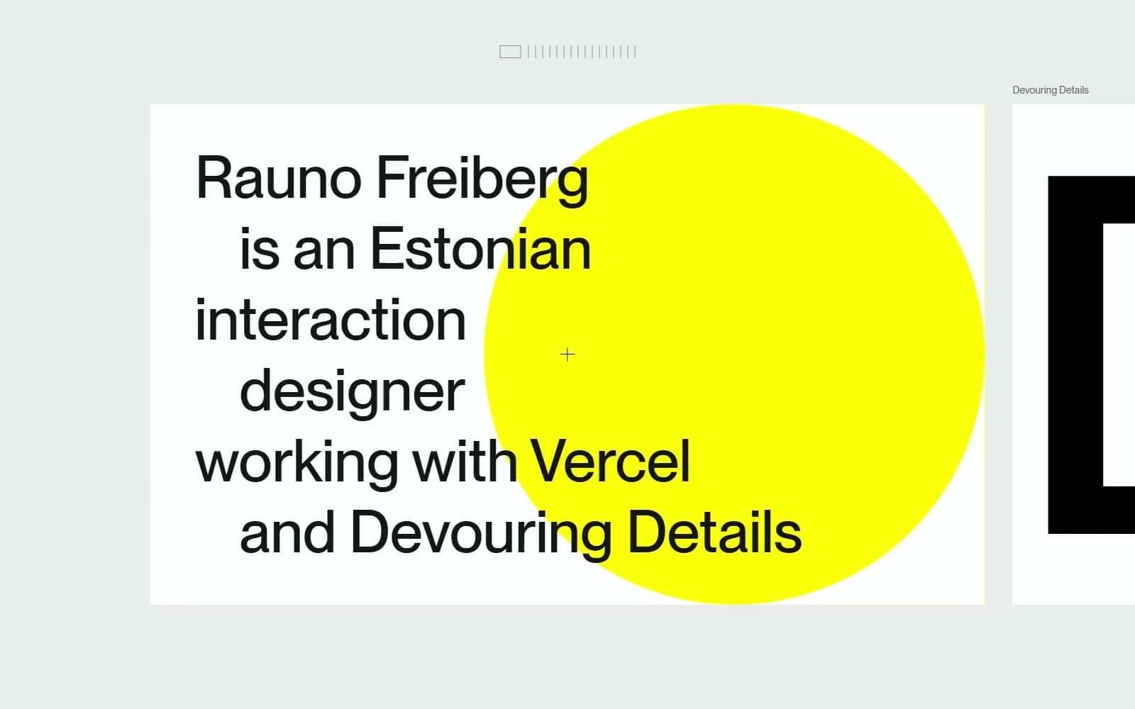
Rauno Freiberg
Studio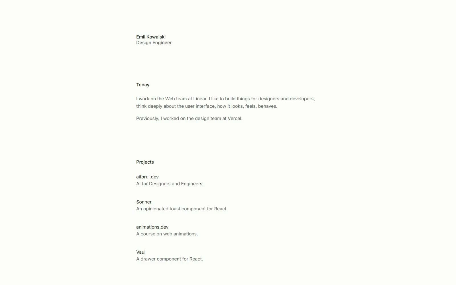
Emil Kowalski
Studio
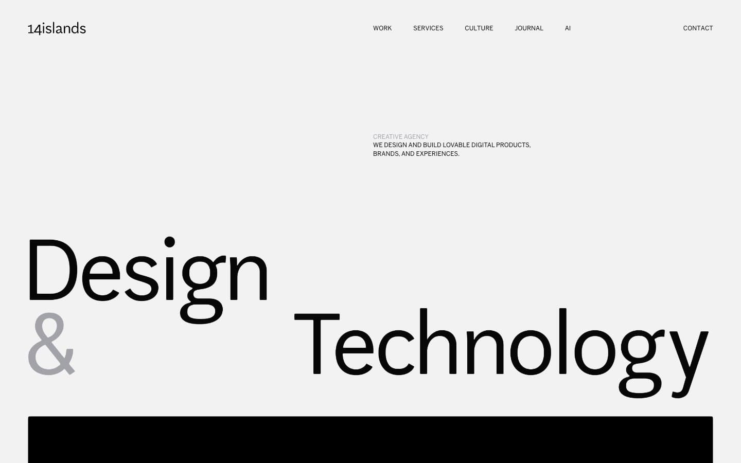
14islands
Studio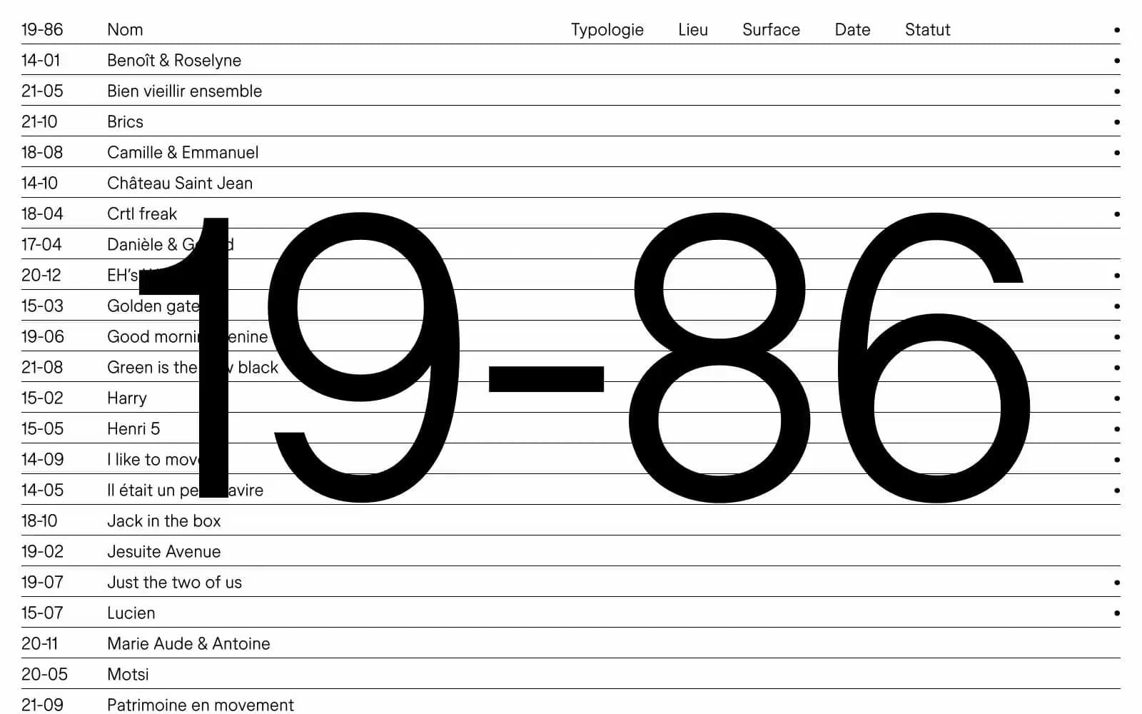
19–86
Studio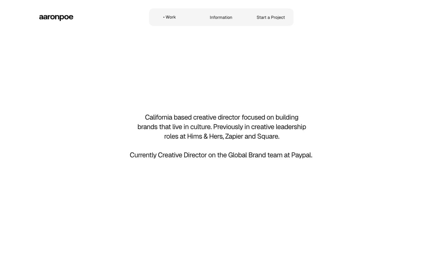
Aaron Poe & Co
Studio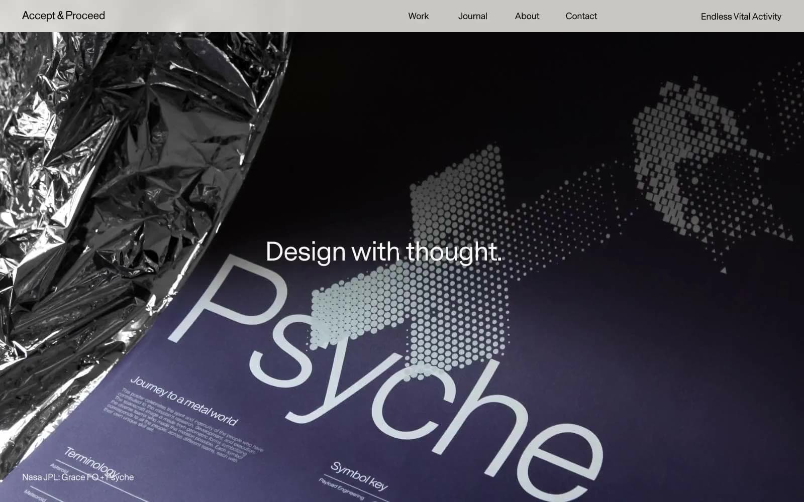
Acceptandproceed
Studio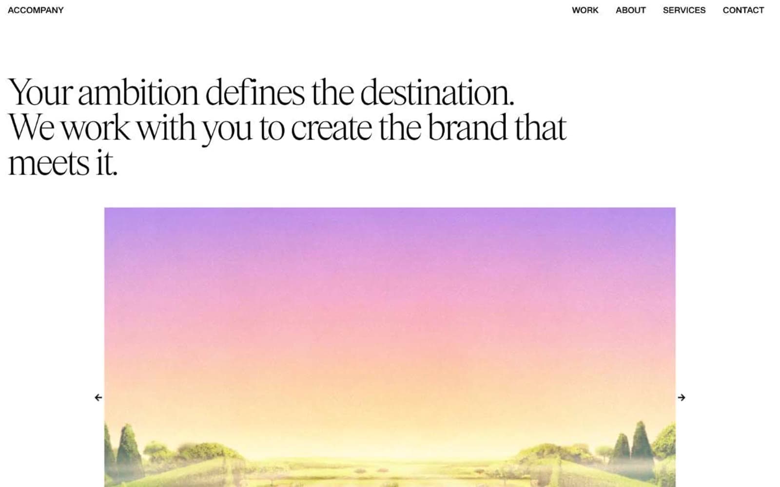
ACCOMPANY
Studio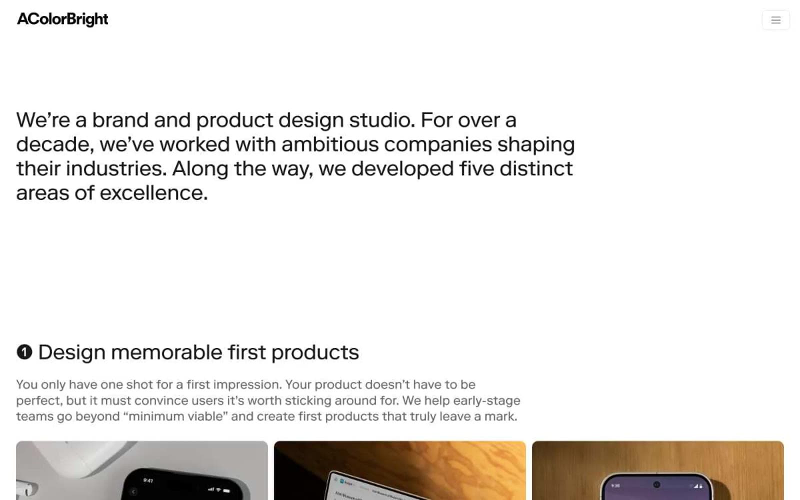
Acolorbright
Studio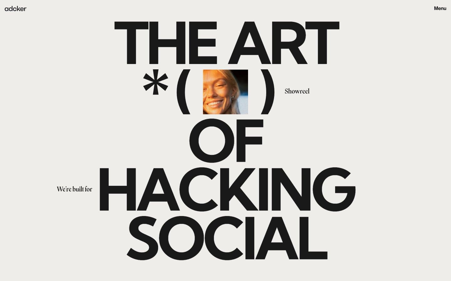
Adcker
Studio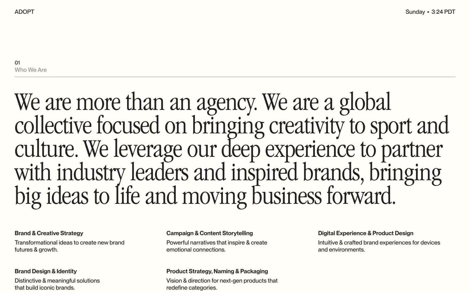
Adopt
Studio
Agence Foudre
Studio


