
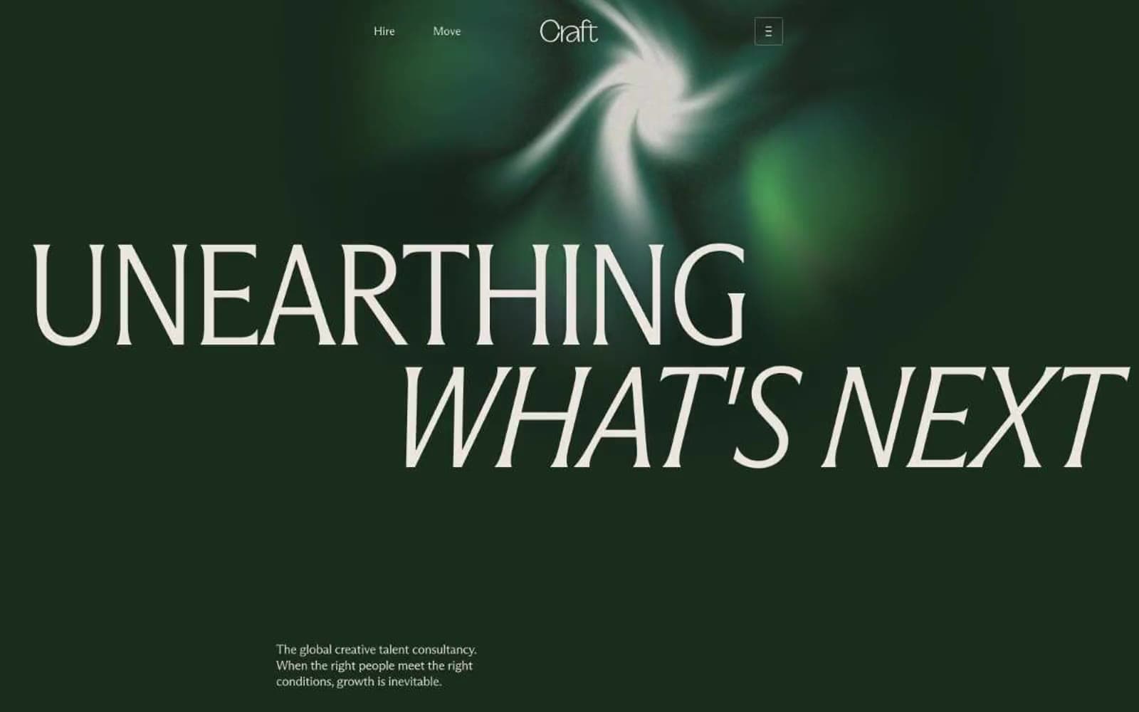
Craft. Cream pages holding vivid green specimens and one quiet forest room.
- Studio
- Light theme
- 9 colors
- 2 typefaces
Craft operates as a botanical conservatory on warm parchment: a cream canvas (#f7f5f2) carries the whole body, punctuated by a single deep-forest hero (#1d3023) that swallows the viewport behind a flowing organic green shape. Type is the primary voice — a custom condensed serif at 180px whispers the brand promise in tight -0.03em tracking, then a lighter Arizona Flare handles everything else at human scale. Color is used as punctuation, not decoration: the cream surface dominates, a near-black plum-brown carries all text, and a vivid lime green (#26d862) appears only on action, inline links, and the occasional accent word inside headlines. Components stay flat and unshadowed — the hierarchy comes from type size, generous whitespace (56px section gaps), and 8px-radius cards that hold full-bleed flower photography. The rhythm is editorial: one dramatic dark hero, then a stream of quiet cream sections with centered serif statements, 4-column stat strips, and image grids that let the botanical subjects do the work.
Craft design system

Brand2
Hero section background, dark surface, outlined ghost-button borders — the deep green room that introduces the brand and reappears as a dark contrast panel
Primary action buttons, inline links, accent words inside headlines, active nav states — vivid green used sparingly as functional punctuation, never as decoration
Accent1
Stat numbers, data emphasis — a deeper teal that shares hue with the forest hero but reads quieter so it can carry numerical data in stat cards
Neutrals6
Primary text, body copy, all headings, nav links — a near-black with warm plum undertone that pairs with the cream canvas at 15.3:1 contrast
Dark accent for small headings and emphasis — warmer alternative to the primary text color when a touch of depth is needed
Secondary text, captions, muted labels — used where near-black would be too heavy, sits at 80 instances
Hairline borders, dividers, structural separators — warm gray that reads as line work, not as color
Card surfaces, elevated panels, secondary containers — a half-step darker than the canvas for gentle separation without shadow
Page canvas, body backgrounds — the warm off-white that carries almost every section and makes the dark hero and green accents feel like specimens on display
Try a pairing
Pick any two colors from the palette to check whether text stays readable on top.
Aa
Bone Linen on Forest Depths
12.87 : 1 contrast
- Body textPasses AA 4.5
- Large textPasses AA 3
- StrictPasses AAA 7
More DESIGN.md files. Same web, different personalities.
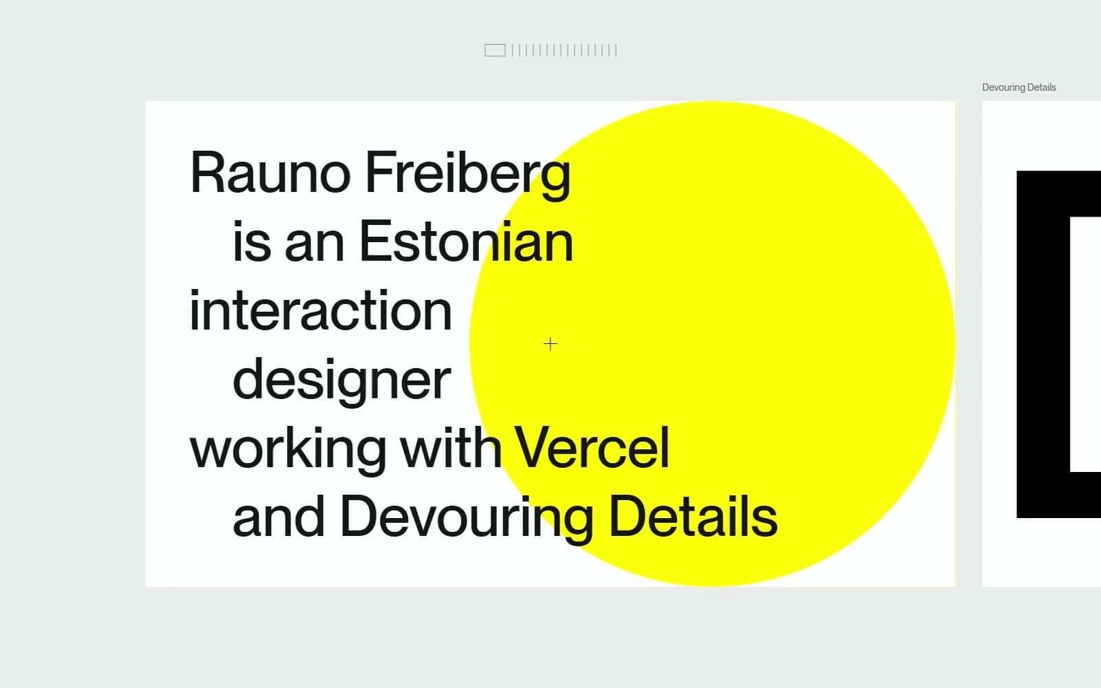
Rauno Freiberg
Studio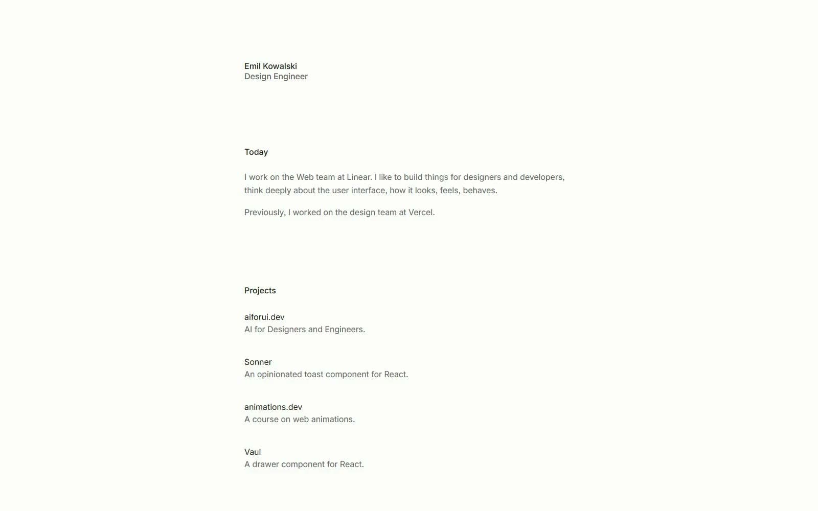
Emil Kowalski
Studio
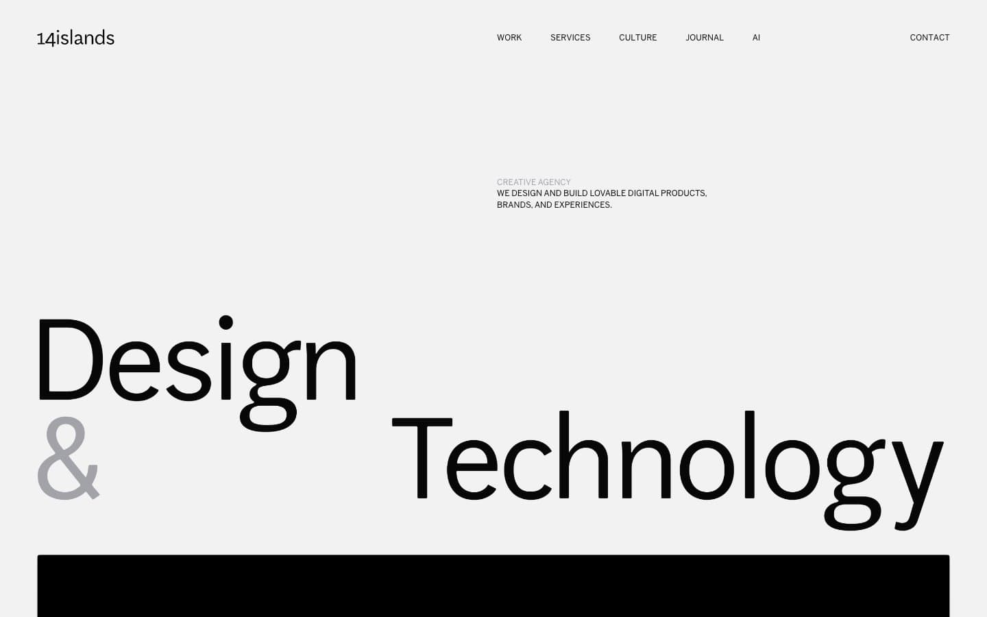
14islands
Studio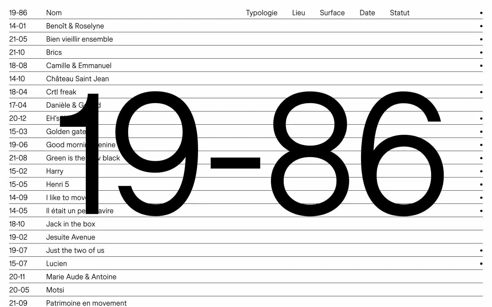
19–86
Studio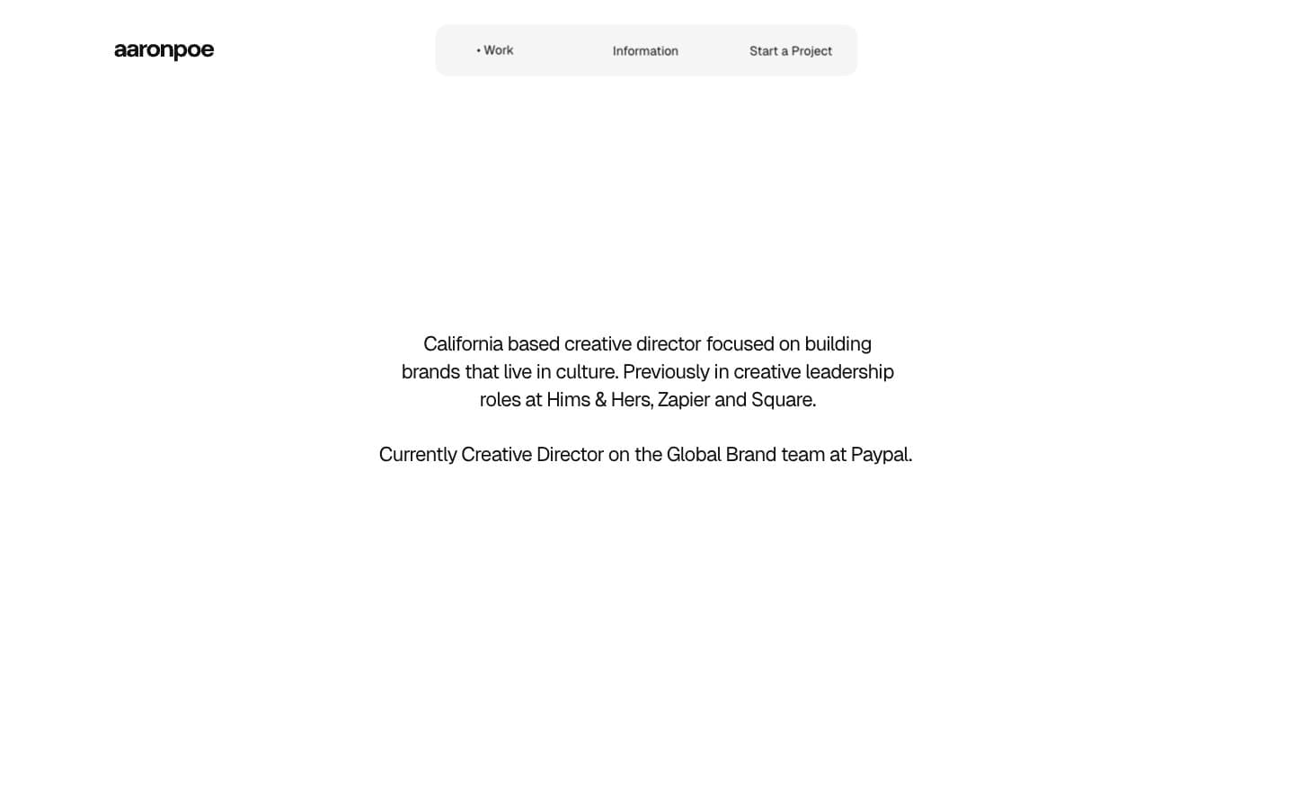
Aaron Poe & Co
Studio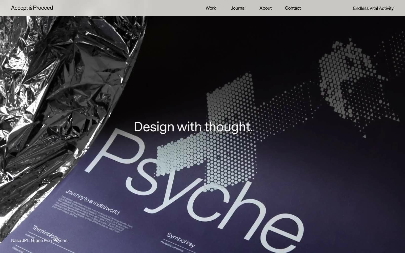
Acceptandproceed
Studio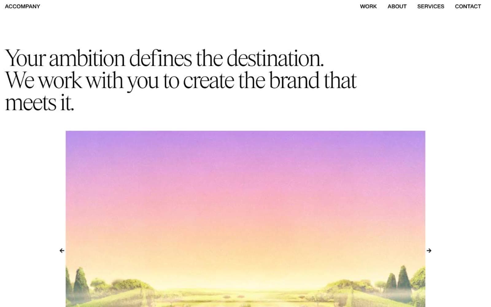
ACCOMPANY
Studio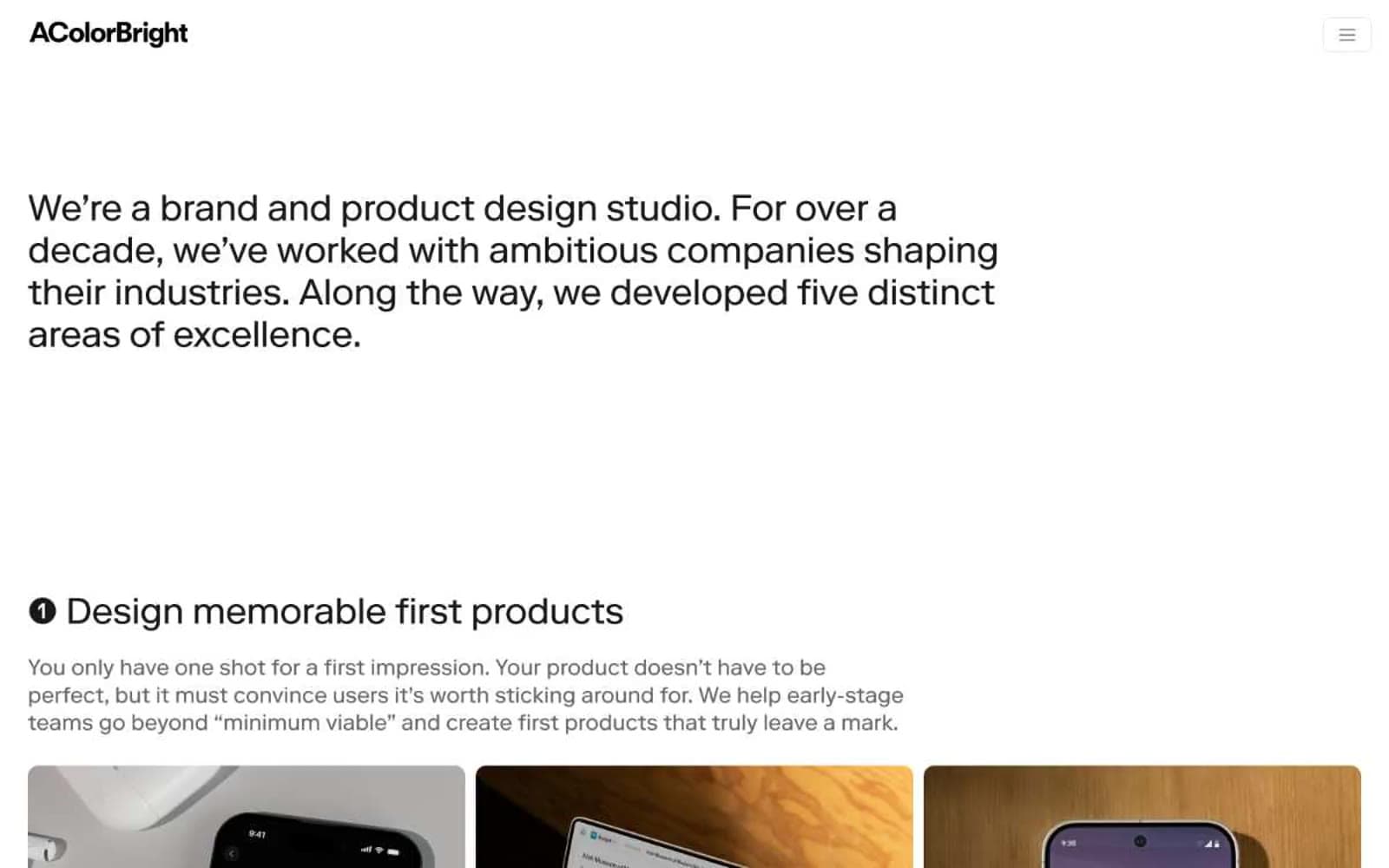
Acolorbright
Studio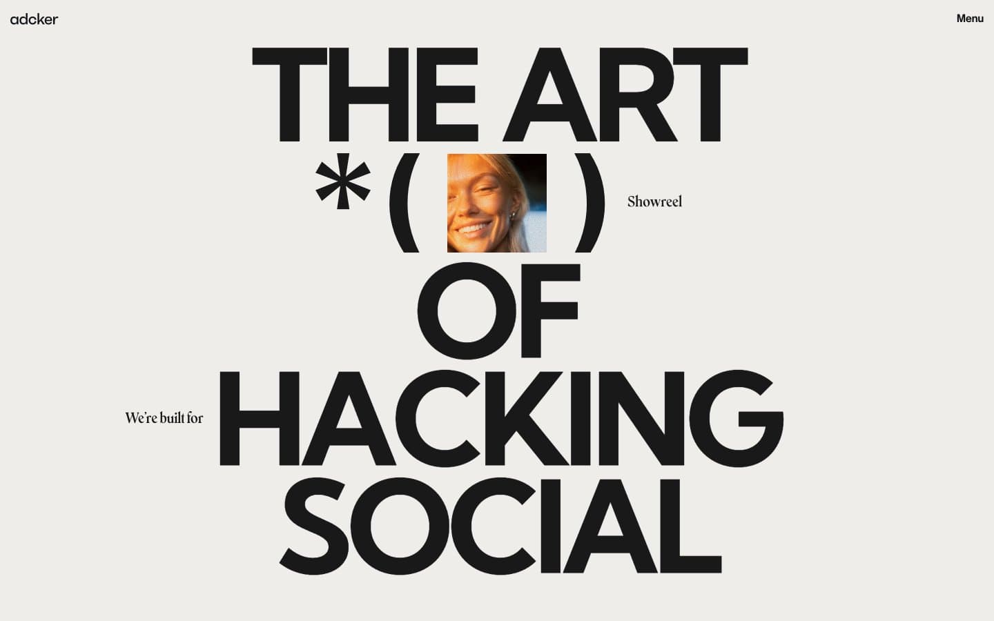
Adcker
Studio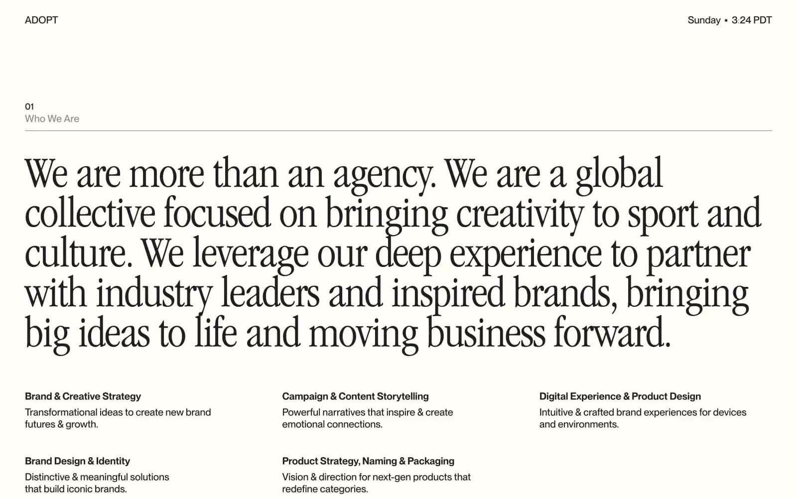
Adopt
Studio
Agence Foudre
Studio


