
Cori Corinne. Editorial gallery on warm paper.
- Studio
- Light theme
- 4 colors
- 3 typefaces
Cori Corinne is a personal portfolio site that reads like an editorial print spread — a warm cream canvas, a single massive serif name as the cover line, and quiet sans-serif navigation that almost disappears. The entire system is restrained to one ink color and one paper color, letting photography and typography do all the expressive work. Every element earns its place: the wordmark is the hero, the page sections function as gallery plates, and the only UI chrome is a hairline-thin top bar. Components are essentially absent — this is a typography-and-photography system, not a component library. The visual identity comes from the tension between the whisper-light cream background (#f6f5f0) and the dense, high-contrast serif display, which creates a fashion-editorial or art-catalog feeling rather than a typical portfolio grid.
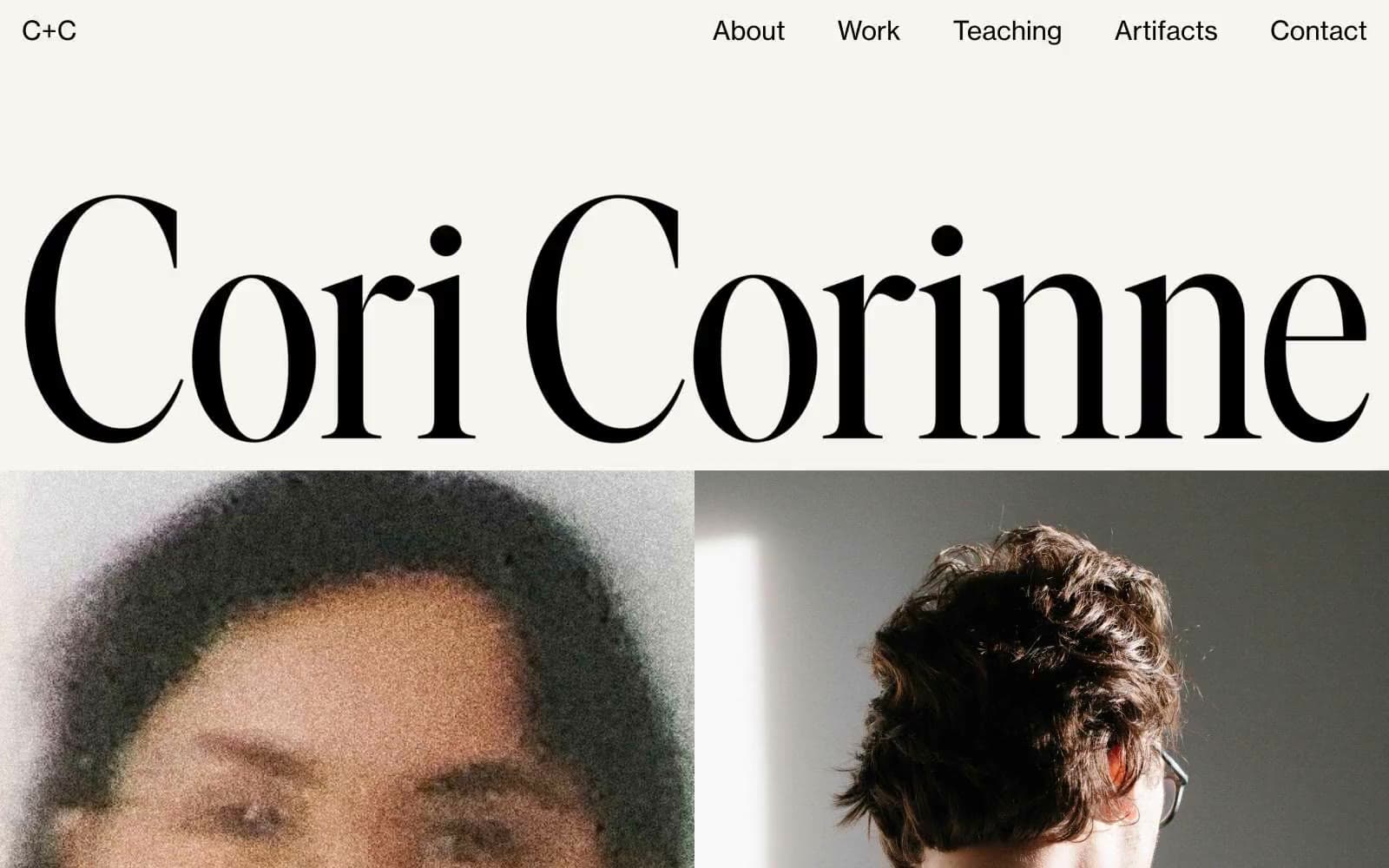
Cori Corinne design system

Neutrals4
Navigation text, link colors, and heading strokes — reserved for the most weighty typographic moments
Primary text, heading fills, and structural borders — near-black with a faint warm cast that sits softer on cream than pure black
Page background — warm off-white canvas, the surface everything floats on
Alternate surface for image plates and card containers layered on the cream canvas
Try a pairing
Pick any two colors from the palette to check whether text stays readable on top.
Aa
Bone White on Pure Ink
21.00 : 1 contrast
- Body textPasses AA 4.5
- Large textPasses AA 3
- StrictPasses AAA 7
More DESIGN.md files. Same web, different personalities.

Rauno Freiberg
Studio
Emil Kowalski
Studio

14islands
Studio
19–86
Studio
Aaron Poe & Co
Studio
Acceptandproceed
Studio
ACCOMPANY
Studio
Acolorbright
Studio
Adcker
Studio
Adopt
Studio
Agence Foudre
Studio


