
Cora. Romantic sky painting with floating desk.
- AI
- Light theme
- 12 colors
- 3 typefaces
Cora pairs a romantic plein-air sky painting with a precision product interface — the page feels like looking up through clouds at freedom, then returning to a calm desk. The signature move is full-bleed atmospheric illustration as the canvas, not as a banner: tree branches, cumulus clouds, and birds occupy the entire viewport, with UI elements floating on top like cards laid against a window. Typography is literary: a light-weight serif (signifier) for headlines whispers where most SaaS sites shout, and a workhorse sans (switzer) handles the product surface. Color stays minimal — vivid cerulean sky, one deep navy for filled actions, warm red as a single ink-stamp accent — so the painting and the type do the emotional work, not the palette.
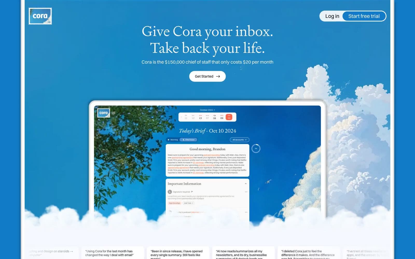
Cora design system

Brand4
Full-bleed canvas for hero and atmospheric sections, primary nav background, sky-illustration base
Tinted shadow color — the brand-blue cast on every elevation shadow makes even drop shadows feel atmospheric
Outlined action border — secondary buttons and card outlines gain a cool sky tint instead of neutral gray
Primary filled action background — the Get Started pill, pressed against the sky, reads as a deep horizon line
Accent1
Single chromatic accent — reserved for emphasis ink, important markers, and the occasional stamp of urgency against the blue
Neutrals7
Deepest text tone, used sparingly for highest-emphasis body copy with a barely-warm purple undertone
Body text and dominant UI strokes — the dark that anchors serif type against white cards
Tertiary text, icon fills, low-emphasis labels
Muted helper text and secondary metadata
Hairline borders and dividers — the only neutral border color in the system
Subtle card background for nested surfaces, the lightest gray still distinct from pure white
Primary surface for cards, product UI, testimonial panels — the white that floats against the sky
Try a pairing
Pick any two colors from the palette to check whether text stays readable on top.
Aa
#fafafa on Cerulean Sky
4.29 : 1 contrast
- Body textFails AA 4.5
- Large textPasses AA 3
- StrictFails AAA 7























