
Copy. Violet voltage on white blueprint.
- AI
- Light theme
- 23 colors
- 3 typefaces
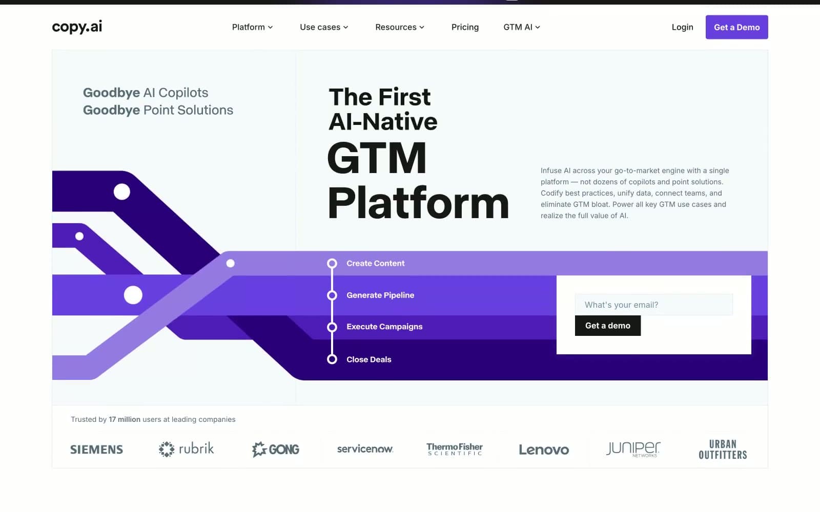
Copy.ai operates as a sunlit enterprise platform: white canvas, crisp black text, and a single vivid violet that acts as electric punctuation across an otherwise quiet monochrome interface. The design language is assertive but restrained — heavy display weights in a custom grotesque deliver headlines with presence, while a universal 4px radius keeps every surface sharp and architectural rather than soft. Depth comes from a violet gradient hero band and inset hairline shadows on buttons, not from drop shadows or skeuomorphism. Components are flat, dense with information, and grid-aligned, with cards sitting on white rather than tinted surfaces to maintain contrast discipline.
Copy design system

Brand5
Violet supporting accent for decorative details and low-frequency emphasis. Do not promote it to the primary CTA color
Mid-gradient stop in hero band and platform diagram backgrounds. Bridges Voltage Violet to darker violet depths
Deeper gradient stop, card-on-violet backgrounds in platform architecture diagram
Even deeper gradient stop; used in platform diagram cells and hero band lower section
Deepest gradient stop; anchors the bottom of the hero band and provides shadow depth in violet illustrations
Accent2
Soft violet tint — decorative washes, subtle highlights on violet illustrations, muted violet borders on light backgrounds
Slightly lighter violet stroke for illustration linework and decorative connectors in hero graphics
Neutrals16
Primary text color on light backgrounds; near-black with a barely perceptible cool cast. Used for body copy and headings
Dominant text and icon color across the entire interface. The workhorse neutral for headings, body, nav, and icon fills
Dark surface accent borders; used as outline color on dark elements
Secondary heading weight and nav text; darker than mid-gray but lighter than Obsidian
Nav and UI utility text; near-black neutral
Muted heading and button text on light surfaces; cool gray with blue undertone
Stroke color for illustrations and decorative SVG linework; cool dark gray
Utility text and less-prominent body content; neutral mid-gray with no color cast
Body text secondary level, descriptive paragraphs, and muted helper text. Highest frequency gray
Icon strokes and decorative linework in illustrations
Light decorative strokes and illustration linework
Button borders on light surfaces; cool pale gray with slight blue cast
Dividers, subtle borders, and box-shadow base color; the universal hairline gray
Input borders and card edge dividers; slightly cooler than Cloud
Page canvas background; off-white with the faintest cool tint to soften the page without going gray
Card surfaces, button text on dark fills, and nav background; pure white for maximum contrast
Try a pairing
Pick any two colors from the palette to check whether text stays readable on top.
Aa
Paper on Voltage Violet
6.26 : 1 contrast
- Body textPasses AA 4.5
- Large textPasses AA 3
- StrictFails AAA 7























