
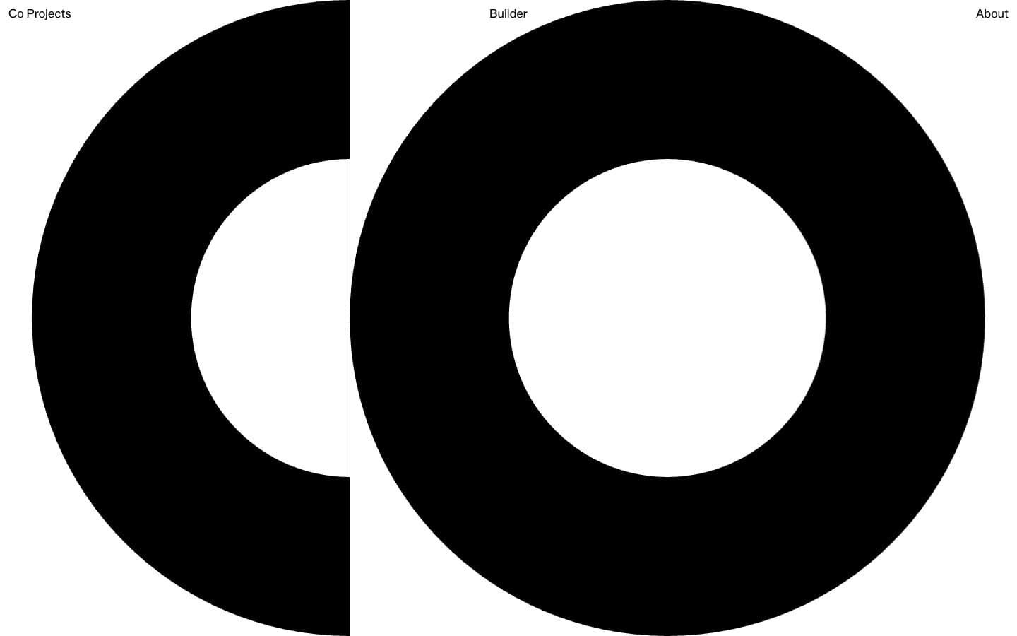
Co Projects. Black geometric sculpture on white void.
- Studio
- Light theme
- 3 colors
- 2 typefaces
Co Projects operates as a geometric art gallery translated into web form: a pure white void interrupted by massive black circular forms, a single hairline gray for structural rules, and two weight-400 typefaces doing all the communication. The system rejects almost every contemporary UI convention — no shadows, no gradients, no color, no rounded rectangles, no bold weights, no icons. What remains is raw figure/ground contrast at architectural scale: tiny 16px nav labels float in the corners while 60px display text and viewport-spanning black rings dominate the canvas. Spacing is museum-generous, with 139–208px gaps between major elements creating room to breathe that most product interfaces would call wasteful. The visual language trusts that shape, scale, and negative space carry the brand harder than any color system could.
Co Projects design system

Neutrals3
Primary mark fill, text, and the large circular ring forms. The sole chromatic-payload element in the system
Hairline borders, structural dividers, and subtle separator rules at 1px. The only gray in the palette and it never fills — it only divides
Page canvas, background of all surfaces, inner counter of the ring forms — the negative space that gives the black marks their mass
Try a pairing
Pick any two colors from the palette to check whether text stays readable on top.
Aa
Paper White on Graphite Ink
21.00 : 1 contrast
- Body textPasses AA 4.5
- Large textPasses AA 3
- StrictPasses AAA 7
More DESIGN.md files. Same web, different personalities.

Rauno Freiberg
Studio
Emil Kowalski
Studio

14islands
Studio
19–86
Studio
Aaron Poe & Co
Studio
Acceptandproceed
Studio
ACCOMPANY
Studio
Acolorbright
Studio
Adcker
Studio
Adopt
Studio
Agence Foudre
Studio


