
CLOU architects. Ink on cream paper.
- Studio
- Light theme
- 2 colors
- 1 typeface
CLOU architects operates in a radical two-color universe: warm cream (#fffffc) and absolute black (#000000). Nothing else is allowed in the interface — every other hue comes from architectural photography bleeding into the layout. The system is built on one geometric sans-serif (Circular Std) pushed to extremes: headlines reach 200px+, letter-spacing tightens aggressively at scale, and line-heights compress to 0.80 for display copy. The cream background is deliberately off-white (not #ffffff), which prevents harshness against the dominant black typography and gives the page a paper-like, gallery-wall warmth. Navigation is a dense black bar; the body is expansive cream; the only "decoration" is the photography itself — full-bleed, unframed, the actual project. This is a design system that says almost nothing visually so the architecture can say everything.
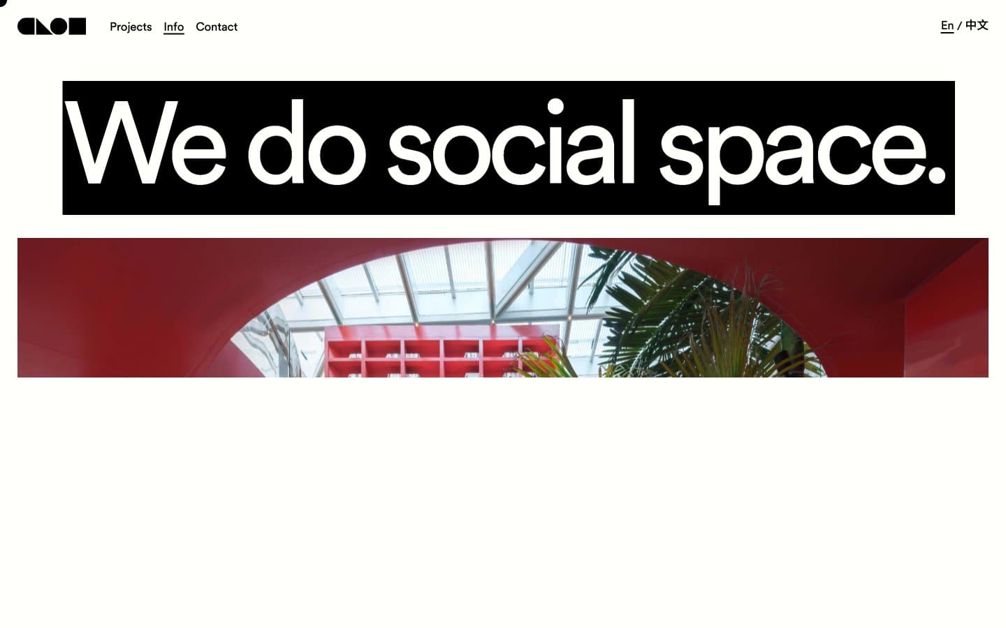
CLOU architects design system

Neutrals2
All text, borders, navigation background, button borders, icon strokes — the only foreground color in the system, used at full saturation with no opacity reductions
Page canvas, card surfaces, button fills — the slightly warm off-white prevents stark contrast against black ink, giving the entire site a printed-paper warmth rather than a digital-screen feel
Try a pairing
Pick any two colors from the palette to check whether text stays readable on top.
Aa
Cream Paper on Ink Black
20.96 : 1 contrast
- Body textPasses AA 4.5
- Large textPasses AA 3
- StrictPasses AAA 7
More DESIGN.md files. Same web, different personalities.

Rauno Freiberg
Studio
Emil Kowalski
Studio

14islands
Studio
19–86
Studio
Aaron Poe & Co
Studio
Acceptandproceed
Studio
ACCOMPANY
Studio
Acolorbright
Studio
Adcker
Studio
Adopt
Studio
Agence Foudre
Studio


