
Claude. Ink on bone paper, clay as the only chromatic breath.
- AI
- Light theme
- 11 colors
- 2 typefaces
Claude presents a warm-paper editorial interface: off-white parchment canvas (#f8f8f6) replaces the usual cold-white SaaS backdrop, paired with a near-black warm charcoal (#121212) for typography that reads as ink on paper rather than pixels on glass. The system is deliberately monochrome — the only chromatic accent is clay orange (#d97757), used sparingly as a signature mark rather than a call-to-action flood. Typography is the hero: Anthropic Serif sets the emotional headlines (the rare serif in tech), Anthropic Sans carries everything else at restrained weights (400-580), creating a hierarchy through size and weight contrast rather than color. Surfaces are flat with generous corner radii (16-24px on cards, 8px on controls), minimal shadow, and hairline borders — the aesthetic of a printed document rather than a digital product.
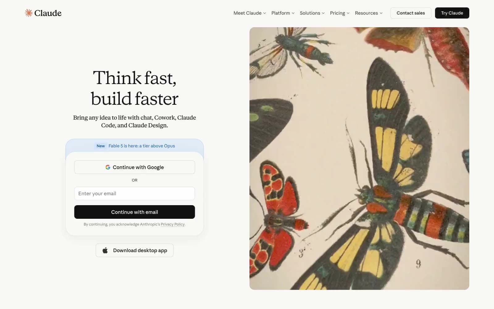
Claude design system

Accent1
Orange decorative accent for icons, marks, and small graphic details. Do not promote it to the primary CTA color
Neutrals10
Footer background — only true black on the page
Primary text, headings, icon fills — warm near-black rather than pure black
Secondary headings, button text, nav text — softer than carbon
Muted helper text, captions, fine print, disclaimer copy
Tertiary text, copyright, very low-priority labels
Hairline nav dividers, subtle border lines
Decorative illustration fills, soft background tints
Nested card surfaces, subtle background variation, alternate section bands
Page canvas, large background areas, nav bar, secondary cards
Elevated card surfaces, primary content surfaces above the canvas
Try a pairing
Pick any two colors from the palette to check whether text stays readable on top.
Aa
Obsidian on Clay
6.73 : 1 contrast
- Body textPasses AA 4.5
- Large textPasses AA 3
- StrictFails AAA 7























