
Clase bcn. Editorial gallery on white wall.
- Studio
- Light theme
- 10 colors
- 2 typefaces
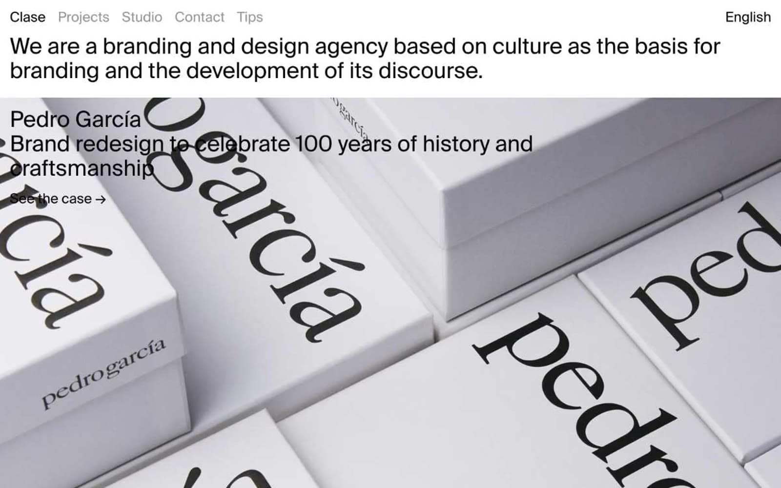
Clase bcn is an editorial gallery on a white wall: a branding agency whose portfolio reads like a museum catalogue. The interface is almost invisible — text, hairline dividers, and full-bleed project imagery do all the work. A single sans-serif (Suisse Int'l) at one weight (400) carries every element, from navigation labels to oversized project titles. Whitespace is generous and structural: project cards span the full viewport with titles and subtitles overlaid directly on photography. The only interactions are text links with arrow indicators; there are no buttons, no fills, no shadows, no decorative UI chrome. Color appears as content — individual project case studies bring their own palettes as background fills — while the chrome stays achromatic and quiet.
Clase bcn design system

Accent2
Project card background — warm content fill, not a UI accent
Project card background — vivid content fill, not a UI accent
Neutrals8
Primary text, hairline borders, nav labels — the structural anchor of every element
Near-black project card background — reads as deepest neutral
Secondary text and deep surfaces where pure black reads too harsh
Project card background — slightly cool dark, content-driven not UI
Muted navigation labels, secondary link text, inactive nav state
Tertiary link borders and subdued annotation text
Subtle surface division, alternating card backgrounds
Page canvas, card surface base, text on dark cards
Try a pairing
Pick any two colors from the palette to check whether text stays readable on top.
Aa
Ink Black on Terracotta Blush
14.05 : 1 contrast
- Body textPasses AA 4.5
- Large textPasses AA 3
- StrictPasses AAA 7
More DESIGN.md files. Same web, different personalities.

Rauno Freiberg
Studio
Emil Kowalski
Studio

14islands
Studio
19–86
Studio
Aaron Poe & Co
Studio
Acceptandproceed
Studio
ACCOMPANY
Studio
Acolorbright
Studio
Adcker
Studio
Adopt
Studio
Agence Foudre
Studio


