
CHRISTOPHER IRELAND CREATIVE. Bone-white gallery wall, editorial monograph in morning light.
- Studio
- Light theme
- 4 colors
- 2 typefaces
A photographer's portfolio rendered as a quiet editorial spread: a warm bone canvas, a single typeface pairing (a contemporary serif for display, a geometric sans for utility), and no chromatic accent whatsoever. The visual system defers entirely to the photography — text is a thin scaffolding of category labels and a few oversized serif headlines that behave like magazine pull-quotes. The feeling is closer to a printed monograph than a website: large blocks of breathing room, asymmetric split layouts (text-left, image-right), and weight 400 everywhere — the serif never thickens, the sans never condenses, so hierarchy comes from size and tracking rather than emphasis.
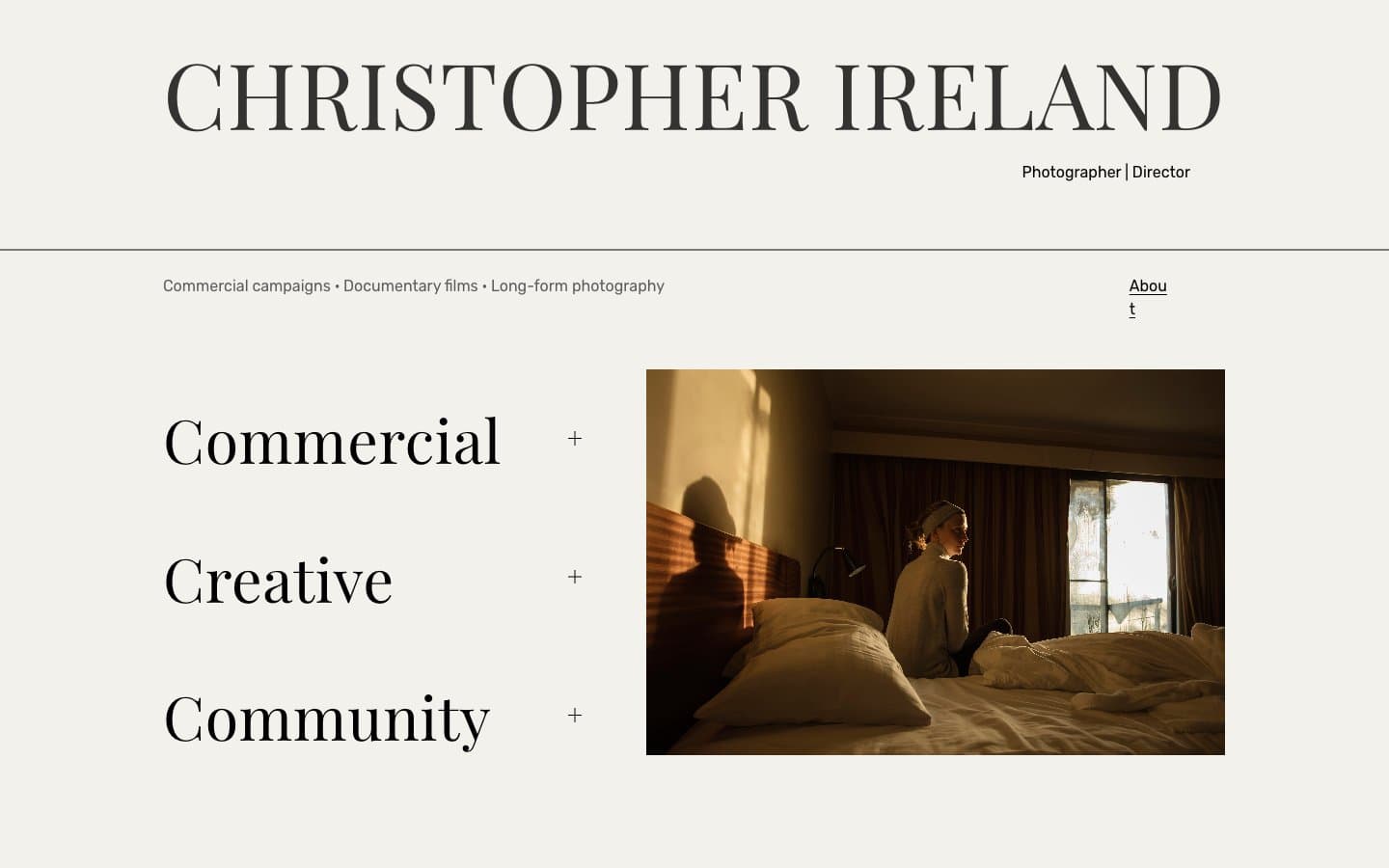
CHRISTOPHER IRELAND CREATIVE design system

Neutrals4
Primary text, borders, dividers, plus-marks, section rules — pure black against bone creates the highest-possible contrast for a posterized editorial feel
Headline text — nearly black but with a quarter-step of warmth; lets the serif headings feel set rather than stamped
Secondary body text, captions, sub-labels — the only muted step in an otherwise binary palette
Page canvas, card surface — warm off-white reads as paper, not screen; gives the page a tactile, printed quality
Try a pairing
Pick any two colors from the palette to check whether text stays readable on top.
Aa
Bone on Ink
18.57 : 1 contrast
- Body textPasses AA 4.5
- Large textPasses AA 3
- StrictPasses AAA 7
More DESIGN.md files. Same web, different personalities.

Rauno Freiberg
Studio
Emil Kowalski
Studio

14islands
Studio
19–86
Studio
Aaron Poe & Co
Studio
Acceptandproceed
Studio
ACCOMPANY
Studio
Acolorbright
Studio
Adcker
Studio
Adopt
Studio
Agence Foudre
Studio


