
ChatGPT. Graphite ink on warm paper.
- AI
- Light theme
- 7 colors
- 1 typeface
ChatGPT uses a graphite-on-paper language: near-white canvas (#f9f9f9 sidebar) with the main conversation surface staying white, near-black ink for all primary text and icons, and zero chromatic accents. The entire UI is achromatic — meaning is carried by weight (600 headings, 400 body, 500 for emphasis) and spatial rhythm rather than color. Surfaces stay flat; elevation comes from a single hairline border at 1px rgba(0,0,0,0.05) rather than shadow. Controls are small, square-ish (10px radius), and chrome-light so the written response dominates. The system reads as restrained utility software — every pixel earns its place.
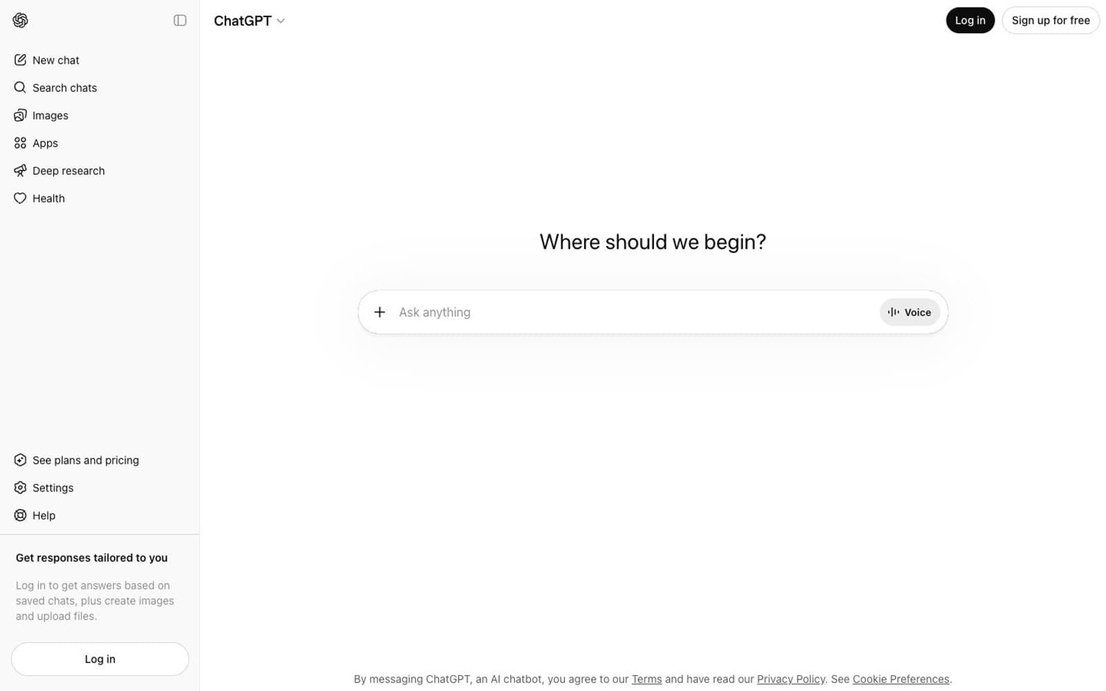
ChatGPT design system

Neutrals7
Pressed/inverted surface fill, tooltips, scrim — true black for max contrast moments
Primary headings, body text, and icon fills on light surfaces. Do not promote it to the primary CTA color
Secondary text and icons — supporting labels, metadata
Tertiary text, disabled states, muted helper copy
Stronger divider or inactive surface — used sparingly as a higher-contrast border alternative
Sidebar and secondary surface backgrounds — page chrome recedes behind the conversation
Main canvas and elevated surface — primary reading area, elevated panels, inverted text backgrounds
Try a pairing
Pick any two colors from the palette to check whether text stays readable on top.
Aa
Pure White on Ink Press
21.00 : 1 contrast
- Body textPasses AA 4.5
- Large textPasses AA 3
- StrictPasses AAA 7























