
Carlbeaverson. Gallery wall in winter light.
- Studio
- Light theme
- 6 colors
- 2 typefaces
Carl Beaverson's portfolio operates on radical restraint: a warm off-white canvas, exclusively neutral tones, and a single accent typeface (Suisse Works) reserved for the smallest typographic moments. The entire system is achromatic — no brand color, no chromatic accent, no semantic hues. Hierarchy is built through scale jumps, tracking, and generous negative space rather than color or weight. Components float on warm-tinted brown shadows that subtly warm an otherwise cold minimalist grid. The reading order is content-first: three-up project tiles, tiny attribution text, and large section gutters that let each piece breathe independently.
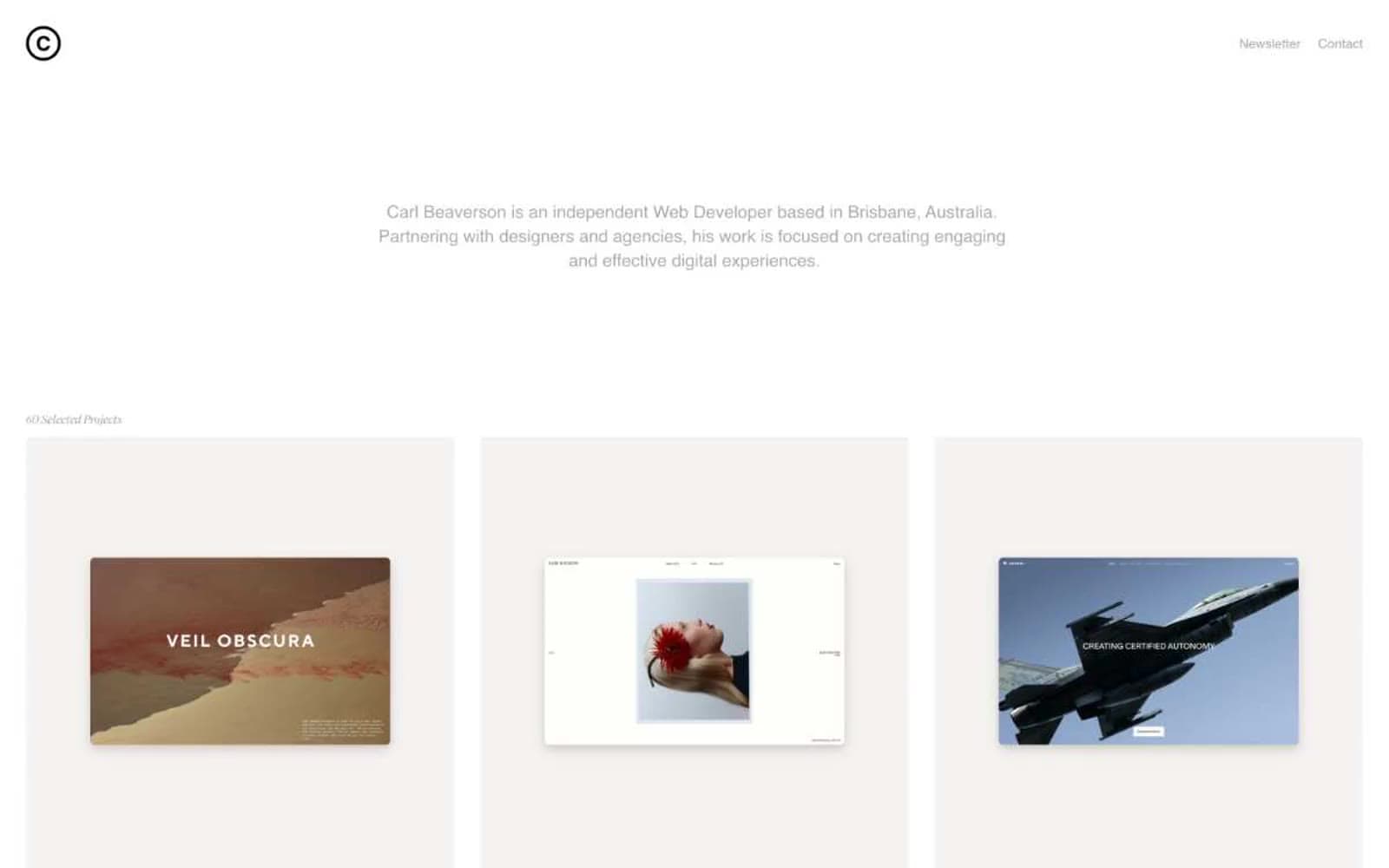
Carlbeaverson design system

Neutrals6
Primary headings, button text, input text, high-contrast labels
Body text, paragraph copy, longer-form descriptions
Muted secondary text, tertiary metadata
Subtle borders, dividers, light secondary text, project attribution labels
Card surface lift from canvas, subtle background variation
Light supporting surface for subtle backgrounds and section separation. Do not promote it to the primary CTA color
Try a pairing
Pick any two colors from the palette to check whether text stays readable on top.
Aa
Bone Canvas on Ink
11.39 : 1 contrast
- Body textPasses AA 4.5
- Large textPasses AA 3
- StrictPasses AAA 7
More DESIGN.md files. Same web, different personalities.

Rauno Freiberg
Studio
Emil Kowalski
Studio

14islands
Studio
19–86
Studio
Aaron Poe & Co
Studio
Acceptandproceed
Studio
ACCOMPANY
Studio
Acolorbright
Studio
Adcker
Studio
Adopt
Studio
Agence Foudre
Studio


