
BUTT STUDIO. Gallery wall with one massive serif wordmark.
- Studio
- Light theme
- 5 colors
- 3 typefaces
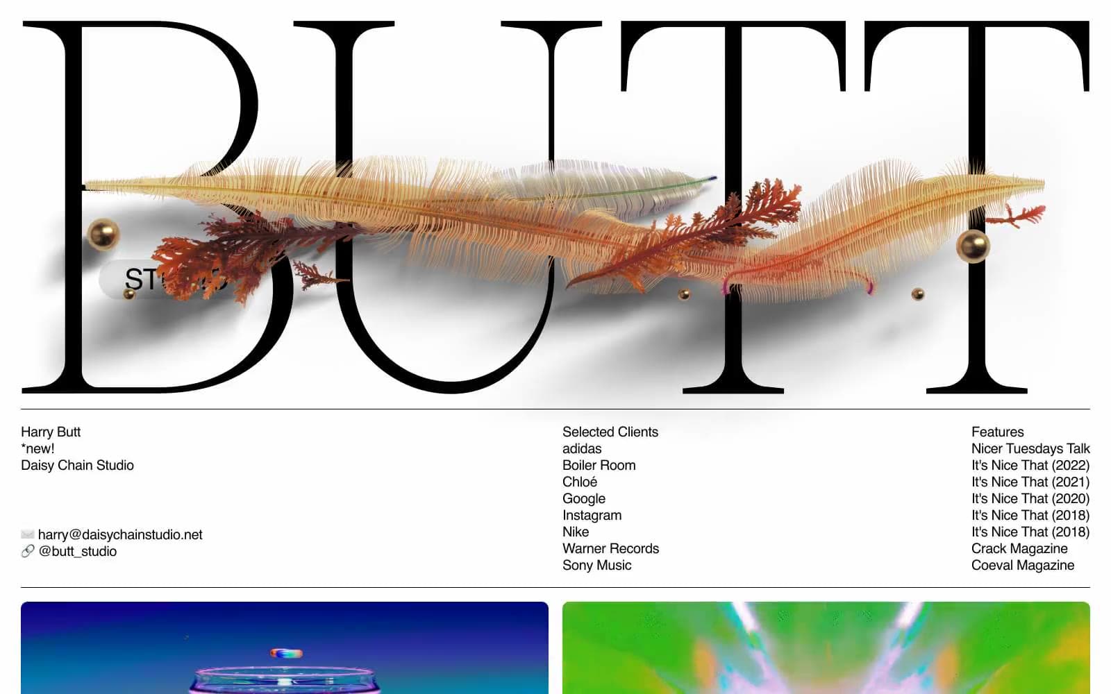
BUTT Studio is an editorial portfolio that treats type as architecture: one enormous Caslon wordmark stretches wall-to-wall across the top of the page, broken by an organic illustration that weaves through the letterforms. Below the hero, the system collapses into a clinical three-column ledger of contact, clients, and features in a quiet sans-serif, then opens into a generous two-column project grid. Color is almost entirely absent — matte black ink on warm gray paper, with a single deep indigo badge as the only chromatic punctuation. The feel is a print magazine that happens to be alive: confident serif display, utilitarian sans body, no gradients, no rounded chrome, no decorative shadows.
BUTT STUDIO design system

Brand1
Sole chromatic accent — STUDIO pill badge, and any deep brand punctuation. The only saturated color in the system
Neutrals4
Primary text, borders, button outlines, structural strokes — the only color that ever carries information
Dark project tile backgrounds, near-black surface for video panels
Page canvas, neutral button fills — the warm gray the whole composition sits on
Card surfaces, thumbnail covers, inverted text on dark blocks
Try a pairing
Pick any two colors from the palette to check whether text stays readable on top.
Aa
Paper on Studio Indigo
10.53 : 1 contrast
- Body textPasses AA 4.5
- Large textPasses AA 3
- StrictPasses AAA 7
More DESIGN.md files. Same web, different personalities.

Rauno Freiberg
Studio
Emil Kowalski
Studio

14islands
Studio
19–86
Studio
Aaron Poe & Co
Studio
Acceptandproceed
Studio
ACCOMPANY
Studio
Acolorbright
Studio
Adcker
Studio
Adopt
Studio
Agence Foudre
Studio


