
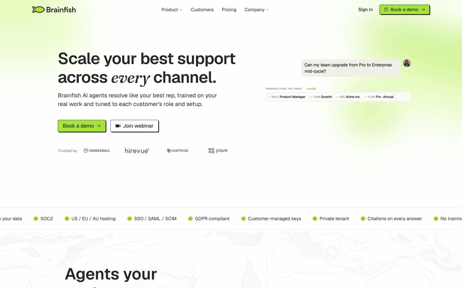
Brainfish. A near-monochrome page where a single vivid green stroke does all the work.
- AI
- Light theme
- 11 colors
- 3 typefaces
Brainfish operates as a minimalist editorial broadsheet: a near-monochrome canvas of paper white and deep ink, interrupted by a single highlighter-lime accent that makes every CTA feel like a mark on a page rather than a button on a screen. The type system pairs Geist's geometric clarity with Fraunces italic for one or two emphasis words inside a headline, creating a signature rhythm where a serif "actually" or "every" sits inside a sans-serif sentence. Components are printed rather than projected — 4px button corners, 2px hard offset shadows, 1px ink borders, and cream card surfaces that read as paper rather than glass. A topographic illustration runs beneath the entire page as a quiet watermark. Color is rationed: lime appears only where action is requested or where a section needs punctuation.
Brainfish design system

Brand1
Green action color for filled buttons, selected navigation states, and focused conversion moments.
Accent2
Green accent for outlined action borders, linked labels, and lightweight interactive emphasis
Gray action color for filled buttons, selected navigation states, and focused conversion moments
Neutrals8
Strongest display text and filled icon glyphs where maximum weight is needed inside a headline or pull-quote
Primary text color, default border, icon stroke, and hard shadow color. This is the single dark token that does structural work across text, lines, and elevation
Dark button and surface background — used for the large primary action blocks in the nav and hero where a heavier fill than ink is needed but true black would be too harsh
Secondary body text, supporting descriptions, and the slightly softer voice below a heading
Tertiary helper text, badge labels, copyright fine print, and the most de-emphasized text in the hierarchy
Hairline borders, card outlines, footer dividers, and the soft separator between sections
Warm off-white surface for cards, stat tiles, and footer — a barely-there yellow-green tint that distinguishes a lifted surface from the page without introducing a new color
Primary page canvas and inverse text on dark surfaces
Try a pairing
Pick any two colors from the palette to check whether text stays readable on top.
Aa
Black Ink on Lime Sprint
13.93 : 1 contrast
- Body textPasses AA 4.5
- Large textPasses AA 3
- StrictPasses AAA 7























