
큰그림컴퍼니. Concrete slab typographic manifesto.
- Studio
- Light theme
- 5 colors
- 4 typefaces
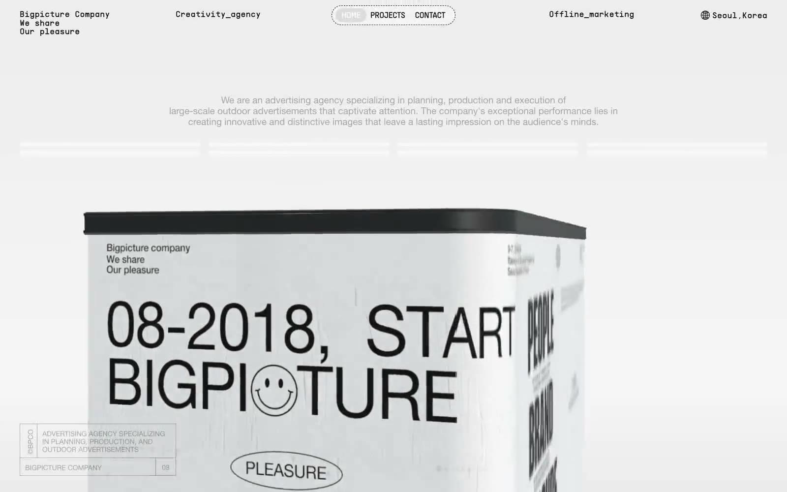
Bigpicture Company is a monochrome editorial system that treats the webpage as a printed press kit laid out on raw paper. The interface strips away all chromatic color and relies entirely on black ink, white space, hairline rules, and a single crumpled-paper texture to carry atmosphere. Typography is the product: display headlines reach 274px at Helvetica Neue 700 with aggressive negative tracking, making text the dominant visual mass on every screen. Monospace labels ([01-N INTRODUCTION], CREATIVE/AGENCY) act as print-style captions, while four-pointed sparkle icons serve as the only ornament between sections. Layout is generous and zine-like — 72px section gaps, 144-250px horizontal padding, and full-bleed image blocks with 288px corners let the page breathe like a gallery wall rather than a software product.
큰그림컴퍼니 design system

Neutrals5
Primary text, hairlines, section borders, icon strokes, footer text — the singular dark tone that carries 95% of all foreground information
Tertiary text, disabled state, low-contrast surface lines
Light borders, icon stroke accents, secondary dividers
Subtle surface fills, soft borders, hairline dividers, the tone behind the crumpled-paper texture
Page canvas, card surfaces, nav pill background, heading-bordered surfaces
Try a pairing
Pick any two colors from the palette to check whether text stays readable on top.
Aa
Paper White on Press Ink
18.73 : 1 contrast
- Body textPasses AA 4.5
- Large textPasses AA 3
- StrictPasses AAA 7
More DESIGN.md files. Same web, different personalities.

Rauno Freiberg
Studio
Emil Kowalski
Studio

14islands
Studio
19–86
Studio
Aaron Poe & Co
Studio
Acceptandproceed
Studio
ACCOMPANY
Studio
Acolorbright
Studio
Adcker
Studio
Adopt
Studio
Agence Foudre
Studio


