
Azione. Sunlit editorial diptych.
- Studio
- Light theme
- 7 colors
- 4 typefaces
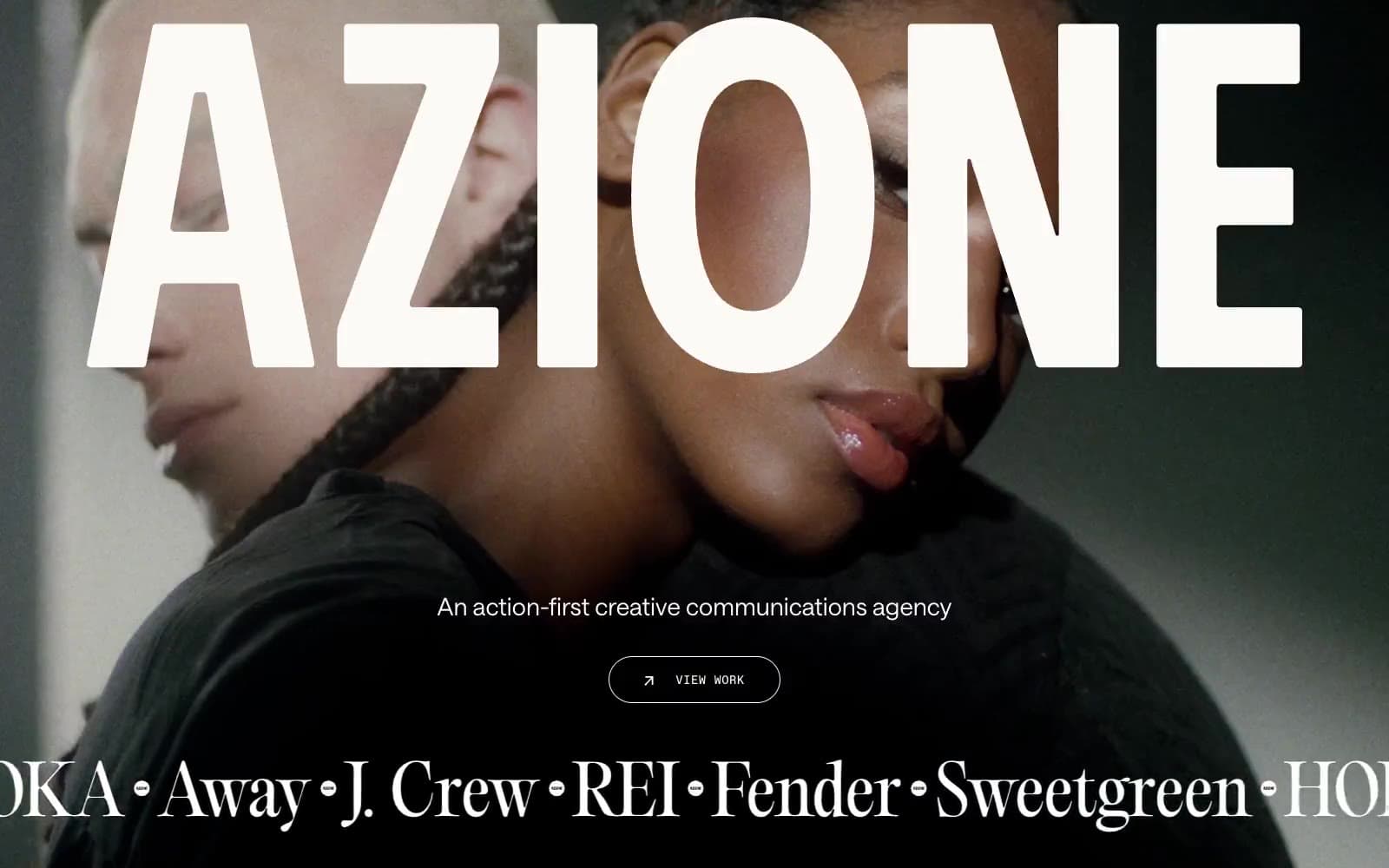
Azione — sunlit editorial diptych. The interface pairs cinematic, full-bleed campaign photography with enormous cream wordmarks and delicate editorial-serif statements, then cuts to tightly framed image-and-copy panels in rust brown and off-white. Typography is deliberately triadic: PP Editorial Old carries dramatic cultural weight, Saans TRIAL handles concise human copy, and Favorit Mono turns navigation, labels, and controls into small technical annotations. Surfaces stay flat and tactile, with 16px rounded content containers, hairline cream rules on dark treatments, and color reserved for the rust information panels rather than universal controls.
Azione design system

Brand1
Large editorial copy panels and branded content fields — an earthy counterpoint to cool campaign photography
Neutrals6
Dark page bands, navigation overlays, menu surfaces, and primary text
Text on pale utility controls and understated dark labels
Form-field divider and border lines
Pale circular utility-control fills
Primary canvas, light cards, reversed display type, navigation text, and hairline outlined controls
Portfolio tile and card surface within the Paper Cream canvas
Try a pairing
Pick any two colors from the palette to check whether text stays readable on top.
Aa
Card White on Azione Rust
8.63 : 1 contrast
- Body textPasses AA 4.5
- Large textPasses AA 3
- StrictPasses AAA 7
More DESIGN.md files. Same web, different personalities.

Rauno Freiberg
Studio
Emil Kowalski
Studio

14islands
Studio
19–86
Studio
Aaron Poe & Co
Studio
Acceptandproceed
Studio
ACCOMPANY
Studio
Acolorbright
Studio
Adcker
Studio
Adopt
Studio
Agence Foudre
Studio


